Author: Fraser Steele

  • Life on Enceladus?

    Life on Enceladus?

    Saturn’s sixth-largest moon may have the right conditions for life. But how to prove if there is life on Encaladus?

    Background – Cassini-Huygens mission

    The Cassini-Huygens mission was launched in 1997 with the mission objective to explore the saturnian system. It would take seven years to reach Saturn, and it would collect images, chemical analyses and magnetic field readings as it passed through the inner solar system, the asteroid belt and past Jupiter.

    Image of Saturn eclipsing Cassini.

    This would be the first mission to orbit Saturn and would carry the Huygens lander, which landed on Saturn’s largest moon, Titan. Among the instruments on the Cassini probe there was a mass spectrometer, the Cosmic Dust Analyzer1, which was designed to collect and characterise cosmic dust.

    The Cosmic Dust Analyzer (CDA) that was mounted on the Cassini probe. The opening is about 40 cm, the hexagon in the middle is the multiplier, which sits above the ionisation grid. The detectors are at the bottom of the cylinder, hidden from view. The unit is mounted on a turntable which allowed it to collect dust from a wider angle than if it had been stationary.

    Among the many amazing discoveries on the mission was the observation of gas plumes – cryovolcanoes – erupting from the southern polar region of Enceladus, the sixth-largest of Saturn’s 274 moons2 .

    Further observation and analysis of the plumes showed that they were mostly water and these ice crystals also constituted much of Saturn’s E-ring, the fifth ring to be discovered, whose existence was not confirmed until 1980.

    Astronomers reached this conclusion from the chemical analysis provided by the CDA in the early part of the mission. Collecting dust from the E-ring and from around Enceladus, it was seen that the chemical make-up of the ice crystals in the ring and in the plumes matched. However, looking again at the chemicals trapped inside it was concluded that the water coming out of Enceladus was salty and contained not only silicates, but ammonia and organic chemicals of varying complexity.

    A recent publication in Nature Astronomy3 has summarised the analysis of data collected by the Cosmic Dust Analyzer (CDA) during the last part of the probe’s orbit of Saturn from 2004 to 2017. The organic chemistry observed in these analyses shed light on the make-up of the oceans of Enceladus and raised the possibility that the moon is capable of supporting life.

    The first question that needs to be asked in the search for extra-terrestrial life is whether the conditions are suitable for life to exist. Liquid water at a reasonable temperature and pH is one such condition4. Also, six elements – carbon, hydrogen, oxygen, nitrogen, phosphorus and sulphur – are regarded as necessary for biological systems to survive.

    Enceladus

    Enceladus was discovered by William Herschel in 1789. Not much was known about it before the Cassini mission. It was known that it was 500 km in diameter – one seventh the size of our moon – and was associated with Saturn’s E-ring, though how the two interacted was not known.

    Enceladus, photographed by Cassini. The fissures cover most of the moon’s surface, except in the southern region. A small proportion of the ice from the plumes falls back to the moon and covers this region in smooth snow.

    Analysis of the magnetic data that Cassini collected provided astronomers with a update on the structure of the moon. There is a rocky core and an icy upper crust – this much was known. But data strongly suggested that there is a liquid ocean between the rock and the ice. This is a salty, high pH (11 to 12) environment but crucially there is liquid water.

    The article by Khawaja et al provides an analysis of some of the data the CDA collected in the last months of the mission. It has taken years to refine the data to the point where statistically significant conclusions can be drawn. A lot of the information from the Cassini fly-past was collected at relatively slow speeds. And ‘relatively’ means less than 12 km/s. Data from higher speed fly-bys at up to 18 km/s were also collected and form the basis of the new analysis.

    The speed at which the crystals were collected matters. The way the CDA works is that the crystals would hit a screen at the front of the CDA. The crystals are tiny – at most 1 nanometre (one millionth of a micrometre) and some ten orders of magnitude smaller (10-19 m)5. In the time it takes the ionised particles to reach the detector (about 20 microseconds at lower speeds) the water will freeze and this can shield many of the analytes from the instrument. At higher impact speeds the ice did not have time to reform and so more of the trapped chemicals were visible to the detector.

    With faster incoming particles, the detector had to work faster to be able to distinguish between each particle. Higher speed detection required the analyser to work at its maximum rate and in a mode for which it was not really designed. The data were noisy and in the years since a great deal of effort has been spent finding enough useful data to be able to make conclusions.

    What was found was some volatile organics such as methane and ethane, plus a mix of volatile low-mass nitrogen and oxygen bearing organics, single-ring aromatics and some complex macromolecular species, up to the limit of detection of the CDA (about 200 Da).

    This complex mix of chemicals can be seen as the building blocks for life and raises the question of what the source of these chemicals could be.

    In all this, you have to bear in mind that the CDA was designed and built nearly 30 years ago. Computer speeds have increased massively since the mid 90s and a CDA designed now would be smaller and more efficient than the one on Cassini. But also a CDA built in 2055 would be more advanced again.

    James Webb

    The James Webb telescope, launched in 2021, has investigated Enceladus. Using near infrared – more sensitive to water than the instruments on Cassini – it detected water plumes extending 10 000 km from the moon. Enceladus itself is only 500 km in diameter.

    Near-infra red image from the James Webb telescope. The blue colour is water, almost all of which originates from Enceladus. The plume extends up to 10 000 km from the moon.

    New missions to Enceladus have been proposed, but are not likely to take place any time in the next ten years. The tantalising possibility that there is life on another body of the solar system has taken a step closer with these data.

    The mix of chemicals determined to be in the plumes, and therefore in the oceans of Enceladus, are known to be those that support life. Until or unless we get a sample of an enceladan microbe under a microscope there won’t be proof of life there. The data reported by Khawaja doesn’t mean that there is definitely life on Enceladus. It does mean that it’s possible.

    1. Full description in Srama et al (2004) Space Science Reviews 114: 465-518 ↩︎
    2. At the time of writing, there were 274 named moons. More may well be found in the coming years. ↩︎
    3. Khawaja et al (2025) https://doi.org/10.1038/s41550-025-02655-y ↩︎
    4. The limits of ‘reasonable’ has changed over the last few decades. Extremophile microbes capable of surviving and thriving at temperatures of 120 °C and pH up to 11 have been found. ↩︎
    5. This is a huge dynamic range for the detector to be able to analyse. It’s like being able to analyse a grain of sand and something the size of the Earth’s orbit in the same instrument. ↩︎
  • Perth art trail

    Perth art trail

    Western Australia’s capital has a wealth of public art, both street art and sculptures commissioned by the city council. Here’s a taster.

    Three weeks in Australia

    Back in 2019, we booked a holiday to Australia. We planned to go back to Melbourne (where we lived from 2003 to 2005), then take a week to travel to Sydney (where my brother lives) seeing parts of Victoria and New South Wales we hadn’t had the chance to see. I was working and our first child was born while we were there, so we were rather busy. But we had saved and planned for this big trip and were looking forward to the adventure.

    Then 2020 happened.

    So in September 2024 we booked to go again and hoped there wouldn’t be another global pandemic to crimp our plans. This time, we had a wedding to go to and we were going to celebrate older child graduating, younger child finishing GCSEs, Mrs S getting her first accountancy qualification and me reaching 20 years with the same company.

    One of those things didn’t happen – I fell about 6 months short of 20 years at my job. However, we had paid for the flights and accommodation, so we went anyway, with a mind to reducing the number of extravagances we might otherwise have been able to do. And we had a blast.

    Sydney and Melbourne

    The focus of the trip was my brother’s wedding in Sydney, then a few days to revisit Melbourne, where we lived for two and a half years. Finally, we decided to go to Perth for a long weekend at the end of the holiday, mostly because we hadn’t been there and so many Australians haven’t made the trip either.

    Perth

    We didn’t know what to expect in Perth. We knew it was remote (thousands of miles from the next place of comparable size) but not a lot else. One of the feelings we got was that it was quite self-sufficient. A lot of locally produced food and drink, which makes sense when Adelaide is two days train ride away.

    Taking advice from Australians about what to do, one suggestion that came up was a visit to Rottnest Island. It seemed odd that we should travel so far (four hours by plane from Melbourne) only to spend a day away from the city. So we settled on looking around Perth and spending a chunk of one day in Fremantle, the suburb of Perth that is on the Indian Ocean at the mouth of the Swan River.

    We arrived on Friday afternoon, got some food in and watched the footy that was taking place a few kilometres from our apartment1. A Ramen dinner, an early-ish night – we were two hours ahead of Perth time – and up and about on Saturday morning. So our first full day in Perth, what do we do? We go on an art trail, of course!

    Perth Art Trail

    This was a free, self-guided trail that we found online (link). The city of Perth has a public art strategy dating back to 2009 with over 100 works distributed around the CBD and suburbs around the centre of the city.

    Our hotel was close to Elizabeth Quay, where the trail officially started, but we decided that we had better get some breakfast in us before starting. It took us a while to find a place that was serving food at 11 am, but we settled on having brunch in the bar of the Ibis hotel on Murray St. This was fortunate because we were able to kick off the trail on Wolf Lane.

    Wolf Lane

    There are other streets in Perth with a lot of art, but this is the one that was highlighted in the tour guide. Most of the buildings in this back street have some art on them, a lot from a 2012-2016 effort to brighten the inner city. The move to have fresh street art was revived in 2024 and we were lucky enough to see two new additions. Well, one addition and one revival.

    This was painted in 2024 as part of an initiative to revive some of the forgotten places in Perth city centre. This is actually an update of an original wolf mural, with red cloak and a ladybird added by the original artist, done in about 2014. As a street artist, Buckles also goes by the tag ‘Hurben’ and you can see his circled H to the right of the picture.

    The titular ‘wolf’ or Inside Your Head, There’s a Heart, was altered by the artist (Steve Buckles) in 2024 to a slightly brighter image, but in the same style. The original can be found on some websites, such as this Facebook post. There is also a blog that discusses the original commission of street art in 2014.2

    An untitled piece caught Mrs S’s imagination. By Dan Bianco, it was only painted in January 2025. She loved the way the painting was incorporating and would be incorporated by the living plants that were being trained on the wire trellises. It would be nice to be able to keep abreast of the changes in this work.

    Untitled (Dan Bianco). Installed in early 2025 on Wolf Lane. It’s not obvious in the photo, but there are trellises around the painting of the woman. Over time the plants will partially obscure but ultimately enhance the mural.

    Two of my favourites were on the same building. Untitled by Spanish artist Hyuro (tumbling women) and Seahorse by Alexis Díaz .

    Untitled (tumbling women) by Spanish artist Hyuro, I like the kinetic energy of the women and empty dresses tumbling across the side of the building.

    The seahorse – which I thought was a dragon at first – was the work of Puerto Rican artist Alexis Díaz.

    Seahorse by Puerto Rican artist Alexis Díaz. It’s a complex composition, a sort of collage of various sea-related items and what look like hands to make a seahorse.

    I lost count of how many murals there were on Wolf Lane, but there’s a selection below. Also an old advert for Solyptol Soap – I do like old adverts, they don’t muck around.

    Selection of murals from Wolf Lane.

    Beyond Wolf Lane

    From there we were directed to Telethon Gardens, where a striking collection of wrought iron figures seemed to stand guard on the lawn.

    Koorden (Rob Garlett, Fred Chaney, Rochie Kuhaupt). Three local Noorgar artists collaborated on these sculptures.

    The Noorgar are the traditional guardians of the land where Perth now stands. These figures represent the Noorgar leaders who represented Aboriginal communities at Perth’s commemoration of Federation in 1900. There is also an ecological significance to the work, the latticework representing the layers of social, environmental and cultural heritage of the area.

    From there we walked towards Perth train station. This is where the Indian Pacific train terminates; this is a bucket list item for us, though we will wait until we can afford (a) to come over again, (b) to travel in a private cabin and (c) have done some other things on the bucket list3.

    Anyway, back to the art trail.

    Opposite the train station was Grow Your Own, an abstract by James Angus. Inspired by the growth of organic farming, this is sometimes referred to as ‘the cactus ‘ by locals.

    “Grow Your Own” by James Angus. Inspired by the organic farming movement, this was installed in Forrest Place in 2011. It’s at the edge of the main shopping area, with Perth train station in the background. More importantly for us, we stumbled upon The White Dwarf bookshop, a shop specialising in SciFi and Fantasy books. The owner was great, chatted with us for a while about England and science fiction.

    Right by this artwork was the White Dwarf bookshop. Feeling the need to have a rest we got some water from the shop next door and spent a pleasant half hour or more in the bookshop. The owner was friendly; he said he was familiar with Forbidden Planet in London and we recommended he go to the branch in Liverpool – he was surprised that there is more than one. We didn’t buy anything, mainly because we didn’t want to have to carry books with us on the rest of the walk, but we promised to come back.4

    St George’s Cathedral

    After walking through the shopping district we arrived at the precinct of St George’s Anglican Cathedral. Built using local jarrah wood, Rottnest limestone and bricks from local sources it was consecrated in 1888 and is one of the oldest buildings in Perth.

    To the southwest of the cathedral was the most confusing piece we saw on the trail. Ascalon looked like a broken sail5, but it is intended to portray St George slaying the dragon and seeks “to evoke a sense of righteous power and victory over a force of darkness and oppression”6; Ascalon is the name of his lance (or sword), which I didn’t know.

    Ascalon (Marcus Canning, Christian de Vietri). Named after the lance that St George used to slay the dragon, standing in the grounds of St George’s cathedral. This was easily the most confusing piece on the trail. We wondered why they were commemorating putting a hankie on a car aerial, until we read the description. It’s a representation of St George slaying the dragon, with the white billow representing St George’s cloak and steed and the black base representing the defeated dragon. I always say that the best art is art that needs a glossary.

    Further down towards the river is the precinct by the Council House. This is a rather plain 60s building, enlivened by a collection of kangaroo sculptures called ‘The Mob’ and the Boonji Spaceman.

    One of a number of kangaroo sculptures on this terrace outside the City Council offices.
    Boonji Spaceman ‘Lightning’ (Brendan Murphy). This is a temporary installation celebrating Perth’s identity as the City of Light. In 1962 when John Glenn orbited the Earth, Perth residents and businesses were encouraged to turn their lights on so Glenn could see the city from space. Glenn commented on the bright lights as he passed over, all the while in conversation with a technician from the local Muchea tracking station.

    The Boonji Spaceman was installed in May 2025, on the site of a popular artwork dubbed ‘The Kebab’7 (removed in 2021) which was built in 1971 to celebrate Perth’s population reaching 1 million. The new installation was not without controversy.

    The final work on the trail, but not the last piece we saw, was in the entrance of the Federal Court of Australia. A very 1970s piece, I have spent rather more time than I care to think about trying to find the name and artist of this piece. If you know, tell me.

    This was the last item on the art trail, though we carried on to the ‘proper’ start before going back to our apartment. I have tried to find the name and sculptor, but can’t. If you know, tell me and I’ll update the blog and credit you.

    The beginning and the end

    After a walk along the prom by the Swan River we ended up at Elizabeth Quay, where the trail is supposed to start. There are two artworks here – First Contact and Spanda.

    First Contact , the work of Noongar artist Laurel Nannup, stands on the banks of the Swan River. It’s 5 metres tall and cast in aluminium and represents the shared legacy of the Stolen Generation, of which group Nannup is a member. The piece lights up at night, as we discovered later that day when we had a very nice dinner at The Island on Elizabeth Quay. More information on the building of this piece is available here.

    First Contact by Noongar artist Laurel Nannup, a five-metre cast aluminium sculpture that we later discovered lights from within. This is the first piece of the Perth Art trail, though we came to it last. It’s beside Elizabeth Quay and not far from where we stayed in Perth.

    Spanda was the result of a competition to create a signature artwork for Elizabeth Quay, won by Christian de Vietri (who also co-created Ascalon).

    Installed in 2016, this is something of a symbol for Western Australia, though we didn’t know it at the time. Six white arches are intended to trigger the viewers inner experience of their own resonance with the world (‘Spanda’ is Sanskrit for pulse or divine vibration).

    The whole walk took us a couple of hours. There was a great deal to ponder, looking at all the different styles of art and the media used by artists to celebrate their culture, make a statement, commemorate an event, or just to amuse the viewer. As with any art collection, not everything speaks to everyone. There is also a lot of art we missed8, so a return trip may be necessary.

    1. The Dockers were well beaten by reigning champions and 2025 finalists, Brisbane Lions. ↩︎
    2. Including the line “leaving a cold wet 17 degrees in Melbourne”. That’s 17 Celcius. ↩︎
    3. Which includes a Nile cruise, May blossom in Japan, Hawaii, and a longer return trip to Malta ↩︎
    4. We did, on the Monday, and spent about $70 there. We needed books for the return flight. ↩︎
    5. Or a pole-dancing ghost. ↩︎
    6. According to the WA Public Art Inventory ↩︎
    7. Official name: The Ore Obelisk. ↩︎
    8. Including the Bon Scott memorial statue in Fremantle. We were about 100 metres from it at one point, but I didn’t know it existed until we got back to the UK. ↩︎

  • Blender – Dolly zoom!

    Blender – Dolly zoom!

    The return of Steve the orc…

    Playing around with what the camera can do in Blender, I was inspired to try and set up a dolly zoom. It turned out to be quite easy.

    What’s a dolly zoom?

    It’s an effect you’ll have seen but perhaps not known the name of. I think the most famous example is from Jaws, when Chief Brody sees the shark attack off the coast and the camera seems to both zoom in on him and yet he stays the same size onscreen.

    It’s a matter of doing two things at the same time. You change the focal length of the camera from wide to close and you also physically move the camera away from the main subject. To do this with a physical camera you need to have the camera mounted on a track (or dolly) and change the focal length to zoom in on the subject. Hence, it’s a dolly zoom.

    In real cinema this would need at least three people, perhaps four. The camera operator and the focus puller would be on the camera mount, and one or two big chaps (the dolly grips) would move the camera and coordinate with the focus puller and the director to get the smooth effect the director wants.

    For computer generated animation, it’s all a lot easier. You decide where you start from, add an animation keyframe once you have the scene how you want. Keyframe camera position and focal length. Then set the next keyframe for the end of the effect, reposition the camera and set the focal length so that the main subject is the same size as before. Set the keyframes and play the animation.

    Writing it down makes it seem a lot more complex than it is.

    If you’ve not got it quite right, it’s a quick job to change the timing, camera position or focal length. Much easier than doing it for real.

    Let’s give it a go

    To test the idea I set up a simple scene. Three blocks to represent the main subject and two things a bit further back and a white picket fence to the back of the three blocks. The ground is a slightly uneven plane with a sand colour and the sky is an image I got from Poliigon.

    To get an idea of how this looks when you’re in Blender, I learned how to do a screen record (I used ShareX for this) and set up a top-down view of the scene.

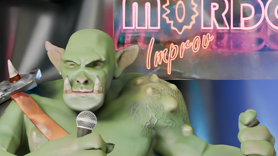
    Then I tried it on Steve the orc doing his failing stand-up. Steve has just realised the next five minutes is all dwarf jokes and a deputation from Khazad-dûm has just walked in.

    This type of dolly zoom is used to give an unsettling feeling to the scene. In the Apple TV series Severance it is used to indicate the change between ‘outer’ and ‘inner’ personalities.

  • Wall break demo

    Wall break demo

    I used the ‘cell fracture’ add-on to break up the anvil in a previous video. The video below pulls back a bit from the set-up I used for the second part of the inflation (the popping of the anvil) so you can see that the pink anvil starts breaking up immediately and falls to the floor before changing back to the metallic texture.

    The grassy scene behind the polka dot ‘studio’ is a HDRI (High Dynamic Range Image) and it’s used to give ambient light to a scene.

    I thought it would be a good idea to make a demo video to show how the number of cells you break something into affects how the demolition looks.

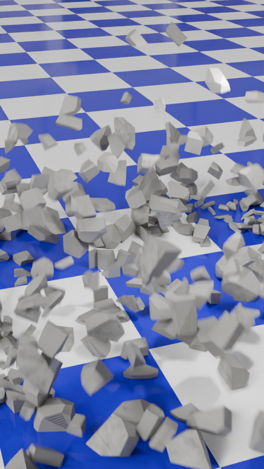
    To make this, I first set up a concrete wall and a nice, shiny checked floor. I also made a rusty metal ball to act as the object that smashes the wall and set up the camera to get a good view of the full event. This would be the basis for the six animations that make up the final video.

    For each of the animations I changed the number of pieces that the wall would be broken into. This is the essence of the video, and was simply a matter redoing the wall break-up (takes a few seconds) and then rendering the animation (about 10 minutes for each part).

    This is how the wall looks when it’s been broken up into 100 cells. When the ball hits the app calculates where the bits will flu out to. Then it’s up to me to add sounds.

    I then used the Blender video editor to make one video from the six separate animation. Once that was done, I had to find out how to add text to a video. It turned out that is was easy enough using the Blender video editor, you need to set the font and position of the text and use visual editing to set when the text appears. All of this was fairly intuitive now that I’ve used the editor for a while.

    The most complex part was the audio. What I wanted was a series of crashes that conveyed how the size of the particles decreased but the number increased. After a bit of searching I found a two-minute audio of a wall being demolished by a wrecking ball. Some parts were louder and sounded more like a wall being smashed to pieces, others were more like a few pieces being knocked from a wall. I just needed to cut bits out and, for some of the parts, layer up the audio so that there was more noise of crashing concrete because there were more pieces being generated.

    I also put the full audio in the background, to make it sound like an ongoing process at a building site.

    The very last thing I had to do was make sure the video would show as a ‘short’ on YouTube. I uploaded the video that was generated by the Blender Video Editor, but that was categorised as a normal video. So I used Canva to force the video into a ‘Short’ format using a template and that edited video is now on YouTube as a ‘short’.

  • Inflating anvil – part 2!

    Inflating anvil – part 2!

    Changing up a video I made a few months ago. The inflating anvil was a fun little thing I did in June, an anvil inflating and floating out of shot.

    I made two changes to the initial inflation stage. First, I changed the background to polka dots and second I added a shading change so that the anvil turned from a metal anvil to a plastic balloon.

    The easiest way to add the popping was to make another animation using the same background and camera setup, do the break-up and fall as a separate animation and edit the videos together when I added the sound effects.

    The initial break-up after the ‘pop’ happens off camera. There’s an add-on available in Blender that lets you break up an object into random chunks. This is great for breaking walls, smashing up objects or popping inflatable anvils.

    Using the visual video and sound editor in Blender, it was easy enough to edit the two videos together. Three sound effects were used. Inflating balloon and balloon pop were both from Pixabay. The clattering is from the BBC sound archives – all of the metal falling sounds on Pixabay were too hollow, they sounded like coins or cans and I wanted a heavy metal sound.

    What I also had to do – and forgot originally – is reset the aspect ratio to square so that YouTube sees this as a ‘Short’ rather than a full video. Shorts get promoted in the YouTube algorithm in a different way and it’s a lot easier for people to see them. This has the unfortunate side effect that the video looks a bit odd here in the blog.

  • What’s yellow and dangerous?

    What’s yellow and dangerous?

    Shark-infested custard!

    It’s an old joke, but also a bad joke. It’s old enough to be the subject of a new design to go on the RedBubble shop.

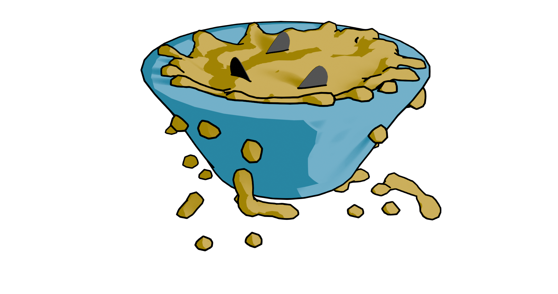
    Finished design. Lumpy yellow custard in a blue bowl with three shark fins poking out.

    Blender fluids

    To make a bowl of custard with sharks in it, I used Blender. There was no other choice, apart from drawing it from scratch. This meant three things. One, model a bowl. Two, add fluid – viscous custard. Three, add shark fins.

    Simulating a viscous fluid in a bowl is theoretically easy. Making a bowl was quick enough to do with the experience I’ve built up over the last few months. I took a cylinder, fiddled with that and made a fairly crude bowl. I did a version that was more conventionally bowl-shaped, but Mrs S preferred the straight sided version.

    When using fluids you have to define the space where fluids can be simulated, a source for the fluid, and what objects interact with the fluid.

    The simplest thing in fluids is to have a sphere that lets liquid out constantly into a volume. It’s not very exciting, but it’s a start.

    Fluid simulation in Blender. Make a sphere, add fluid domain (the volume where the fluid will be simulated – not visible here), then press start on the animation and you get liquid flowing. Change colour as required.

    Then you can add a vessel or other object that the fluid can interact with and overflow. You also have the option- which I used for this – of making a given volume of liquid and only generating that. I used this to make a sphere of custard that flopped into the bowl. I could adjust the volume of the sphere so that the bowl filled, but didn’t overfill.

    Shading was next. Yellow is the obvious colour for custard and a blue bowl contrasts well with that. I think a cartoon style works well for this type of product design. It reduces the number of colours in the design and also allows a for a bold appearance. To get the fins, I just added some planes and adjusted to make into fin shapes.

    After that, I ran the animation to the point where I liked the look of the piece and rendered just that frame. I rendered this with a transparent background so that the design would look good on products and also allowed me to export to Canva to add text.

    Sharks in custard
    Not the design that I went with, but close enough. There is too much custard (or not enough bowl) in this one.

    I’ve mainly used Canva for the promotional videos I make for Facebook and for some t-shirt designs. Here I added text in Hellprint font with a brown outline and was able to curve the text to a circle. This was easier than the method I used for the chilli and caffeine designs, but there is less control.

    Finished design. Lumpy yellow custard in a blue bowl with three shark fins poking out.

    Because I’m using RedBubble rather than Etsy, I can offer the design on a variety of things. I think this one works best as a sticker or fridge magnet, but it doesn’t cost me any extra to make it available on t-shirts and other clothes.

    Let me know if you have any favourite old and bad jokes that you would like to see immortalised in cartoon form.

    A selection of the products available with the ‘Shark infested custard’ design. I think the sticker works best, though I like the badge too.

  • Spinning doughnuts and brollies!

    Spinning doughnuts and brollies!

    Now that I’ve learned how to add music to my videos, I can fill my Drew Ackermann channel with mediation-type videos with looped animation and relaxing music.

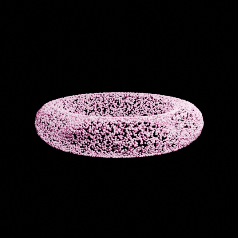
    For this one I used the Falling Rings video as the basis and replaced the rings with a doughnut. There was a slight issue with the tumbling effect because the original rings turned 180 degrees through the animation sequence. This looked OK because they had horizontal symmetry. The doughnuts don’t, the icing meant that the doughnuts would spin 180 degrees then suddenly shift to the original orientation. Once I realised that this was happening it was fairly easy to fix. It was slow because the doughnuts have a lot more faces than the rings so it took longer to render each time I wanted to change anything.

    Cartoon doughnut! There are a few tutorials about making a doughnut in Blender, some of them also add sprinkles but I thought that would be too much detail for the type of video I planned to do.

    There’s a similar video of tumbling brollies that I’ve put up as well. This one uses three different brollies. I designed the brollies all by myself!

    Three different brollies for the tumbling animation. Not sure how much detail is needed for the animation, but they certainly look brolly-ish.

    I really think Blender is like a language, you don’t understand a lot of what is going on for the first years but you can quickly make up your own sentences.

    I may set up another channel of unsettling animations, because people like all sorts of things. A cycled tune in a disturbing key accompanied by melted figures falling into a fire. That sort of nonsense.

  • Ozzy Osbourne (1948-2025)

    Ozzy Osbourne (1948-2025)

    Pioneer of heavy metal

    I came home late last night and saw the news that Ozzy Osbourne had died. He looked unwell a few weeks ago at the final Black Sabbath gig in Birmingham, but I thought this due to the Parkinson’s disease, which was diagnosed in 2019. He was clearly a lot worse than was being let on.

    Black Sabbath in the early 1970s.
    Black Sabbath, early days. Tony Iommi, Bill Ward, Ozzy Osbourne, Geezer Butler.

    Having been a metal fan since the mid-80’s I obviously listened to a lot of Black Sabbath. By the time I was listening to a lot of metal, Ozzy was a few years into his solo career and regularly appeared in the pages of Kerrang! usually alongside the title ‘Clown Prince of Darkness’ after some onstage mishap.

    The place of Black Sabbath in defining heavy metal has been discussed at length by many people. Without them we wouldn’t have Judas Priest, Metallica and my favourite, Iron Maiden. It’s easy to dismiss heavy metal as a one-dimensional music genre and a lot of lazy journalist have done just that. Obviously, I disagree and to my mind metal has a greater range of emotion, power, volume, musical skill and lyrical content than any other music genre. Restricting to guitar, bass and drums with judicious use of synthesisers is a choice, in the same way other artists stick to one medium.

    Enough beard-stroking.

    With Osbourne, Sabbath released eight albums in the ’70s. I don’t have a favourite album, but all my favourite Sabbath songs are from this era, plus the two albums with Ronnie James Dio. ‘Black Sabbath’, ‘Paranoid’, ‘War Pigs’1, ‘Children of the Grave’, ‘Sabbath Bloody Sabbath’… quite a list. ‘Supernaut’ remains one my favourite Iommi riffs.

    In 1979 Ozzy was sacked from Sabbath, apparently for doing drugs. This is akin to sacking the Pope for being Catholic. The band got through kilos of cocaine in their time. The song “Snowblind” is about cocaine, Geezer had an “enjoy cocaine” sticker on his bass at one time2 and there is footage of a concert in 1978 where they are all clearly off their tits.

    Terry "Geezer" Butler, bassist for Black Sabbath as a young man playing a white bass with an 'enjoy cocaine' sticker, and as an older man playing a bass with Aston Villa decoration.
    Geezer Butler was the brains behind Black Sabbath. He was the main lyricist (except when Ronnie James Dio was in the band) and he is one of the founders of metal bass playing. He also never did drugs and does not support Aston Villa.

    However, sacked he was and Black Sabbath went through a rotation of vocalists starting with Ronnie James Dio3, then Ian Gillan and others and I’m afraid I lost interest after that.

    Ozzy’s first solo album, released in 1980, was “Blizzard of Ozz” and included “Crazy Train”. This was the first of his solo songs that I remember, its distinctive Randy Rhodes riff lodged into my brain and hasn’t moved for 40 years. The early death of Rhodes in a plane crash devastated Ozzy and it took much persuasion from his wife and manager Sharon for him to continue. But continue he did, racking up 13 solo albums while occasionally reuniting with Sabbath.

    Ozzy’s voice is a divisive issue. I’ve seen it described as ‘soulful and plaintive’, but to me he was always a vocalist rather than a singer. But without that voice, Iommi’s distinctive guitar sound4, Geezer and Bill’s blues-based rhythm section and the overall doom-laden sound and lyrics of the early albums5 and an indifferent, verging on hostile, press (they were described by Lester Bangs as ‘Like Cream, but worse’) they would not have built a fan base and grown to found two distinct music genres. Not only were Black Sabbath the first heavy metal band6 , but they produced the first thrash song in “Symptom of the Universe”.

    It is good that his last public appearance was at the final Black Sabbath gig and he looked like he was having a blast. I hope this is the memory he carried with him at the end.

    1. Which rhymes ‘masses’ with ‘masses’ in the first verse, which always makes Mrs S laugh. ↩︎
    2. Since replaced with a slightly less controversial AVFC sticker. ↩︎
    3. One of my favourite vocalists. ↩︎
    4. A result of a well-documented industrial accident where the tips of his fretting fingers were sheared off by a metal pressing machine. ↩︎
    5. “The Wizard” and “Planet Caravan” notwithstanding. ↩︎
    6. Other groups – including The Beatles – had produced heavy metal songs, but Black Sabbath were the first to concentrate on and expand the genre. ↩︎
  • Morphing animation in Blender

    Morphing animation in Blender

    While I looking at ways to morph objects to create soothing animations, I came across a way to make a less-soothing, but still fun, way of morphing any two objects.

    For the base models I’ve used some resource that are in an ‘add-on’ in Blender. Not sure why I chose a banana and a monster truck, you’ll have to ask my brain about that and it’s not talking to me.

    Once you have the two models there’s some animation to be added to make the objects spin. The changeover happens at maximum spin speed at which point the banana becomes invisible and the truck appears.

    This is how the truck and banana look without any rendering. The floor and wall are also just grey objects waiting to be coloured in.

    Once I’d done that, I realised I’d set the banana quite high above the floor, so I animated the truck falling and bouncing.

    Setting the scene was next. I thought it would be nice to have it look like the morph was happening in a car showroom. I made a chequered floor1 and a wall at the back with windows. Getting the window glass to look convincing needed a bit of fiddling around with various settings, but in the end I got it so you can see through the windows to the scenery behind. A couple of blue-tinted backlights add an extra dimension to the objects.

    Once the animation had been rendered, I used the video editing suite to add two sound effects that I downloaded from Pixabay, where I also got music for the ambient videos. The swoosh and the thump could be positioned in time to get them synced with the animation. This is one of those things that’s easy when you know how, but I had a hell of a job finding how to even start video editing.

    Screenshot of a video and audio editing screen.
    Video editor in Blender. The videos and the sound effects can be moved and cued up to happen at the right time. It’s a click and drag system, so pretty easy to use.

    So the ‘swoosh’ in Channel 2 reaches its peak as the banana speeds up and there’s a ‘thump’ in Channel3 timed to coincide with the truck hitting the floor. I did search for a sound effect of a monster truck hitting a tiled floor, but couldn’t find one. Surprisingly.

    1. This is one of the many presets for the Shader editor in Blender, so easy when you know what to look for. ↩︎
  • Ambient videos

    Ambient videos

    Ambient YouTube videos, under a pseudonym for now. I may link further to ‘how-to’ videos once I work out how to do a ‘how to’ video.

    I need a ‘how to do how to do’ video, then.

    Mrs S suggested that I change the rings to doughnuts, though this would be less relaxing IMHO.

Verified by MonsterInsights