This is another paid-for course, again with Grant Abbitt as the tutor. This took me a while to complete, there was a lot to learn. But, again, Grant took us through everything and explained why things were being done. I got the course through Gamedev.tv, there are quite few other courses to look at, mainly for game design.
First we learned how to add shapes (mainly blocks) to a scene and add textures to the blocks. This is the sort of thing that familiarises the user with the setup of Blender and how to change things. It’s also useful if you’ve already done a course covering these things but forget quite easily.
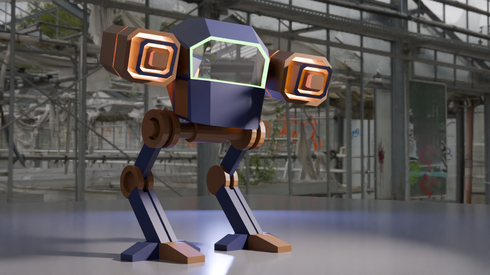
Secondly, we made a ‘mech’. This was a stylised all-terrain mobile gun and sort of a cross between ED 209 from Robocop and the two-legged transports in Star Wars.
A comparison of the two-legged all terrain walker from Star Wars (left) and ED 209, the enforcement droid from Robocop. The mech we designed is inspired by these machines.
The build was an exercise in hard-body modelling, one of the things I wanted to learn so that I could design things for 3D printing. Hard-body modelling is one of those things that you learn by doing. This became apparent as Grant guided us through the build and showed how to get from a cube to the cockpit by cutting and shaping in a particular order.
A chassis and legs came next, then the guns.
How the mech was assembled. The cockpit came first, then the chassis and legs, and finally the guns
It’s a very angular look, this is done on purpose to achieve a ‘low poly’ aesthetic. The number of polygons (individual faces) affects how quickly a computer running a game can operate. You want the computer to be able to present good gameplay without a fiddly, highly detailed object slowing the computer down. The ‘low poly well’ I made earlier in this series is another example of this idea.
A low poly well made using as few ‘faces’ as possible to get a nice-looking but quick to render object.
The artistic side is the painting. We can add colours and textures to any ‘face’ in the model, so that the guns have a range of colours and glowing parts and there’s a green glow around the windscreen.
Completed mech with colouring and glowing guns. The green glow around the windscreen is a classy touch.
Setting the scene is another arty part and it’s best to get it right to show off the work. I changed the colours, because the sort-of camouflage was a bit dull, so I thought some vibrant colours would work well1.
An alternative to the original mech, this one is pink and yellow and standing in a spotlight.
Finally, I made a more fabulous version, with glitter (which took a while to learn how to do). I added a camera circle so that the true magnificence of the final design can be appreciated.
Fly-round of the glittery mech.
The next parts of the course leads up to sculpting, colouring and animating an orc. This took a few weeks to complete, I’ll post the progress in a couple of separate posts.
Grant Abbitt, the tutor for the course I’m doing, and the orc that we will spend the next few weeks sculpting.
Work well for image purposes. Maybe not so well on a battlefield. ↩︎
I’ve not ridden a bike for over 30 years (last one was stolen in 1993) so I’ve missed out on a lot of the developments in bicycle technology. I do enjoy watching the Tour de France, though, and one thing I was well aware of is the use of derailleur gears – they’ve been around since before I was born.
I was maybe 13 when I got my first multi-gear (10 speed, as I recall) bike after I’d outgrown the 3-speed one I got when I was 81. We’d moved to England by then, and where we lived wasn’t very hilly but also not so busy that I was in danger when out on the roads.
Non-riders give little thought to the rear wheel of a bike. It’s the wheel that turns when you turn the pedals. But the mechanism that controls the gears is the subject of much debate and engineering over the years.
Rear gear bit of a bike. The black Z-shaped derailleur guides the chain between the sprockets on the axle and maintains tension as gears change size.
Back in the old days (very old days) bikes didn’t have gears. The penny-farthing had a huge wheel and, if you found the hill was too steep, you hopped off and pushed.
Variable gearing initially involved having two gear spokes on either side of the back wheel and then getting off and turning your wheel around to go uphill (or downhill). I don’t know if there’s any footage of Tour de France competitors doing this, but your skills in fixing a bike were at least as important as your riding ability2.
Engineers first invented rod-based systems in the late 19th century, making the derailleur a remarkably old invention. There is a book on this called ‘The Dancing Chain’ by Frank Berto, but it’s at least £75 and I’m not that into cycling.
Never an organisation to rush into making things easy for competitors, the Tour de France resisted such new-fangled innovations for many decades. In 1937 the Tour finally permitted derailleur gearing for competitors. The effect this had on the average speed of the cyclists was minimal – an increase from 31.1 kph to 31.8 kph was about average for the speed year-on-year speed increase at the time (BikeRaceInfo.com).
Shimano gears
Founded in 1921 by Shozaburo Shimano, Shimano is one of the watch-words in the bike community. Their gears and groupsets (gears, gear changers, etc) are regarded as the best by many riders.
Pro teams currently using Shimano gears include fourteen of the eighteen UCI men’s World Tour (the top ranking pro teams) and four of the fifteen UCI Women’s World Tour teams.
So in honour of this, I researched the early stages of derailleur gears and found the 1970 patent co-authored by Shozaburo’s son, Keizo Shimano. I think this was the basis of the Dura-Ace gear set that remained popular for a couple of decades.
Shimano derailleur gearing patent, blue on a white t-shirt.
The patent design is now available as blue on white or white on blue or black in my RedBubble shop.
I’ll write a bit more about the Penny-farthing (or ordinary) bicycle some other time, but I’ve also made a design featuring the penny-farthing. The caption is based on the snowclone “Have X, Will Travel”. In this case, let’s hope there’s not too many hills in the way.
One of the RedBubble models showing off the Penny Farthing design for me.
As I said at the top derailleurs have been around since before I was born. Indeed, Cream’s 1967 album Disraeli Gears was so called when one of the group’s roadies dropped this malapropism when he heard that Eric Clapton was buying a racing bike.
Let’s listen to one of their songs from that album.
This had hub gears, which I never worked out the mechanism for, there’s just a chain that disappears into the axle. It’s probably magic. ↩︎
The spirit of the individual cyclist riding the Tour is typified by the story of Eugène Christophe from the 1913 Tour. He was leading by 18 minutes and descending the Tourmalet when his front forks broke. It took him two hours to reach the village at the foot of the mountain. He found a blacksmith who would let him use his forge – the rules stated he had to make repairs alone – and, after three more hours he set off with a mended bike. Race officials gave him a 10 minute penalty because a local boy pumped the bellows of the forge for him. He eventually finished seventh overall. ↩︎
Timings: Prep: 10 min. Cooking: 10 min Eat: 10 min
Ingredients
Two large chicken breasts (or three small ones)
Mangetout – about 100 g
Green curry paste, 40 or 50 g (I used Mea Ploy brand for this one)
A can of coconut milk (400 ml)
Jasmine rice (200 g uncooked rice is enough for three)
2 tablespoons oil (peanut, vegetable or whatever is to hand)
You’ll need a big saucepan and a large frying pan.
Slice the chicken breasts. I prefer slices to chunks for this recipe, but you do whatever you like best.
Rinse the rice. Boil about 600 ml water in a large saucepan (more water is fine), add salt and boil the rice while you cook the chicken. The rice will take about 10 minutes to cook.
Fry the green curry paste in the oil. If you’ve bought a one-meal batch of paste, use it all. The paste I’ve been using (see picture below) says to use 50 g. This was at the top end of our tolerance for spicy heat, so I’ve used 40 g since the first time. This makes a curry that’s hot enough to enjoy without feeling challenged.
This is the green curry paste I’ve been using. It’s spicy enough for us without added chilis, as the serving suggestion shows. This pot cost about £3, it’s good for eight to ten meals. Bargain!
Fry for a minute, then add some of the cream from the coconut milk. To make this easier I store the can of milk upside down so that there is a plug of cream when you open the can.
Once the paste and cream are combined and smelling good, add the sliced chicken. Fry until the chicken has gone white on the outside, then add the rest of the can. If you don’t want too much sauce, don’t add all the coconut water from the can.
Stir while cooking and remember to keep an eye on the rice.
About two minutes before the rice is done, add the mangetout. It’ll want a couple of minutes cooking to get warm, but don’t leave it too long or it’ll go soft.
Chicken curry nearly ready for dishing up. Just give the mangetout a minute or two in the sauce. That’s enough to warm it through without losing the crunch.
I crushed a few almonds to add on top – peanuts or any other nut will do, but we had almonds in the pantry.
Once the rice is done, strain in a sieve. If it’s a bit claggy for your liking, rinse with boiling hot water before serving.
Dinner’s ready! Thai green curry with jasmine rice. Some crushed almonds add a crunch.
There’s usually quite a lot of sauce. Make sure there’s enough rice to soak it all up.
We usually have ‘Thai inspired crackers’ with this. Last time, it was a Tesco own brand bag, I don’t think we’ve ever stretched to Sharwood’s own brand. Same with the coconut milk – it’s usually supermarket own brand.
I keep meaning to look into how to make my own green curry paste. I don’t know what the minimum amount is that can be made or how well it keeps. I don’t want to make a kilo of paste and it all go to waste.
Having finished the course on Udemy I had a look round for the next thing to have a go at. In the mean time I’ve done a few more tutorials from YouTube and been mostly pleased with the results.
A minor issue with the videos is that the Blender software has been updated many time over the years and some features have moved, so I do hit a wall occasionally.
Luckily, the internet is full of advice and there is always someone who has had the same problem.
One such issue has centred on Rendering. This is the process of getting from the grey blobs and lines, to coloured images and finally to a .png file or a usable animation.
This is a collection of objects rendered using EEVEE. The results are fine, and the image is produced quickly. This is a collection of objects rendered using Cycles. The results are much better than with EEVEE, especially with the transparent materials. This does take longer to produce an image, though.
If you look at the glass doughnut in the two images, you can see why cycles is preferred for end results. The light from the yellow pyramid has been diffracted in a realistic way in the Cycles render, but EEVEE doesn’t do as good a job. You can fiddle with the settings to improve matters, but I will leave that for the future.
The EEVEE render engine (Extra Easy Virtual Environment Engine) is the fast renderer in Blender. It acts as a game engine, so it produces good quality images for the purposes of quickly seeing what you have made.
For better visuals, you need Cycles, which takes more time to come up with the goods because it cycles through the image properties to perform ray-tracing. This is where the paths of the lights are calculated so that, as in the images above, the light from the yellow cone is refracted in a more realistic way through the glass torus. Reflections also look better in Cycles.
Fiddling with the settings of the glass will give better results, for example changing the index of refraction (IoR) of the glass will change how the light interacts with the material. I did this for the spinning beer mug, stills are shown below. One has a glass edge (IoR = 1.45), the other has a diamond edge (IoR = 2.5).
Light behaves very differently when the surround is given the index of refraction of glass (left) and diamond (right).
You can also use a change in IoR to make different lenses. Since we aren’t concerned with reality there is the potential to make a lens with a IoR of less than 1. Such a thing is not possible (at the moment for visible light1), but since Blender computes light rays we can have fantasy physics.
Changing the refractive index of the surround to the beer mug does odd things to how it looks. The position of the highlights changes, as does the brightness of the reflections. You can go further and change the index of refraction for each wavelength of light.
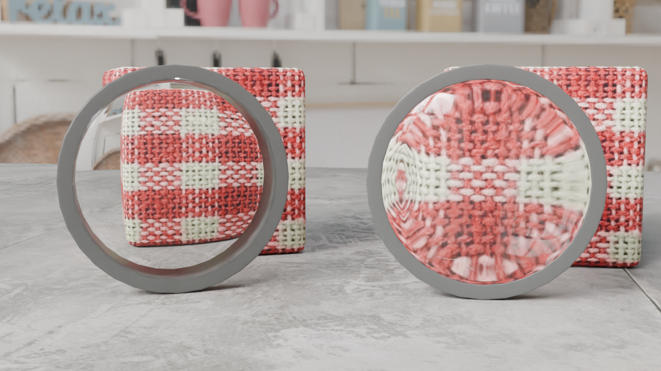
So I made two lenses, both biconvex like the lens of the eye. In the picture below, the one on the left has an IoR of 0.8, the one on the right’s IoR is 1.45 (glass).
Demonstration of the effect of refractive index on lens behaviour. Both lenses are biconvex, but the one on the left has a refractive index of 0.8 (impossible (at the moment)), the one on the right simulates glass and magnifies the block behind it.
I’m not sure what application this will have in 3D modelling, but it is interesting to muck around with what’s possible.
This has been done for microwaves using metamaterials, but that’s not relevant to what I’m talking about here. ↩︎
His most satisfying novel is now a Penguin Modern Classic
As long-term fans of Terry Pratchett (see previous post), the publication of his 29th Discworld novel “for adults of all ages”, Night Watch, was eagerly anticipated in the Steele household. It was published in 2002, a year of changes for us. I finished my PhD that year and secured a placement at Monash University as a post-doc researcher in the Victorian College of Pharmacy1. Mrs S had been headhunted by a mortgage company late in the year, but had to turn it down to move to Australia. We also had our kitchen re-done that year. We completed the work the day before we left the country.
By the time Night Watch was released we had got into the habit of buying the hardbacks for each other on birthdays and Christmases. If Mrs S bought one for me she would be impatiently waiting for me to finish. I’m a slow reader.
All the little angels rise up, rise up…
Twenty-three years down the line I’ve no idea who bought who our copy. But from the first line, we knew it was a good ‘un.
Sam Vimes sighed when he heard the scream, but finished shaving before he did anything about it.
After a brief interview with an apprentice assassin who’s fallen into a cesspit (the source of the scream), flowering lilac reminds Sam of the date – 25th May – the day when the Republic of Treacle Mine Road is commemorated. It went out of his head, what with his wife, Lady Sybil, due to give birth any time soon.
We get reacquainted with The Watch in this, the sixth novel in the sub-series. The fortunes of the watch have improved beyond recognition since “Guards! Guards!”2. We meet the main players at a graveyard where they privately remember the fallen of the Glorious 25th May. One of the gravestones bears the name ‘John Keel’, which sits among five other graves (one of which is normally empty, but Reg Shoe, now a zombie and officer of The Watch, buries himself in solidarity with the other fallen).
But official remembrance of the fallen has to wait. A serial cop-killer, Carcer Dun, has been spotted. A rooftop chase ends by the library of the Unseen University, the most concentrated region of magic in the Discworld. Lightning strikes Vimes and Carcer, sending them back in time 30 years.
Faced with being unknown and out of time, Vimes adopts the identity of John Keel, the sergeant who trained Vimes as a young watchman. The real Keel has been murdered by Carcer, the first change to the timeline and an event that the History Monk Lu-Tze3 spends the novel trying to rectify. Carcer, having falling in with pre-Guild thieves, is soon established as a sergeant in the city’s secret police, the Cable Street Particulars (aka The Unmentionables).
What follows is a mix of social commentary, Les Misérables, philosophical musings on what to do if you meet your younger self (other than be shocked at what a twerp you were), fun with an ox and a piece of ginger, a new spin on the expression ‘Look after yourself’, and, finally, the way home.
How do they rise up, rise up?
This isn’t his funniest book. That’s a toss up between Witches Abroad and Last Continent4. Too much humour would have been out of place in a book where political corruption culminates in the assassination of the city Patrician, where we witness the intense loneliness of Sam in his home city but 30 years away from his current life, and where a torture chamber is unearthed that makes watchmen vomit.
We also get a timely reminder of an earlier Pratchett aphorism that it’s not only the cream that rises to the top in society.
But there is gallows humour and the sort of social observation we love in Pratchett’s work. The use of old ladies as psychological warfare, the topology of a revolutionary state (if there’s more of the city inside our barricades than outside, that makes us the majority) and how seamstresses differ from needlewomen.
They rise up arse up, arse up high!
Eleven years after his death and just after what would have been his 77th birthday, Night Watch has been published as a Penguin Modern Classic. As such, it joins the ranks of Brideshead Revisited, The IPCRESS File and Nineteen Eighty Four.
This new edition has a new cover – rather than Paul Kidby’s pastiche of Rembrandt’s Night Watch5, we get a black and white version of the original. This is a rare example of the cover art determining the title. The working title was “The Nature of the Beast”, but when Kidby visited Pratchett and showed him the painting (Kidby’s first for the series), Terry changed the title to reflect this wonderful artwork.
Comparison of the original Paul Kidby cover (left) and the cover for the Penguin Modern Classic edition of Night Watch. Kidby’s original features characters from the book, including Sam Vimes, Sam Vimes, Nobby, Lu-Tze, Havelock Vetinari and Reg Shoe (pre-zombie).
The cynical part of me suggests that this cover art is more fitting for serious readers to be seen with. It must be a proper book because it has a black and white image on the cover. Either that or a bold abstract design, because one can’t be seen reading fantasy, can one?
The new edition has notes and annotations to contextualise the novel. I’ve not seen a copy yet, but the authors of the notes are known Pratchett fans. One even nominated Terry for an honorary doctorate at the University of Dublin.
I don’t know how many new Pratchett readers this new edition with generate. It is a rare author who can blend satire, fantasy and properly good jokes. And despite – or perhaps because – Sir Terry was, for a time, the best selling author in the UK, there is still an element of sneering at fantasy and science fiction from some quarters, especially when it’s funny. It may be that Pratchett is seen as putting a hat on a hat – he should have written fantasy, or comedy, not both.
I don’t really care. I’ve never been personally mocked or attacked for reading Pratchett, and it’s likely that I would never have got to know Mrs S were I not a fan. All praise to the Republic of Treacle Mine Road!
The motto of the Republic of Treacle Mine Road: Truth, Justice, Freedom, Reasonably Priced Love and a Hard-Boiled Egg.
‘Victorian’ as in the Australian state Victoria. Not ‘Victorian’ as in men in tweeds with handlebar moustaches riding penny-farthings. Though that remains the image I have in my mind whenever I hear the phrase ‘Victorian Police’. ↩︎
This includes the presence of the troll Detritus, who we first met in “Guards! Guards!” working as a splatter (“like a bouncer, but trolls use more force.”) then in “Moving Pictures” as hired muscle. His transformation from animate rock to respected Sergeant in the City Watch is the most remarkable character growth in the series. He’s truly a renaissance troll. ↩︎
Six thousand year old monk, practitioner of déjà fu, devotee of The Way of Mrs Cosmopolite. He was a main character in Thief of Time; first seen in Small Gods. ↩︎
Inevitably, this is a personal opinion and subject to change depending on how recently I’ve read them and which bits Mrs S and I have quoted to each other. ↩︎
Officially, the painting is called The Company of Frans Banning Cocq and Willem van Ruytenburch, but that’s much harder to fit on the cover of a novel. ↩︎
Air Commodore Sir Frank Whittle (1907-1996) was a test pilot and flying instructor, but he is best remembered as a pioneer of jet aircraft. It was he who convinced the British government that the standard propeller engines had speed limitations (based on calculations made while writing his thesis) and that yes, he had a solution.
The problem was that conventional engines with hundreds of moving parts would inevitably fall apart when pushed beyond what was possible with contemporary materials. The solution was to reduce the power plant to a single moving part. He needed people to believe in his solution. He also needed money, which the government of early 1930’s Britain was reluctant to give him.
Sir Frank Whittle (1907 – 1996), one of the pioneers of jet propulsion.
He co-founded Power Jets Ltd in 1936, a company which was able to exploit his 1930 patent for a turbojet engine with only one moving part. By the time the Second World War started, he had finally convinced the government that he had a usable and safe design. They bought the experimental engine from Power Jets and lent it back, allowing the company to continue until the company was nationalised in 1943.
All this effort took its toll on Sir Frank. Nervous exhaustion forced him to retire from the RAF in 1946, but not before a further jet propulsion system could be patented in his name. It is this that forms the basis of the new t-shirt design.
Discworld connection
The term ‘Whittle’ came up in the Discworld series. In “Guards! Guards!” we are introduced to Lady Sybill Ramkin, a wealthy resident of Ankh and enthusiastic breeder of swamp dragons (draco vulgaris). She used “whittle” as a term for disappointing dragons such as Goodboy Bindle Featherstone of Quirm (aka Errol), who would never amount to much. Short, stubby wings meant Errol would never fly and would therefore be incapable of mating.
Sam Vimes, Captain of The Watch, reflects on this dismissive adjective:
Total Whittle, Vimes thought… It sounded like whatever it was you had left when you had extracted everything of any value whatsoever. Like The Watch.
As it turns out, Sir Frank was something of a whittle himself. Standing five foot tall and with a small chest measurement, he failed the RAF medical (twice) when he applied. Luckily for him and for the development of the jet engine, he found a way in to the RAF. And it all came good for both Sir Frank and Errol – Sir Frank applied again and rose to be Air Commodore. Errol learned to fly and was last seen flying into the distance with a noble dragon (draco nobilis) which had terrorised the city.
Errol the ‘whittle’ takes flight during the climax of “Guards! Guards!”. This is the book where we meet Sam Vimes, one of the Discworld’s best characters.
It all ends well for Sam and the rest of the Night Watch. The men get a pay rise and a new dartboard, Sam finds love and companionship with Lady Sybill.
Whittle’s patent
All of this leads back to the landmark invention by Sir Frank, the jet engine. In 1946, he was granted US patent 2404334 for an aircraft propulsion unit – a jet engine. This wasn’t the first, and wasn’t the last, but it does have the big advantage from my point of view that it has a striking image to go with the patent.
Cleaned-up version of the patent image. I used Inkscape to remove the background, leaving just the black images. I then saved it as a white version to show up on the dark blue t-shirt.
T-shirt design
The patent image used started out as shown above. Using Inkscape, I could remove the background and be left with an image of just the text and drawings. Two things need to be done before I can put the design on a t-shirt. First, I need to choose the colour for the printing. Second, I need a fine scale render (high dots per inch (dpi) count) of the image. Inkscape can do both, so I got a 500 dpi image in white (which I won’t reproduce here).
I chose a dark blue t-shirt so that the image looks like an engineering drawing. Patents are not engineering drawings, but using blue adds a nice aesthetic to the design. Blueprints were so called because they were printed in white on Prussian Blue paper.
There is a useful website (colordesigner.io) which will give the Hex codes for any colour so that the correct colour can be programmed into a colour rendering app. Gelato, who I use as the print on demand supplier, also give the Hex codes for their t-shirts (or at least the T-shirts I’m using). There is also a colour comparator site so that you can see how close two colours are.
This is a comparison of Prussian Blue (left) and Navy blue (right). Prussian is a bit more purple and lighter, but there’s not a lot of difference.
Am I going too far with this? Maybe, but it’s best to be correct about these things even if nobody notices.
The closest blue t shirt available was Gelato’s Navy Blue. I can’t tell the difference unless the colour are next to each other.
So, finally, I was able to put a white design on a blue t-shirt. Then it was a matter of getting some virtual models to do virtual cat-walks for me and upload everything to Etsy (no longer available) and also RedBubble.
Timings: Prep: 50 min. Cooking: 30 min Eat: 15 min (finished just in time for Doctor Who)
Ingredients
500 g beef mince (5% fat)
One onion, diced
4 gloves garlic, chopped
Tin chopped tomatoes
Tomato puree
2 carrots
Herbs – using dried herbs, basil, oregano, thyme. A teaspoon of each.
Chili flakes because we like them
veg stock and beef stock (can overpower the flavour of everything else)
2 tablespoons oil (peanut, vegetable or whatever is to hand)
700 g potatoes (I used baking potatoes)
100 ml full fat milk
50g butter
Oven to 180 C (fan). You’ll need two big saucepans and a frying pan as well as an ovenproof casserole dish for the pie,
Meat sauce
Brown the mince until it goes uniform brown and no red bits.
Meanwhile, fry the chopped onions in the oil until they go translucent, then add chopped garlic and fry for another minute. Add the dried herbs and chilli flakes, and stir these in to release the aroma.
Add the tin of tomatoes and a squeeze of tomato puree. Add the browned mince, veg stock (and beef stock) and stir well. Turn off the heat.
Mash
Peel and dice the potatoes. Boil potatoes for about 20 minutes until soft. This is where the type of potato is important; waxy potatoes don’t make good mash. You can keep a portion of the water used to boil the potatoes to add to the mash.
Add a splash of milk and the butter, mash the spuds until they’re a smooth consistency. Add more milk if needed, this will depend on the starch content of the potatoes. Some of the starch-rich boiling water can also be added.
Mash ready for use. Either with sausages and beans or gravy or as a topping for cottage pie, shepherd’s pie or farmhouse pie.
Assemble the pie
Pour the meat sauce into an ovenproof dish.
First part of the mash is on. It’s best to add a ring around the edge and move inwards, it stops the filling sinking too much.
Add the mash to the top. I was told (can’t remember who by) to add the mash around the edge to begin with and work to the middle. This stops the meat bulging at the edges. To even out the mash, use a fork to flatten the topping and add a bit of texture to the top.
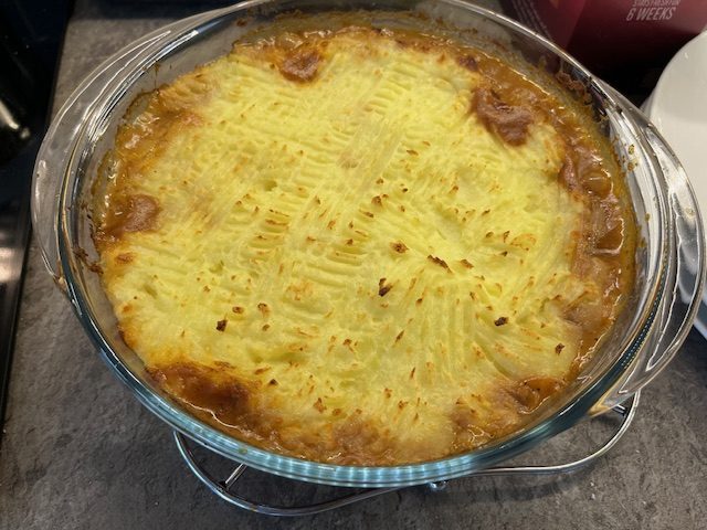
Ready for the oven! Adding a few fork strokes evens out the topping and gives ridges that catch a bit more heat and caramelise.
If you’re able, you could pipe the mash over the filling. They do this is some places, but I didn’t have the equipment, inclination or runny enough mash.
Shove it in the oven for 25minutes. Turn on the grill and brown off for 5 minutes or so.
Dinner’s ready! After 25 min in the oven and 5 minutes under the grill, the mash is browned and there is some leakage of filling.
This is enough for four people. Since there’s only three of us at home at the moment, I’ll get to have this for my lunch tomorrow! That’s a win!
The first serving was taken from the cottage pie. The beef stock overpowered the other flavours, but it was still a delicious meal.
On reflection, the beef stock could have been left out. There are enough herbs and a veggie stock cube added the base flavours.
Sculpting is the name of the game for the final part of the Udemy course.
It’s like virtual clay with the advantage that if you muck up, you can just press ctrl-z to go back.
We start with a blob of virtual clay that we use various tools (with exciting names like ‘Grab’ and ‘Clay’) to pull and push the material around.
Got some personality now. The eyes help.
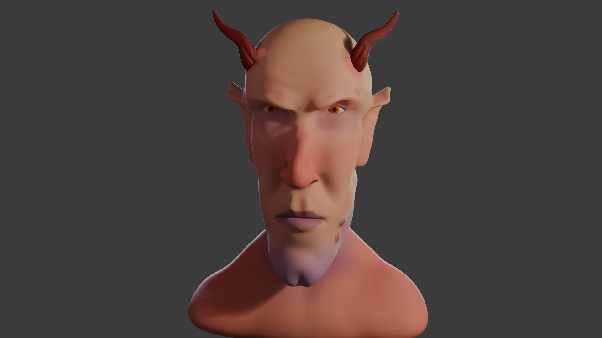
The idea is to get an exaggerated face, suggestive of a creature not of this world. Grant shied away from the word ‘demon’, but there is something demonic about the face that’s emerging.
The lips are made by pinching the clay and the philtrum similarly, but also pressing into the clay to give a more realistic look.
The eyes are just spheres. Getting them in the correct place needed a bit of reference to real figures. I never knew that the average face is 5 to 6 eyeballs wide.
Adding and shaping the ears was fun.
Ears are essential, of course. These started out as discs but grabbing, pushing and pinching yielded Spock-like ears for that authentic demonic / otherworldly appearance.
Some final additions include giving Bob (as he was now called) a cleft chin and horns. Warts, too – a nice double set, just like Lemmy out and off of Motörhead had. And horns, which Lemmy never had.
Fully coloured Bob, with a dimple in his chin, Lemmy warts, horns and some back lighting.
The clay can be painted on directly, using a variety of brushes and all the colours you can wish for.
An important part of the visual set-up is lighting. Grant didn’t shy away from this part, which too many tutors do. There are four lights1 for this image, two back lights an area light and a main light.
Lighting setup around Bob for the final render. Four lights in all of varying power and size. the little black triangle at half past four is the camera.
Unlike a real studio, you’re not restricted in how many lights, what colours and how bright you want the lights. Virtual clay doesn’t melt under your 3000 W spotlight.
The finished Bob. I didn’t know how to get the camera to to a 360 around the object, so I had him rotate instead.
I also gave Bob a nick in his right ear. I’ve had the same mark since I was five (or so), when I ran into a door frame and gashed my ear. There was much blood.
I tried adding an earring, but that didn’t look right somehow. Although I can make a gold-looking thing with no problem, the earring sat in the lobe like a toad on a drum.
The whole thing took me about 5 days, a couple of hours a day.
If I think on, I might tweak a couple of things. The back of his jaw is a bit odd. I might give him a head tattoo, I think Snaggletooth would work well.
Motörhead’s ‘Snaggletooth, the War-Pig’ logo, designed by Joe Petagno for their first album, Motörhead. It featured the song ‘Mötörhead’, a cover of the song ‘Motorhead’ by Hawkwind.
So that’s the first paid-for course done. I’ve not really covered much in the way of Blender for 3D printing, or decided what it is I want to do with the app. I had in mind doing fluid simulations, as a visual aid to rheology training.
“We are about to jump into hyperspace for the journey to Barnard’s Star. On arrival we will stay in dock for a seventy-two-hour refit, and no one’s to leave the ship during that time. I repeat, all planet leave is cancelled. I’ve just had an unhappy love affair, so I don’t see why anybody else should have a good time.”
Cpt Prostetnic Vogon Jeltz, Hitchhiker’s Guide to the Galaxy
Over the last 20 years, thousands of exoplanets have been discovered (5867 in 4377 systems according to Wikipedia). The first confirmed exoplanet was announced in 1992, when planets were detected around a pulsar.
Pulsars are rotating neutron stars that emit a highly regular beam of electromagnetic radiation1. The pulses emitted by a pulsar with a planet are slightly altered by the presence of a gravitational field, such as that caused by the presence of a planet. It was anomalies in the pulse period of a pulsar in the constellation Virgo that led to the discovery of the first exoplanet. Or rather exoplanets, because this pulsar has three, including one that is half the mass of the Moon.
Direct imaging wasn’t really an option until much later. The first exoplanet to be directly imaged wasn’t announced until 2004, when 2M1207b was observed orbiting its parent star the brown dwarf 2M1207 (in the constellation Centaurus), 170 light years away by the Very Large Telescope in Chile.
First confirmed direct image of an exoplanet from the VLT in Chile. This is an infrared image of the brown dwarf and its planet.
To date (4th April 2025), 128 stars have had planets directly observed around them, (including one with four planets). Our closest star, Proxima Centauri, was shown to have a planetary system in 2016; a third planet was announced in 2022.
The Hubble telescope and, more recently, James Webb telescope have provided direct images of many more exoplanets. Spectroscopic analyses have given us insight into the atmospheres of some of the planets.
Barnard’s Star
Anyway, back to Barnard’s Star. This is one of the closest stars to Earth, though it is so faint that it wasn’t discovered until 1916, by Edward Barnard. He announced the discovery of a star with a large proper motion (how far it appears to travel) after observations 14 days apart. He followed this up with reference to observations made in 1894 (Lick Observatory in California) and 1904 (Bruce Observatory, Whitby), where the star showed up on earlier photographic plates. From this, he calculated a proper motion of 10.3″ a year, or one degree every 6 years.
So it’s moving fast. And it’s getting closer. It’s one of the few objects in the sky with a blue shift — the most important other one is the Andromeda Galaxy, which is approaching the Milky Way at about 110 km/s; they are expected to collide in 4 to 5 billion years. Get your crash helmets ready.
Blue shift is the opposite of red shift. Light is ‘shifted’ when the expected spectrum of light from the star is different to what is expected from the known emission spectrum of the elements in the star. It’s also known as the Doppler Effect and is the basis of this cartoon by the German cartoonist Martin Perscheid.
Trust me, it’s funny.
So we have a star that’s approaching and it has at least four planets. Why the fuss? Well, there have been plans to visit either Barnard’s star or the Alpha Centauri system. Back in the late 1970s the idea was mooted to build a probe capable of travelling one-tenth the speed of light. The probe would take forty years to get there, and another four years before any signals from the probe arrived at Earth.
So we could now be getting images of planets from a probe that was launched before we even knew that these planets existed.
There’s some physics behind this that I don’t fully understand. ↩︎
This song has been going through my head recently, with good reason.
Smithers-Jones by The Jam. A story of a man getting laid off.
To summarise, it’s about a man who goes to work on Monday morning and has a meeting with his boss. And, rather than the promotion he’s been hoping for, he gets laid off.
It’s the refrain that goes through my head when I leave the office (which was once half of the garage) and have a break from what I’m doing.
Put on your slippers, turn on the TV
It’s all a part of feeling groovy
Now, in the song Smithers-Jones has worked his arse off. I doubt anyone would accuse me of that, but the overall feeling of ennui and having been disposed of is one I can understand. I’ve been feeling a bit of that myself. The worst day was when I had to call IT services to be shut off from the work system, over a month before my gardening leave ended. A few days later my email stopped, too. It did feel as if 19 years of my work life had been chucked in the skip.
Thinking rationally, it hadn’t – all the work is still there, but I’m no longer a part of it.
Job search
So I have been looking for work over the last few months, but there isn’t a lot that’s suitable.
An annoying aspect that wasn’t around when I was last looking for work (1997) is the rise of Data Science as a job. More than three-quarters of the jobs I see or am recommended for as a ‘Principal Scientist’ are actually looking for experienced data scientists. I don’t have at least two years experience in SQL, Python etc or a PhD in Large language Models. Wish I did, the pay is fantastic!
Training in Excel
I’m well into a course on Excel supplied by Reed, one of many employment websites. I’ve been using Excel for 30 years, ever since I was working at Liverpool University. We had Excel 5 (I think) and we used this to collate data from the mass spec. I also used it for my Masters as a matrix calculator to estimate isotope fractionation from spectroscopic data1.
Excel has expanded since then. Like most regular users, I was aware that there are many features that I don’t use and don’t know how to use, or even never knew existed (Format Paint, anyone?) but never had the time or impetus to investigate. But I now have the time and, yes, there are features I wish I had known about earlier that would have made some things easier.
The course also has an introduction to VBA, which I was aware of but never explored. I’d always wondered how to make Entry Forms, and now I know.
Still, this might stand me in good stead to get a job as an admin somewhere. Or I might design an Excel course and see if I can make money from that.
Applications
So far the table for applications is:
Applied for
13
Rejections
4
Heard nothing
9
It’s this last one that’s the most galling. When I was in charge of recruitment I made sure to respond to every applicant and let them know when they would expect to hear from us.
I’ve applied for jobs in London as well as more local to Horsham. I’d be willing to work for less than I was on if it means I don’t have the hour long2 commute each way. London would mean taking the train and perhaps two hours total travel, which would not be great, but at least I’m not driving.
More jobs seem to be coming, though. One I was rejected from (overqualified) was in formulation, which is what I was doing before I was laid off. Today I saw another formulation position, this one in Finsbury Park (1hr 30m by train) but I’d be spending all my wages on train fares.
So I will keep going. It’s not like I don’t have anything to do, what with the Excel training and learning Blender and, now that the weather is improving, garden and home maintenance to do.
Maybe I’ll turn the TV on and feel groovy instead.
I can do a blog post on this if anyone’s interested. ↩︎
Mrs S still works for the company. It took her three hours to get home the other day. Two hours to do about a mile because Guildford was gridlocked. ↩︎