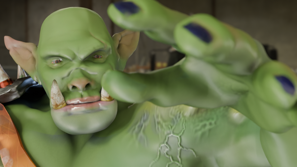
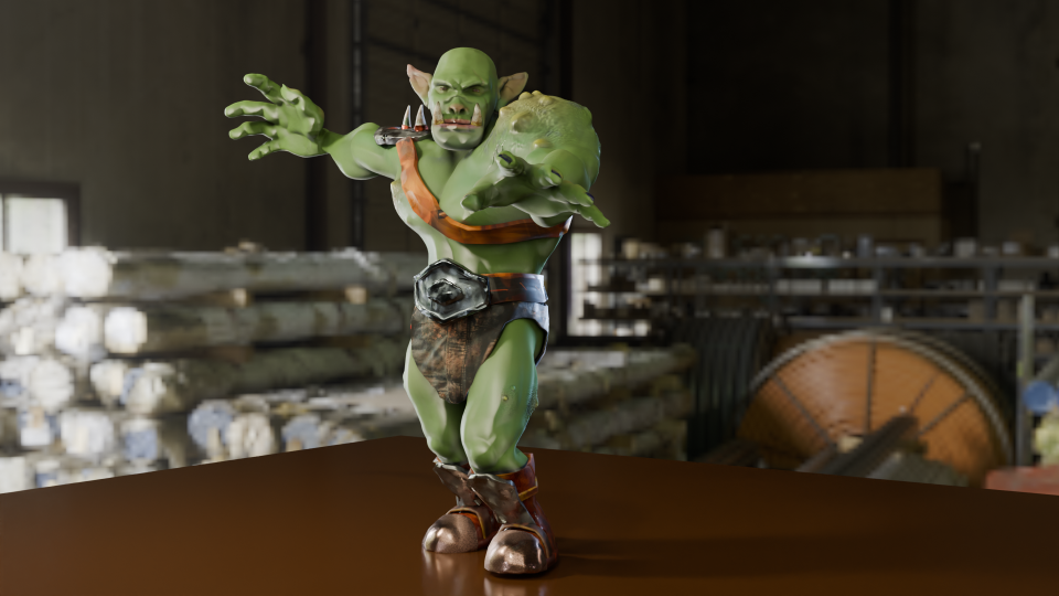
Now that I have Steve the orc, what can I do with him?
Orc with Balloon
One of the best-known British artists is Banksy. Best known, even if we don’t know who they are1. Most of the works attributed to Banksy are stencil-based, the work is in the preparation of the stencil, rather than the application of the paint which was done stealthily and quickly.
Here, I’m redoing their ‘Girl with Balloon’, which first appeared on Waterloo Bridge in London in 2004.
Blender allows you to add a reference image to the work so that you can use guides to pose or build the model you’re making. This was used in a couple of the earlier lessons, building the spitfire and also the original modelling of Steve was done using an outline provided as part of the lesson plan.
Adding a version of Girl with Balloon, I used this to get the pose of the orc similar to the original. Not exact – Steve has longer arms and I wanted the balloon to be a bit closer.
Original image of Steve with the balloon. The wall behind has been lit to look a bit like a wall – Banksy’s work appeared on several walls around the world, one of them must have looked like this.
Modelling the heart-shaped balloon was done by using a Webding heart as the base. Text in Blender is treated as an editable object with access to all the fonts you have on your computer. For the caffeine molecule mug design, I had used Berlin and Bauhaus fonts and added a bit of a curve to the text. Here, I coloured the heart and added a curve to the top surface so it would look a bit more balloon-like.
For the trailing ribbons I used Grease Pencil to draw black lines. I’d used grease pencil before in the caffeine molecule, adding lines automatically. This time they were hand drawn.
The cartoon effect I used on the caffeine molecule was repurposed to give a stencil look to the posed orc. Instead of using one colour for the light parts and another for dark, I just used black and white. Shading in black and white wasn’t difficult, but getting the lighting right so that the finished figure would look like a stencil and be recognisable as an orc took a bit of fiddling around.
Orc with Balloon. Final image of Steve with his balloon.
And finally, a short video of the transition from live orc to stencil.
The transition of Steve from rendered to stencilled in four seconds.
Next up, Steve has a go at stand-up comedy.
According to Wikipedia, his name is Robin Gunningham, he’s from Yate near Bristol. ↩︎
Now that the GameDev course is complete – I even got a certificate! – I can have a look at other tutorials and find out more about what can be done with Blender.
Don’t forget about Steve. He will be back! I just need to fix his fingers.
Textures featured in the previous course, not only in getting Steve’s skin and clothes looking good, but also in the mech when I added glitter. More interesting textures can be downloaded for use from several websites and the uses for these are only limited by your imagination.
To keep this blog post short and to show some of the things you can do with textures, below are a few spheres with added textures. Despite their appearance in the rendered image, they are just spheres and can be edited and shifted around as such. Using these textures instead of trying to sculpt your own lava flow or mossy stone reduces the load on the computer and is a lot quicker. The downside is that you are restricted by what is available.
Five textured spheres. Two types of rock and a hollow plastic ball (back) and snakeskin and leather (front).
You can make your own textures, but that’s way too advanced for me. What’s interesting is that the shadows agree with the textures. The jagged rock (middle back) casts a jagged shadow. And also the hollow plastic red ball is see-through, the holes act as they would in real life.
For further mucking around, I downloaded an anvil model and decided that it would be nice if the blacksmiths didn’t have to put up with all the noise of hammering metal all day. So I made an anvil with a soft furnishing texture – a Chesterfield anvil.
Anvil with a Chesterfield texture. I don’t know why nobody thought of this before. Think how quiet forges would be with soft anvils to work on.
You could also have a glass anvil, for those extra-delicate jobs. Or as the focus for a strokey-beard discussion about the juxtaposition of use and material as a Dadaist/surrealist concept1 , or as a satire on the impermanence of the permanent and the transparency of the solid.
Anvil with a textured glass appearance. Add your own philosophical musings in the comments.
Or an inflatable anvil, for the blacksmith on the move.
Just because it looks like metal, doesn’t mean it has to behave like metal.
I think I’ll step away from the artistic discussions, it’s well above my pay grade and makes my head hurt. I’m only a simple scientist!
Next, more work with Steve, trying to get him to earn a living.
See also Man Ray’s “Cadeau”, an iron with 14 nails glued to the base. ↩︎
A slight departure, this time I’ve designed a mug. I was thinking about what molecules would look good on a coffee mug and the obvious answer was ‘caffeine’.
One of the things I had planned to use Blender for was to make scientific models and diagrams as well as protein and molecular models. How to do these things was another matter and how to make anything of them when the market for scientific diagrams is (a) small and (b) a closed shop were further matters.
Having had the idea of caffeine-on-a-mug1 I hit the University of YouTube and found out how to get from a molecule to a 3D design, and then from a 3D design to a cartoonised version. This latter was a design choice – I thought it would look bold and also it would be a way of cutting down on the number of colours required for the design.
I found a good tutorial by CG Figures who went through the two-step process to get from molecule name to a file that can be read by Blender.
I was already familiar with one of the websites that was recommended – molview.org – and the software to convert the SMILES file into a protein database (.pdb) file was easy enough to use. The SMILES format is a standardised way of representing organic molecules and it was the format I used to input molecules of interest into a molecular modelling tool to predict the pharmacokinetics of drugs – SwissADME is the website, if you’re interested.
Once I’d got the molecule model into Blender, there were a bunch of further steps to clean up the file into something that didn’t take up too much filespace and have extraneous faces that could give odd results when the image is finally rendered.
The caffeine molecule after some tweaking of the initial file. The software adds colours by default, in this case grey is carbon, blue is nitrogen, red is oxygen and white is hydrogen.
It didn’t take long to get to the point where I had a model that I could use as a basis for a design. Next, I wanted to turn it into a cartoon version. This means that the light and shade are demarcated by sharp lines with no fading.
In Blender there is a function called a “color ramp” which takes a colour or a shade and changes it. Using this I could control which parts of the atoms were darker and which had highlights. By moving the light around I could change where the light spots landed and also change the size of the highlights. And because the software sees the molecular model as a three dimensional object, the highlights vary around the model, making the model look more three dimensional, even though the idea is to create a two dimensional image.
Three cartoon monkey heads. Turning the head changes the cartoon lighting and adding grease pencil adds definition to the image.
In order to add a more cartoony look, a function called grease pencil can be used to add black lines to the scene. There are two ways to do this. Blender can add grease pencil automatically, which is what I’ve done here. You can also add it manually so that you can put details on the image.
Anyway, back to the caffeine image. Not only did I add the cartoon effect and grease pencil, but the molecule needed a caption so we know what it is.
Alternative fonts for the caption. I like the Bauhaus font (left) as a design choice, but the capital C is a bit too closed to read easily. Berlin font (right) has a similar vibe and a more open C.
Looking through font choices I tried Bauhaus – it’s bold and has a historic feel to it. After showing this to Mrs S, I changed to Berlin. She pointed out that the C in the Bauhaus font is a bit too closed, and the Berlin version looks better in this application.
As an alternative, there’s also the molecule on a mustard-coloured background and in German. I’ve yet to offer these alternatives in the shop, I don’t know how big the German market for nerdy science mugs is2. I will likely keep the Bauhaus font for this, since the K looks echt cool, oder? I’ll need to use either Berlin or another font for the French (caféine), Spanish and Portuguese (cafeína) and Italian (caffeina) versions.
Two view of caffeine (Bauhaus font) and Koffein. Mustard yellow background or pinky purple? Which is better?
I can try other background colours, but I’m not sure what works best. Any suggestions are welcome.
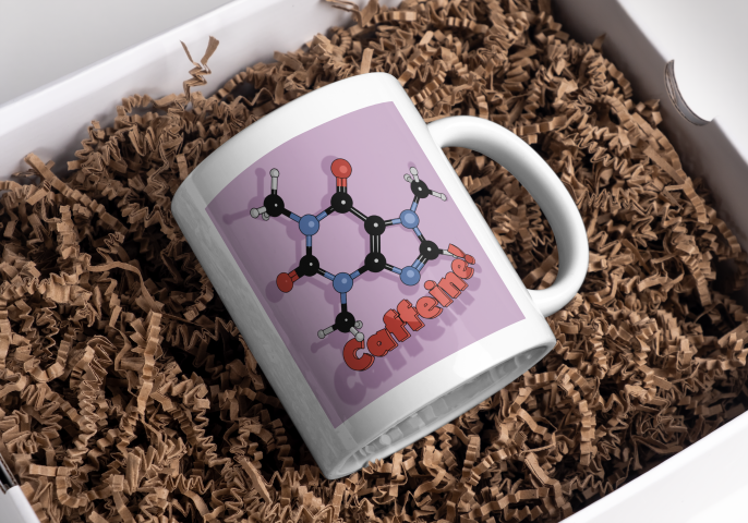
The finished design could then be uploaded to Gelato so I could put that onto a mug and then get it published on Etsy.
Mock-up of the finished mug nestled in a bed of curly brown stuff.
The next stage was quite complex and not very visual for blogging purposes, except that the end result was obviously an image. It involved baking textures and it’s why we spent time on getting the musculature and the facial features right. It’s all to do with poly count.
The number of faces (polygons) in a model is an important factor in 3D modelling. The more faces you have, the better your model will look. The drawback is that these polygons take some time for the computer to calculate. This slows down your work and can result in the computer crashing.
By way of illustrating this, the face count for the model shown at the end of the last section and below was 14.5 million and a file size of 160 MB. By baking the textures onto a lower poly duplicate of the original, this comes down to 47,000 faces and a 64 MB file.
The unpainted orc on the left as 16 million polygons, the painted one on the right has 47,000 and more detail. The down side is that I can’t easily change anything about this model.
Baking is the process where details from a highly detailed model, such as shadows from clothes and weird veins and scars, get painted onto a lower poly mesh. The details aren’t there, but look like they are.
Baking textures allows you to use a low poly mesh that looks like a high poly mesh. The disadvantage is that you can’t change you mind about, for example, the position of the clothes once the bake is done. You can always repeat the bake, which takes a bit of time and isn’t very exciting.
Now that the rigging is in place, I can move the orc to give it an action pose. Might need to move the loincloth, it looks like it’s digging into the thigh.
In the end, I’m happy with how Steve turned out. There are a few mistakes with the painting, but if you can see them keep it to yourself. I should go back and re-do where I went wrong as an exercise.
So I had an orc with bones that I could manipulate and pose in a threatening manner. But the hands were wrong – the fingers looked awful when I tried to make them grab anything. That was the next thing, because I wanted to make Steve grab things and make a fist. That was for another time, though.
Two views of the orc’s right hand. The rigging allows you to move body parts and the controls for curling the fingers are simple enough. However, I did something wrong when I set the fingers up because the fingers don’t move properly.
So that was the course finished. Next up, I’ll have a look at getting realistic textures onto objects and then I’ll try and get those hands looking right so I can pose and animate Steve. And don’t forget to look for science-related opportunities for Blender.
When I made Bob the non-demon (see below) I was introduced to sculpting in Blender. Virtual clay you manipulate with a mouse without having to consider gravity and then paint any colour you like offers huge opportunity for creativity.
After lighting and colouring, here’s Bob.
This promised to be a longer sculpt, since we were making not only a head, but a body and some rudimentary clothes – boots and a loincloth. I’ll split into three parts. Second part will look at the finishing of the sculpt, the third will look at some of the other stuff we can do with posable figures.
We used squashed spheres to block out the main shape of the head, body and hands. It’s the hands that proved the most tricky to get looking good. Later, the hands were to cause quite a lot of frustration when it came to rigging. But I’m getting ahead of myself.
Progression of the orc sculpt. From blobs, to a bit of shape, to rough definition of muscles and hand. We only did one half because we can apply a mirror to the sculpt once we’d done fiddly stuff.
The body was the first part that got any proper attention. We added clay to the spheres and built up the main muscle groups. For much of the lessons I wasn’t sure what the end goal was, other than the final orc. So we spent some hours adding and refining the musculature, getting the boots right and sculpting a loincloth and belt shield.
Progress of the sculpt. The face was a detailed task, since we want to give the orc some personality. Then adding detail to the body muscles and then adding clothes to cover such bits as an orc feels it necessary to cover.
I’m not sure why, but I didn’t save any of the progress during the face sculpt; it followed a similar path to the work we did to create Bob, but adding tusks and shaping the mouth around them was different.
Next was to make the basic figure a bit more characterful. As with Bob, this involved adding asymmetry, scars and general wonkiness to the face. Further, this time we added ugly lumps and diseased parts to the orc. It was a shame to do this, I’d spent some time getting the musculature of the shoulders right and they were covered by the shoulder plate and the hideous growth that I added.
To make the orc a bit more interesting and to seem like he’d had a bit of a life, we added unsightly lumps and a horrible growth to his left shoulder. That’s what happens when you mess with wizards.
Raised veins were added using a texture brush – basically paint on a texture and it makes whatever shape is on the brush. I’d need to go back and be reminded how to do that again.
As part of the messification of the sculpt, we had added some detail to the belt boss and bashed the metal bits around because this orc has seen action.
It was about here that I showed the sculpt to our daughter, who named him ‘Steve’.
So I had an orc ready to colour in and use to learn about animating characters. But that’s for next time.
This is another paid-for course, again with Grant Abbitt as the tutor. This took me a while to complete, there was a lot to learn. But, again, Grant took us through everything and explained why things were being done. I got the course through Gamedev.tv, there are quite few other courses to look at, mainly for game design.
First we learned how to add shapes (mainly blocks) to a scene and add textures to the blocks. This is the sort of thing that familiarises the user with the setup of Blender and how to change things. It’s also useful if you’ve already done a course covering these things but forget quite easily.
Secondly, we made a ‘mech’. This was a stylised all-terrain mobile gun and sort of a cross between ED 209 from Robocop and the two-legged transports in Star Wars.
A comparison of the two-legged all terrain walker from Star Wars (left) and ED 209, the enforcement droid from Robocop. The mech we designed is inspired by these machines.
The build was an exercise in hard-body modelling, one of the things I wanted to learn so that I could design things for 3D printing. Hard-body modelling is one of those things that you learn by doing. This became apparent as Grant guided us through the build and showed how to get from a cube to the cockpit by cutting and shaping in a particular order.
A chassis and legs came next, then the guns.
How the mech was assembled. The cockpit came first, then the chassis and legs, and finally the guns
It’s a very angular look, this is done on purpose to achieve a ‘low poly’ aesthetic. The number of polygons (individual faces) affects how quickly a computer running a game can operate. You want the computer to be able to present good gameplay without a fiddly, highly detailed object slowing the computer down. The ‘low poly well’ I made earlier in this series is another example of this idea.
A low poly well made using as few ‘faces’ as possible to get a nice-looking but quick to render object.
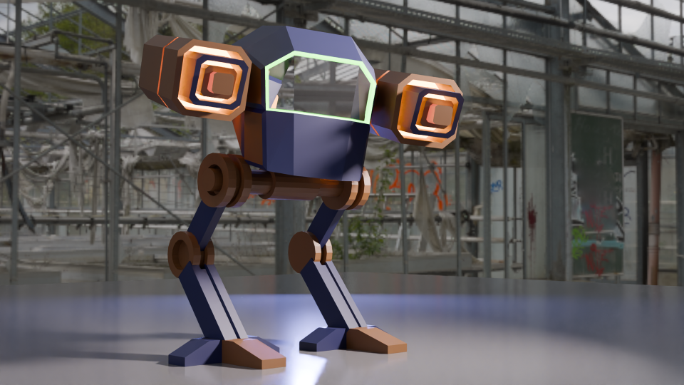
The artistic side is the painting. We can add colours and textures to any ‘face’ in the model, so that the guns have a range of colours and glowing parts and there’s a green glow around the windscreen.
Completed mech with colouring and glowing guns. The green glow around the windscreen is a classy touch.
Setting the scene is another arty part and it’s best to get it right to show off the work. I changed the colours, because the sort-of camouflage was a bit dull, so I thought some vibrant colours would work well1.
An alternative to the original mech, this one is pink and yellow and standing in a spotlight.
Finally, I made a more fabulous version, with glitter (which took a while to learn how to do). I added a camera circle so that the true magnificence of the final design can be appreciated.
Fly-round of the glittery mech.
The next parts of the course leads up to sculpting, colouring and animating an orc. This took a few weeks to complete, I’ll post the progress in a couple of separate posts.
Grant Abbitt, the tutor for the course I’m doing, and the orc that we will spend the next few weeks sculpting.
Work well for image purposes. Maybe not so well on a battlefield. ↩︎
Having finished the course on Udemy I had a look round for the next thing to have a go at. In the mean time I’ve done a few more tutorials from YouTube and been mostly pleased with the results.
A minor issue with the videos is that the Blender software has been updated many time over the years and some features have moved, so I do hit a wall occasionally.
Luckily, the internet is full of advice and there is always someone who has had the same problem.
One such issue has centred on Rendering. This is the process of getting from the grey blobs and lines, to coloured images and finally to a .png file or a usable animation.
This is a collection of objects rendered using EEVEE. The results are fine, and the image is produced quickly. This is a collection of objects rendered using Cycles. The results are much better than with EEVEE, especially with the transparent materials. This does take longer to produce an image, though.
If you look at the glass doughnut in the two images, you can see why cycles is preferred for end results. The light from the yellow pyramid has been diffracted in a realistic way in the Cycles render, but EEVEE doesn’t do as good a job. You can fiddle with the settings to improve matters, but I will leave that for the future.
The EEVEE render engine (Extra Easy Virtual Environment Engine) is the fast renderer in Blender. It acts as a game engine, so it produces good quality images for the purposes of quickly seeing what you have made.
For better visuals, you need Cycles, which takes more time to come up with the goods because it cycles through the image properties to perform ray-tracing. This is where the paths of the lights are calculated so that, as in the images above, the light from the yellow cone is refracted in a more realistic way through the glass torus. Reflections also look better in Cycles.
Fiddling with the settings of the glass will give better results, for example changing the index of refraction (IoR) of the glass will change how the light interacts with the material. I did this for the spinning beer mug, stills are shown below. One has a glass edge (IoR = 1.45), the other has a diamond edge (IoR = 2.5).
Light behaves very differently when the surround is given the index of refraction of glass (left) and diamond (right).
You can also use a change in IoR to make different lenses. Since we aren’t concerned with reality there is the potential to make a lens with a IoR of less than 1. Such a thing is not possible (at the moment for visible light1), but since Blender computes light rays we can have fantasy physics.
Changing the refractive index of the surround to the beer mug does odd things to how it looks. The position of the highlights changes, as does the brightness of the reflections. You can go further and change the index of refraction for each wavelength of light.
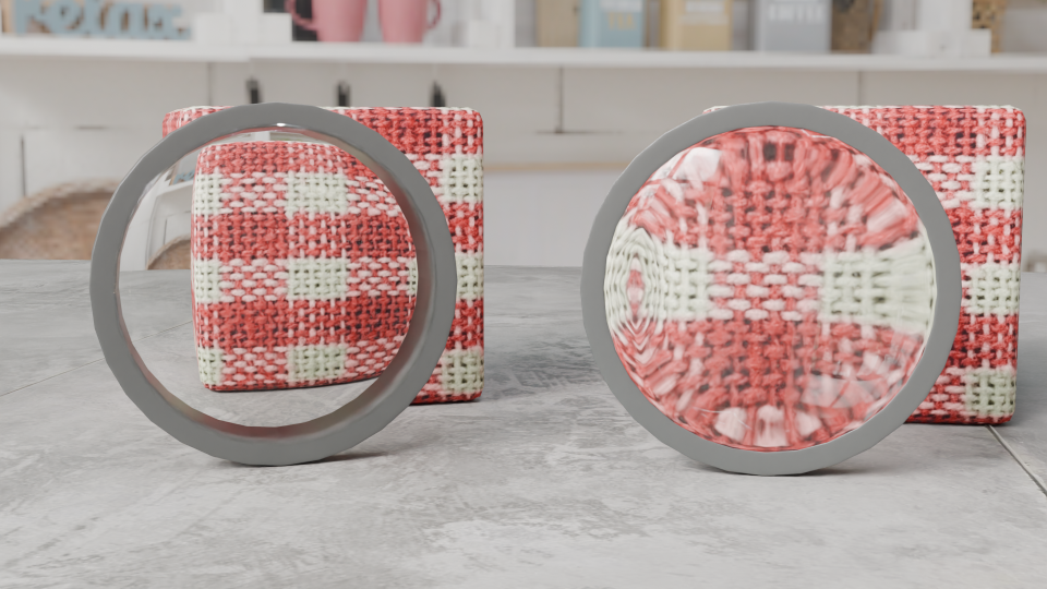
So I made two lenses, both biconvex like the lens of the eye. In the picture below, the one on the left has an IoR of 0.8, the one on the right’s IoR is 1.45 (glass).
Demonstration of the effect of refractive index on lens behaviour. Both lenses are biconvex, but the one on the left has a refractive index of 0.8 (impossible (at the moment)), the one on the right simulates glass and magnifies the block behind it.
I’m not sure what application this will have in 3D modelling, but it is interesting to muck around with what’s possible.
This has been done for microwaves using metamaterials, but that’s not relevant to what I’m talking about here. ↩︎
Sculpting is the name of the game for the final part of the Udemy course.
It’s like virtual clay with the advantage that if you muck up, you can just press ctrl-z to go back.
We start with a blob of virtual clay that we use various tools (with exciting names like ‘Grab’ and ‘Clay’) to pull and push the material around.
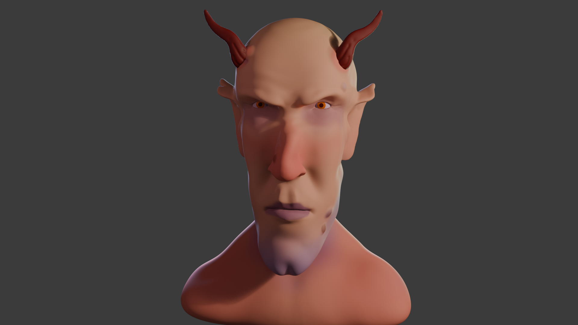
Got some personality now. The eyes help.
The idea is to get an exaggerated face, suggestive of a creature not of this world. Grant shied away from the word ‘demon’, but there is something demonic about the face that’s emerging.
The lips are made by pinching the clay and the philtrum similarly, but also pressing into the clay to give a more realistic look.
The eyes are just spheres. Getting them in the correct place needed a bit of reference to real figures. I never knew that the average face is 5 to 6 eyeballs wide.
Adding and shaping the ears was fun.
Ears are essential, of course. These started out as discs but grabbing, pushing and pinching yielded Spock-like ears for that authentic demonic / otherworldly appearance.
Some final additions include giving Bob (as he was now called) a cleft chin and horns. Warts, too – a nice double set, just like Lemmy out and off of Motörhead had. And horns, which Lemmy never had.
Fully coloured Bob, with a dimple in his chin, Lemmy warts, horns and some back lighting.
The clay can be painted on directly, using a variety of brushes and all the colours you can wish for.
An important part of the visual set-up is lighting. Grant didn’t shy away from this part, which too many tutors do. There are four lights1 for this image, two back lights an area light and a main light.
Lighting setup around Bob for the final render. Four lights in all of varying power and size. the little black triangle at half past four is the camera.
Unlike a real studio, you’re not restricted in how many lights, what colours and how bright you want the lights. Virtual clay doesn’t melt under your 3000 W spotlight.
The finished Bob. I didn’t know how to get the camera to to a 360 around the object, so I had him rotate instead.
I also gave Bob a nick in his right ear. I’ve had the same mark since I was five (or so), when I ran into a door frame and gashed my ear. There was much blood.
I tried adding an earring, but that didn’t look right somehow. Although I can make a gold-looking thing with no problem, the earring sat in the lobe like a toad on a drum.
The whole thing took me about 5 days, a couple of hours a day.
If I think on, I might tweak a couple of things. The back of his jaw is a bit odd. I might give him a head tattoo, I think Snaggletooth would work well.
Motörhead’s ‘Snaggletooth, the War-Pig’ logo, designed by Joe Petagno for their first album, Motörhead. It featured the song ‘Mötörhead’, a cover of the song ‘Motorhead’ by Hawkwind.
So that’s the first paid-for course done. I’ve not really covered much in the way of Blender for 3D printing, or decided what it is I want to do with the app. I had in mind doing fluid simulations, as a visual aid to rheology training.
UV shading sounded scary when I first watched videos on the subject, but having Grant to hold your hand helps. As he explained it, a UV map is like making a label to fit on your 3d model as you would for a bottle. Only 3d models are usually more complex (they have challenging topology, as he put it).
Fitting a flat image of a Spitfire to a model was an interesting exercise. I think the end result was ok.
Spitfire, modelled in 3D, then colouring applied from a photo using the magic of UV shading.
Then we did some scenery building and basic animation. Having learned how to add images to 3d objects, putting images of buildings onto cuboids and simple shapes was relatively easy. So a basic street could be made.
Then the Spitfire was added to the scene and we were shown how to make an animation of a flyover. This stretched the capacity of my laptop, it took a while to render but I got a flying plane.
I added a turn to the plane as it flew over to get the final animation.
Next, we did some more on animation basics. In Blender, just about any aspect of an object can be animated, so cameras will move, items change colour and all sorts of fun.
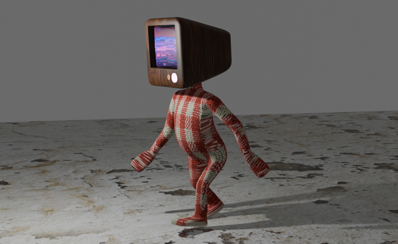
At the end of this, we built a simple humanoid with a telly for head (as you do) and learned how to animate the figure for a walking motion. As a bonus, we added video to the screen on the face.
A man with a telly for a head and a lovely gingham suit. His best friend keeps him on his screen.
I went a bit further and animated two figures, one in gingham, the other in denim, and put the gingham figure on the screen of the denim man.
Little man in a smart denim suit with a picture of his friend on the screen. I may have got the animation wrong somewhere, it look like it’s skipping at one point in the cycle.
One of the things that has been rattling round my head for many years is the idea of 3D printing from an SEM image. I know, it’s a common issue and one you’ve all heard many, many times.
In a previous post, I mentioned how I’d done some of this already using Blender and a bit of artistic licence. What I made needed to be printed in two part (one white, the other yellow) because I didn’t have access to a multicolour printer.
Original version of a 3D printed oil in water droplet. Some artistic licence required and I had to design and print in two parts. You can see the join.
Scrolling through Blender instruction videos (as you do) I saw a post by Architecture Topics on how to convert an image into a 3D Element.
This pinged a synapse in my brain and I wondered if the SEM of the broken oil droplet I took some years ago could be used in the same way.
Scanning electron micrograph of a split oil droplet. I took this image about ten years ago and have been thinking about making a 3D version ever since. I can work faster. Honest.
How hard would it be to convert the original image to a 3D Element?
Rendered version of the converted image. I’ve stuck to black and white since electrons don’t do colour. I could reasonably render this with a gold effect since the sample prep involved coating with gold to get better imaging.
It took a while, but I got there. For the final render, I put the converted image into a box to hide the ragged edges of the conversion. Also I had the opportunity to go into my old work and have a go on the 3D printer there.
After a bit of faffing (because I’d not applied a solidify modifier to the final image) I got a .stl file that the slicer said would print.
My first attempt wasn’t great. I’d only applied enough solidify modifier to give the final print a thin shell. To quickly fix this, rather than going back into Blender and increasing the solidify level, I set the slicer to do 100% infill.
That didn’t work. I’d need to go back to Blender and learn how best to use the 3D toolbox that I learned about while I was doing this.