Category: Heath Way Prints

Online shop I set up to learn about ebusiness and generate income using such creativity as I have. This is where links to the shop on RedBubble can be found and a discussion of the creative process.

  • What’s new in the shop?

    What’s new in the shop?

    Recently, I updated the Facebook site and the Wix site. I designed a new banner for the shops to showcase recent designs. What I haven’t done for a while is make a new advert. But I fixed that.

    Previous adverts only had a few designs on them. This time I think I put twelve designs on, because I decided to re-use some of the videos I made a while ago and I have learned a few more tricks in CapCut.

    New banner

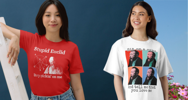
    This features four recent designs: One disc golf, the Vitruvian Meeple, “Stupid Euclid, stop pickin’ on me”, and “Sit on a Cake“.

    It’s only now that I’m doing this post that I realise I’ve not blogged about disc golf1. That will have to change2. I also know I’ve not written about the ‘Stupid Euclid’ design; that’s because I only completed it yesterday.

    Stupid Euclid

    The inspiration for this is pretty obvious – there’s a song from 1958 sung by Connie Francis called Stupid Cupid. Cupid and Euclid sort of rhyme. But where does an ancient Greek Philosopher, the father of geometry, come into it?

    I’m not unique in having done maths at school; it’s a compulsory subject. I took it further than most, I studied it for A level. I did OK, but I realised early on that I don’t have a maths brain. For those who do, maths lessons are an exercise in being shown the obvious. For me, I could do calculus and learned how to use the chain rule, differentiation by parts, I got the hang of surds quickly enough. But it was never a natural thing, as it is for my brother3 and oldest child4. It was more like following a recipe than knowing how to cook something.

    So Euclid, the man whose “Elements” is the oldest textbook that is still useful, personifies the trials of maths and gets to be the target for this design (white printing – black printing also available).

    Designs in the video

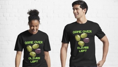
    Old and new designs – Game over, Outpaced by snails, Caffeine!, Blue neon meeple, “I will not be shushed” and “How did that get there?” sticker.
    Further designs – small disc golf, Quinoa and fist, ‘Sit on a cake’, Thinking about disc golf, Vitruvian Meeple and ‘Stupid Euclid’.

    I’ve blogged about some of these designs, and will write about others that I’ve missed. The Game Over design is one of my favourites; the How did that get there is popular, as is the Sit on a cake – both part of the growing Taskmaster collection.

    1. It’s like ball golf, but you throw frisbees at a basket instead of hitting a ball into a hole with a stick. ↩︎
    2. Although I’ve done a pretty full summary of the sport in the previous footnote. ↩︎
    3. Who’s a maths lecturer. ↩︎
    4. Who is about to start a Masters in Mathematics. ↩︎
  • Escape from the corporate roundabout

    Escape from the corporate roundabout

    Where do you see yourself in 10 years?

    This is one of those questions that gets asked at interviews1. I’m not quite sure what the correct corporate answer is. I know there are several wrong answers: “laughing hysterically on a pile of my dead enemies”; “In your chair”; “In a job where I’m not asked stupid bloody questions”. Any of these answers would result in the swift termination of the interview.

    The AI wouldn’t let me generate an image with the prompt “laughing hysterically on a pile of my dead enemies” so I had to substitute “dead enemies” with “dolls”. Which is worse.

    Luckily I’ve never been asked that. There’s two things to say about this question for me: first of all in 10 years time I’ll be getting close to the age when I can collect a state pension in the UK. So as long as I’m still healthy and compos mentis2, I’ll be fine with that.

    Secondly, today I started a new job. It’s part-time, at the local sixth form college, and they weren’t damn fool enough to ask where I saw myself in ten years time.

    Whether I’ll still be doing this in 10 years time I don’t know, I’ve only done one day. It depends really on how well the Heath Way Prints business – or any of the other business ideas I have – go.

    1. Along with “Why do you want to work at (this place)? When I interviewed as night-shift staff at a local supermarket, I came up with some spectacular bullshit. The real answer – I need the money – wouldn’t have worked. ↩︎
    2. Or compost mental. ↩︎
  • Easy boiled fruit cake recipe

    Easy boiled fruit cake recipe

    A boiled fruit loaf, perfect with tea or to fill up the corners1 after dinner.

    Eat the cake, buy the apron!

    Ingredients

    225 g self-raising flour

    175 g soft brown sugar

    500 g mixed dried fruit and peel

    125 g unsalted buter

    225 ml tea (or water)

    2 teaspoons mixed spice

    ½ teaspoon bicarb

    2 eggs (beaten)

    Method

    Line a loaf tin with parchment paper

    Melt the butter and the sugar with the tea2 in a large saucepan. Add the dried fruit and peel, then boil gently3 for about ten minutes to let the fruit rehydrate.

    Fruit, sugar, butter and tea boiling gently. This rehydrates the fruit and lets it absorb the flavour of the tea.

    Remove from the heat and allow to cool.

    Preheat the oven: 140 °C (fan), gas mark 3.

    Tip the flour, mixed spice and bicarb into a bowl. Add a pinch of salt and the cooled fruit mixture. Stir well.

    Flour, bicarbonate of soda, mixed spice and a little salt.

    Add the eggs and mix in.

    Finished batter and the prepared loaf tin. I used premade loaf tin liners because cutting and folding parchment to fit is a right faff.

    Pour the batter into the prepared loaf tin and bake for about 50 minutes. It’s done when a skewer comes out clean.

    It’s had 30 minutes, needs longer.

    Leave in the tin for ten minutes to cool a bit before turning it out to cool properly on a baking rack.

    Serve sliced by itself, spread with butter, or with some strong cheese.

    Finished fruit cake.

    Have it on an apron!

    This might be unusual, but you can also have the recipe on a apron, from the Heath Way Prints shop.

    Fruit cake recipe on an apron. Can you spot the spelling mistake? I didn’t!

    I did the design work in Canva. The cartoon of the cake is the photo above rendered by AI. I don’t normally use AI for design work, but this saved some time and it’s my original photo so no copyright issues.

    You can also get the recipe on a t-shirt or art prints, if you like! Just click on the buttons to go to the shop.

    Nutritional advice

    Serving size: Slice
    Servings: 8
    Amount per serving 
    Calories520
    % Daily Value*
    Total Fat 15.7g20%
    Saturated Fat 8.9g44%
    Cholesterol 127mg42%
    Sodium 223mg10%
    Total Carbohydrate 92.6g34%
    Dietary Fiber 3.1g11%
    Total Sugars 58.5g 
    Protein 8.1g 
    Vitamin D 18mcg88%
    Calcium 155mg12%
    Iron 3mg17%
    Potassium 593mg13%
    1. From The Lord of the Rings after the main feast for Bilbo’s 111st birthday party, guests were “at that delightful stage which they called ‘filling up the corners’. They were sipping their favourite drinks and nibbling at their favourite dainties.” ↩︎
    2. Choose whatever tea you like. I used PG Tips since that is what we drink. Earl Grey would add its own particular flavour to the cake. If you’re daring, go for something smoky like lapsang souchong or perhaps a green tea for variety. ↩︎
    3. Hence the description of the recipe as a ‘boiled fruit cake’. You don’t boil the cake. Only an idiot would think that. ↩︎
  • If that was love…

    If that was love…

    .. turns out I’ve not been in love before.

    This design pulls together three icons of art and humour: Taskmaster, Monty Python and Andy Warhol.

    The ‘Sit on a cake’ design on a t-shirt!

    He was a different man

    I’ve written about Taskmaster before. It’s my favourite programme at the moment, the last two series (19 and 20) rank among the best. It’s got astonishing longevity; Alex Horne has hit upon a winning formula and he carefully selects groups of comedians who make a concerted effort to make the whole thing as much fun as possible.

    Back in the distant past of Series 6 (broadcast in 2018), the final task of the series asked the contestants:

    Tell the Taskmaster you love him in the most meaningful way.

    As is typical, the contestants found wildly different ways to do complete the task. Tim Vine dressed as Greg’s mum and told Greg that he is her favourite child. Russell Howard didn’t have sex with Greg’s mum. Alice Levine got a toy aeroplane to fly a meaningful message for Greg. Asim Choudhry performed a rap declaring that he wanted to have Greg’s babies.

    Three of the five attempt at the ‘show your love’ task. Alice sent a heavily caveated declaration of love, Asim said he wanted to have Greg’s babies and Tim dressed as Greg’s mum. Not shown: Russell not having sex with Mrs Davies (not very interesting) and Lisa’s go, because that’s what this section is going on to talk about.

    Lisa Tarbuck, the series champion, hit the ball out of the park with her demonstration. She asked for a large cake topped with confectioner’s custard. Then she said to Alex:

    Take yourself somewhere private and put your bare arse into it.

    And so it was that Alex took himself to the shed, pulled down his pants and, with carefully positioned cameras recording the event, sat bare-arsed on a cake.

    His expression of horror/ delight has stayed with me for years. He had an experience unlike anything he had known before and changed him. “He was a different man1,” Lisa declared.

    Alex Horne’s life changes forever. He now knows what love is and also managed to absorb a profiterole. Don’t ask how.

    An equal part of the joy of this was Lisa’s reaction. She ran away, giggling when Alex came out of the shed, dripping cake from under a strategically placed towel.

    Andy Warhol’s Shot Marilyns

    With such an image in my head, I had to do something with it. One iconic image deserves another, and there are few more iconic faces than that of Marilyn Monroe.

    Andy Warhol certainly thought so. The silkscreen collection Shot Marilyns is one of his best-known works. This isn’t the name he gave the works – he called them Marilyns and made five in total. Each had a different background colour and slightly different colouring to the face. The “Shot” addition came about when the performance artist Dorothy Podber fired a single shot through a stack of four of the paintings. Her actions – a piece of performance art that Warhol did not appreciate – earned her a lifetime ban from The Factory.

    Four of the five Marilyn paintings that Andy Warhol made in 1964.

    Whether you’re a fan of pop art and the world of Andy Warhol, the colourful images of one of the greatest film starts of the 1950s, you can’t deny the paintings are memorable.

    I tribute to this, I found a way to make images in a similar manner to the Marilyns. Using this method, I made my own set of images of Little Alex Horne’s face.

    A triptych of Little Alex Horne – “Shocked Alex” – as he experiences love for the first time.

    I quite like the triptych as it is. For the final design that uses the ‘four images’ presentation that is often used for these paintings, I wanted some words to go with the image.

    Monty Python’s very rude song

    In one of my first blog posts2 I talked about what makes me laugh. Monty Python is firmly in that camp, especially when they get silly.

    The title of this section is a bit misleading. Python did a number of rude songs – the Not Noël Coward song from Meaning of Life springs to mind – but Sit on my Face is probably the rudest of all.

    If you’re easily offended, don’t go looking for it.

    However, the sentiment from the Python’s song and the sentiment from Lisa Tarbuck’s demonstration of love can find middle ground. A middle ground that, with a little tweaking, can enhance the four images of shocked Alex.

    The ‘Sit on a cake’ design on a t-shirt!
    1. This was also the episode title. ↩︎
    2. There’s an updated version with a few examples of stuff I think is funny. ↩︎

  • I learned it’s called a shock mount

    I learned it’s called a shock mount

    What is the last thing you learned?

    I’m learning all the time, but this is the most recent thing that’s been kind of useful.

    I can’t now remember why I was watching the video this still is from. It’s about The Beatles and I am having one of my periodic bouts of listening to Les Quatres Fantastique1 a lot.

    Blogger David Bennet inspiring a t-shirt design.

    What struck me was the image of the presenter’s t shirt with the mike in front. It looked like he had a microphone print on his top. Would there be a market for such a design?

    The only way to find out is to do it.

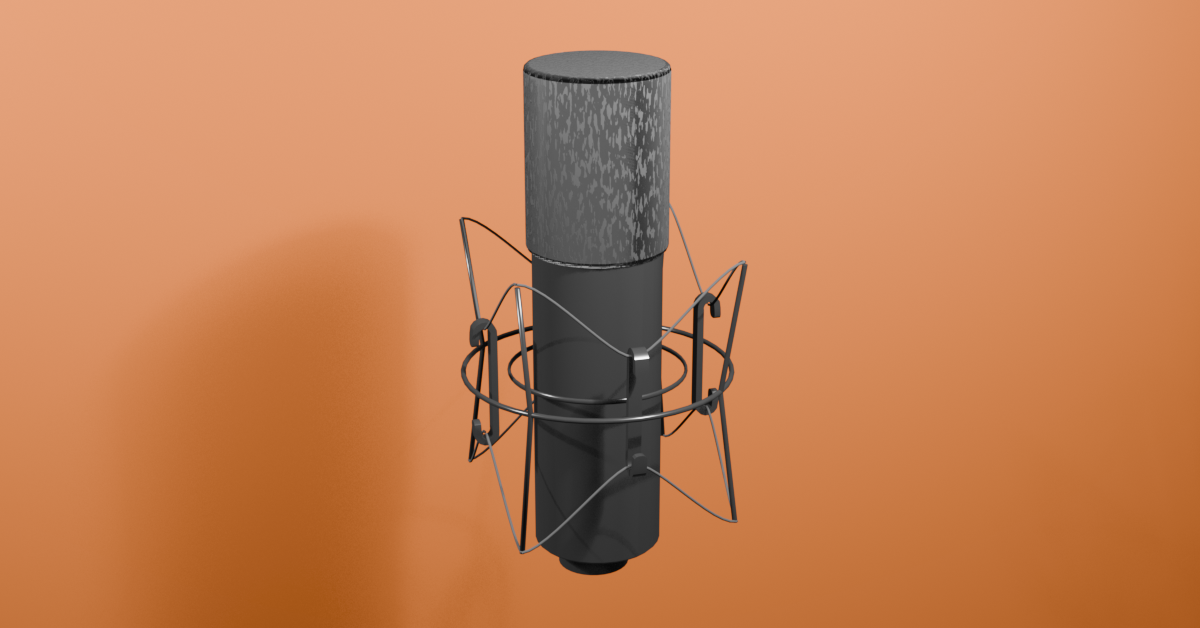
    So I had to find a good image of this thing to act as a reference without knowing what the cage thing around the mike is called. After a bit of searching on the Google I found out: it’s a shock mount.

    Its purpose is to absorb knocks and bumps and so reduce noise while recording. There’s a metal or plastic cage and the mike is held in a cradle of elastic to keep it in place. Hooks keep the tension in the elastic and reduce movement.

    So it was into Blender I went to model the shock mount and a microphone. I’d made a microphone before for Steve the stand-up orc. This mike is a simpler design, it’s the mount that’s the interesting bit.

    One of the models I made in Blender as part of a course. This is Steve the orc, moonlighting at the Mordor Improv.

    I think it took me an hour to get the shapes done and looking satisfactory. Not bad. Then shading was fairly simple, block colours except the mike sponge2 which has a noise texture added to the displacement to give it some texture.

    How the sponge texture is added to the sponge bit. A bit of noise is added to the displacement (how far each bit is from the median surface) to create the effect of a sponge.

    The final version needed a background. If it’s printed as a dark object then it won’t look good on a dark t-shirt, so I added a plane behind the microphone and worked out how to give the plane a blue colour in the centre and fade to transparent at the edge. That way there’s a colour behind the mike whatever colour the t shirt is.

    How the microphone looks in Blender. The flat plane is there to make a vignette effect in the final render.

    I’ll probably do a couple of other colours as background. The brown on the original presenter’s t-shirt might be a good option, as used in the featured image.

    Shader settings for the vignette effect. The ‘Alpha’ in the Principled BSDF controls how transparent the object is. The rest of the nodes control where the object is opaque and how see-through it is.

    It’s up on RedBubble as a T-shirt with the blue background. I’m adopting the motto ‘real artists ship’, so I don’t sit on designs hoping they might mature and improve.

    Microphone design on a white t shirt.
    1. As they’re known in France. ↩︎
    2. Also known as a pop shield or spoffle. ↩︎
  • If Leonardo da Vinci played board games

    If Leonardo da Vinci played board games

    Meet the Meeple

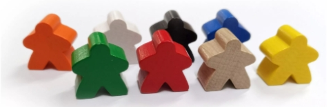
    The meeple is an iconic object within the board gaming community. They are a stylised humanoid figures, used as a playing piece in board games. Slightly fancier than the pieces we used in Cludeo all those years ago, but not much.

    I’ve taken the outline of the Meeple and made a version of Leonardo da Vinci’s ‘Vitruvian Man‘, and called it ‘Vitruvian Meeple’. It’s available as a t-shirt and printed on other things (click the button to go to the shop).

    White print Vitruvian meeple on black t-shirt.
    Black print Vitruvian meeple on white t-shirt.

    Meeple differ wildly from the pieces used in role playing games, which are detailed metal sculptures and often carefully painted by players.

    Painted figures, as used in table top role playing games. You wouldn’t normally see such models used in board games. No reason you couldn’t, though.

    The design came to me after I’d spent a day at a board games convention in Worthing. My main reason for going was to get inspiration and to see if there were any other people selling printed goods to board game enthusiasts. I’d seen the meeple design before, and it has been used on t-shirts. I don’t want to do things that someone else has already done, so I know what to avoid.

    Design process

    The idea of the Vitruvian Meeple came to me while I was sketching out another idea – The Village Meeple – so I sketched the idea (see below).

    Original sketch for the Vitruvian Meeple.

    I used Inkscape to do the design after I tried to get the design made in Canva and Blender. With Inkscape I could control and edit curves a bit more easily than in either of the other two apps. Colour changes are easy, too, so I could do the design in black, white, or any other colour for a good contrast if I want to specify a t-shirt colour.

    Adding a circle (actually an ellipse, the meeple dimensions aren’t perfect) and a square was easy enough, then all I had to do was export it and do the keywords and description in RedBubble. I still find these bits difficult to do, I don’t like relying on AI to do this.

    I may do another version with reverse script above and below to make it look more like the da Vinci original. This will be the deluxe version.

    And as for The Village Meeple? Watch this space…

    Coming soon – The Village Meeple!
  • Logo cloth reveal in Blender

    Logo cloth reveal in Blender

    I’ve had the Heath Way Prints logo for about a year, and I’m happy with how it looks. In a recent advert I used a spinning version of the logo as the end scene for the carousel I made using CapCut.

    Making and ident

    How to expand on this? One thing I saw a few months ago was a cloth reveal. You start with cloth over an object then pull it away using ‘hooks’. In the display, the crosses are hooks, and pull at two parts of the cloth to reveal the monkey head.

    This works well, it can be used for revealing cars and big bits of machinery as well as logos and monkey heads. But I wanted to have the HWP logo suspended in air and then have the cloth be whipped away. Using the ‘hooks’ method wouldn’t work. I couldn’t find a way to animate the influence the hooks have on the cloth, which would mean I could turn off the hooks, so I’d have to get the hooks in the right place on the draped cloth. This is possible but not elegant1.

    Getting the cloth on top of the logo involved adding a plane to be the cloth, subdividing it and then giving it cloth physics. The logo had to have physics, too, otherwise the cloth would drop through the logo.

    What I found was that the logo didn’t interact very well with the cloth. So I added a cylinder the same size as the logo and used that as the collision object. That worked. Then the cylinder is adjusted so that it doesn’t appear in the final render and I still have a logo that has three dimensions.

    Another option I considered was adding a cylinder and ‘painting’ the logo on this. I could then alter the shading of the cylinder so that only the logo would appear. But this would be less satisfactory because I’d end up with a 2D logo rather than the 3D object that reacts to light and looks real. Having a 3D logo means I can animate it or move the lights and the surfaces react to changing light.

    Cloth draping on the Heath Way Prints logo. But how to take it off again?

    So we have a cloth draped on a thing. How to pull the cloth off without using hooks?

    Gravity!

    Changing gravity

    Unlike the real world, you can control gravity in Blender. It is a fun thing to do, you can make a pendulum simulation under various gravity fields to simulate Earth, the Moon, and Jupiter.

    Pendulum simulation with different gravity values. The Moon (1.6 m/s²), Earth (9.8 m/s²) and Jupiter (25 m/s²). The pendulum swings once on the Moon for every 2 ½ swings on Earth and four times faster on Jupiter than on the Moon.

    You can also change the direction of gravity. For this animation, I animated the gravity to change from -9.8 m/s² in the Z direction (down) to 20 m/s² in the Y direction (behind the logo) for two seconds so that the cloth fell from the logo. This is just like tipping the logo up, same way you might tip a table up to remove the tablecloth, if you were so inclined.

    Logo reveal in Boho colour scheme.

    Colours were taken from a ‘boho’ colour palette. I gave the logo a brown colour from the collection, the background green and an off-white for the cloth. The cloth also has a metallic sheen to it, to add a bit of class.

    Sounds were from Pixabay, sliding cloth effect fitted the bill nicely.

    Next: I’ll put the logo on some dice of various shapes and see what can be done with that.

    1. I’ve since found a way of doing this, but I like the effect I used. ↩︎
  • Love is in the air…

    Love is in the air…

    …in every sight and every online shop.

    Why would Heath Way Prints be any different?

    The “Je t’aime” design on a throw pillow.

    French is supposedly the language of love. Certainly to the ears of someone who grew up only hearing English and the occasional Scots Gaelic, the words “Je t’aime” sound more pleasing than “Ich liebe dich”. But to German ears, what does “I love you” sound like? Do they prefer “Te Amo” or would the Dutch “Ik houd van je” sound exotic?

    Background text for the design. Fourteen languages, mainly European because I couldn’t work out how to get other alphabets.

    This design was done in Canva. I only made it a week ago and I have forgotten which languages I used. I think there’s German, Spanish, Dutch, Danish, Welsh, Scots Gaelic, Swahili and Polish. Oh, and English (thanks to Mrs S for reminding me about that one!).

    To make the final design I repeated the background text at random angles and set the opacity down. Then a nice pink gradient as background and it was ready for the main image.

    The main text was done in TC Milo, black with a light pink outline. The massive kiss is one of the graphics that Canva supplies.

    Summary of fonts used for this design.

    This design looked better on some items than on others. I only did one item of clothing, the black sleeved t-shirt. And the apron, if that counts as clothing. Buttons below link to the products.

    The “je t’aime” design on tote bag, t shirt, clock and apron.

  • Baaa Humbug!

    Baaa Humbug!

    A Heath Way Prints design.

    The ‘Baaa Humbug!’ design on a t-shirt, apron (with holly), cushion and pin badge.

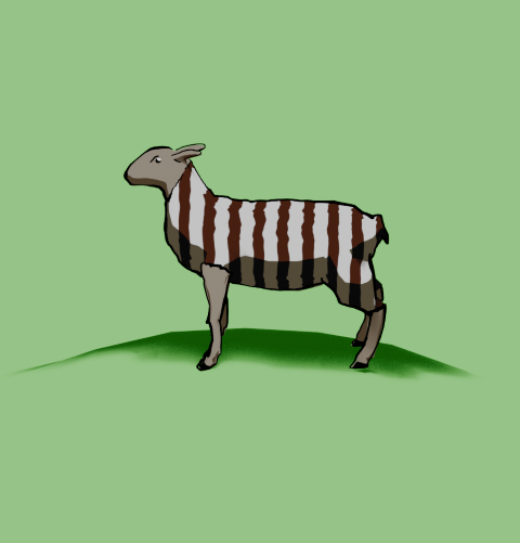
    This was an idea from Mrs S – a sheep with a humbug1 body.

    Sheep building

    The modelling of the sheep was the main challenge here. I decided to go for a ‘low poly’ design, similar to the fearsome dinosaur I made as part of the course I did in March ’25.

    Returning to the University of YouTube, I followed a video by Ryan King, who is a reliable tutor and another one who doesn’t skip the fiddly bits. He made a duck, a shark and a dog in this tutorial, the dog was the best one to follow for the sheep, what with having four legs and all.

    Making a low poly sheep is an exercise in making a tube and shaping it to match a sheep (I used a photo of a sheep as a guide) and then adding legs and ears.

    The start of the sheep construction process. Using a side-on view of a sheep, a tube is extended and squidged to make a sheepish body. Legs are added by extruding from the sides.

    Shading

    The shading was the complex bit. I wanted to have a cartoon look to the sheep because that’s an aesthetic I like and also makes the final print a bit clearer.

    I’ve done quite a lot of cartoon shading over the last couple of months, the tricky part was getting more than one colour onto a cartoon.

    The basic cartoon shader. It converts the original colour to RGB (not sure why), then the colour ramp restricts the colours to two shades, dark and light. This gives a cartoon shading effect that I’ve grown fond of.

    Doing one colour is easy enough, it’s two shader nodes. Adding a striped pattern and getting the stripes to mimic a humbug was a bit of a thinker. In the end, I found a way of doing it using various shader nodes.

    The humbug shader. I used a photo of humbugs to get the right colours. This is a bit more complex than the single shader, since the system needs to be told where to put the brown and white colours.

    So we can go from a plain white or brown sheep to a striped sheep. Then we need to add outlines.

    From left to right, a plain white coat, a brown coat (colour for the humbug stripes), stripes added and then with outline and frown drawn in.

    Outlines

    I’d previously used the system’s grease pencil to add lines to cartoons and it works well. For the cartoon mech, I just thickened the lines a bit but otherwise didn’t adjust the grease pencil added by Blender.

    Another variation of the two legged mech I made a few months ago. This cartoon version has ‘scene line art’ added, automatically adding lines to the model.

    Well, most of the time it works well. But this time it didn’t, adding lines where I didn’t want them and missing out other lines. So I had to draw the lines myself. I’m part way through an 2D animation course so I had learned about adding lines and editing them already. I applied this new knowledge to the sheep, using a drawing tablet I bought a few months ago. This meant I actually learned how to use it.

    My graphics tablet. This one cost £24, the ones professionals use can be in the hundreds of pounds, even over a grand. I’ve also just noticed that there are thumbprints on the left side where I hold it.

    Once I’d drawn the lines I was able to adjust them. Because I’m not much of an artist and I’m not used to the graphics tablet, the lines weren’t perfect. However, because they are digital, the lines are editable, so I could move and stretch them until I was happy with the look. This is similar to the way I sculpted the virtual clay to make Bob the demon and Steve the orc. I didn’t want it to be too perfect, just believably hand-drawn.

    Somehow, I managed to get the sheep looking really grumpy as well. A fortunate accident with the line I drew for the eye ridge.

    Final design

    I exported the final sheep into Canva to add the background and lettering. The font is IM Fell English, based on an 18th century script and so perfect for an olde worlde feel.

    One version of the “baa humbug” design.

    Because I’m using RedBubble rather than Etsy, I can offer the design on a variety of things. In RedBubble I can also specify the background colour to be used in the designs; I can do that in Canva, too, but the shape of the different products means that sometimes there can be white space at the sides or the design looks too small on the product.

    Baaa humbug design on an apron.

    At the suggestion of Mrs S, I added a sprig of holly to the design that goes on the apron. Not sure why, but it works for the apron but not for the other items such as t shirt and cards.

    1. Humbugs are striped, mint-flavoured sweets. ↩︎
  • Game over!

    Game over!

    Heath Way Prints design.

    This was a cryptic crossword clue I thought of some time ago, and realised recently it would make a good t shirt/ mug/ mouse pad etc.

    Canva design

    I think it took me about 20 minutes to do this, all in Canva. Deciding on the fonts to use was the tricky part. What I really wanted for the ‘Game Over’ part was the sort of font used in Rollerball1 and throughout the 1970s to indicate that a computer was involved. There is a font called Rollerball, though Westminster is also available for Word, but I couldn’t work out how to get that in to Canva. So I used Retropix for the Game over, and HK Modular for the Olives left. A nice neon green, reminiscent of the old green screens I spent my early computer years staring at completed the text design.

    Example text for the Westminster font.

    The olives were taken from a Canva catalogue of designs. There were plenty of olive designs to choose from, the three green and one black in a cartoon style was the best, and similar to what I might have designed myself.

    Once I was happy with the design I downloaded it from Canva then uploaded it to RedBubble. Making sure the design looked right on all the products and writing the description and keywords still takes me some time, but I hope I’m getting better at this.

    I finished a social media marketing course in November, this taught me several things I had hoped to learn. How to build a website, the importance of keywords and how to do search engine optimisation. I’m still a beginner, but I now understand why you need to spend time doing the SEO, though the rules change all the time.

    Cryptic crosswords

    The clue I had knocking around was:

    Game over for oil producers? (6)

    The answer is ‘OLIVES’, because when you have no lives left you finish a game, and olives produce oil. The O and the zero look similar, and that’s how cryptic crossword clues work. I sometimes struggle with cryptics, I attempt the Private Eye one and sometimes I can finish it, other times I can’t get more than two clues.

    Another clue I made up a while ago:

    Advances in fantastic trousers (5,7)

    Comment if you know the answer.

    1. A 1975 film starring James Caan, featuring the titular ultra-violent sport and a lot of moody electronic music, set in the far-off dystopian future of 2018. ↩︎
Verified by MonsterInsights