Tag: taskmaster

  • A Beaker, An Ox and a Massive Yacht!

    A Beaker, An Ox and a Massive Yacht!

    This week in the shop

    I’ve not written much about what I’ve been up to in the shop, so I thought a ‘this week in the shop’ thing would be a good idea.

    In between working part-time (school lab technician), I do at least two days a week working on Heath Way Prints. This is the shop I set up about 18 months ago. I got six new designs up this last week, which is pretty good going for a one-man band.

    How I work

    It’s taken me a long time to figure out how I work best for being creative. The last 30 years have been in labs and offices, and it’s always clear what needs to be done and creativity in science is different that when you’re designing t shirts, mugs and posters. What I’ve found I do is have an idea, work on it, and then finish it. However, there can be massive gaps between the three stages and the ‘work on it’ may also take months.

    Two of this week’s designs represent extremes of this.

    Beaker

    The Beaker idea came to me at about 8 o’clock, I had the basic image by 9:15 (having showered, hung out laundry, done the dishwasher and cleaned the bath) and by 10:30 it was done along with the text.

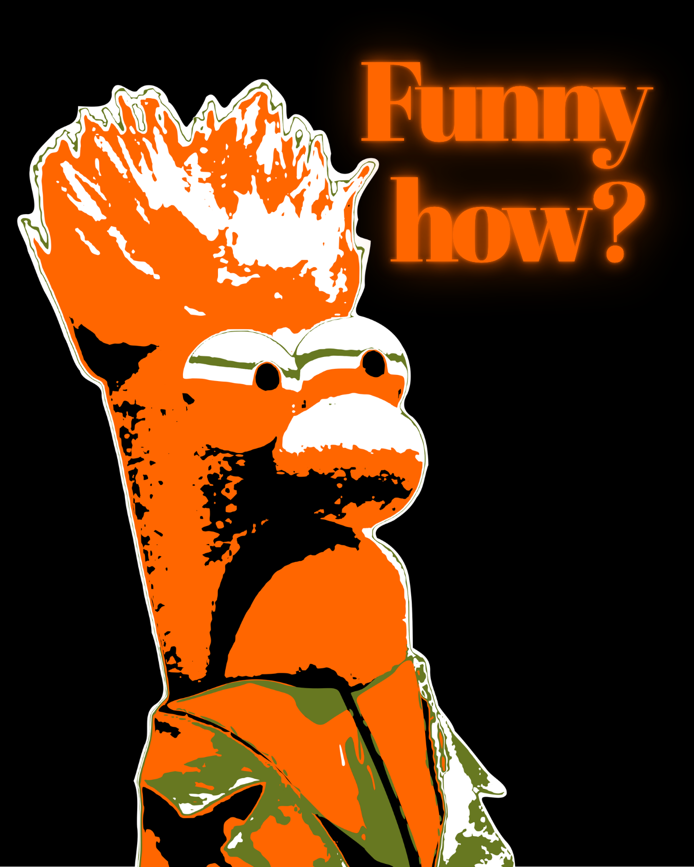
    Comparison of a final design Beaker and the two images that inspired it. The images are of Joe Pesci with the caption 'Funny How', there's an image of Beaker with a long quote that he never said, and also one of my images, Columbo posterised.
    Final Beaker design (left) and the Pinterest board that inspired it.

    The Beaker design was sparked by the collection of images above. I was interested to see what interested the people who had been saving the pins I’ve been putting on Pinterest. A board called ‘Profound Statements’ by Sheri Granger had my Columbo posterised image along with a photo of Joe Pesci from the film Goodfellas and a photo of Beaker from The Muppets.

    The contrast between the tough Tommy DeVito and the hapless Beaker triggered something, and I thought I’d put the two together. The green line across Beaker’s eyes was happenstance, it appeared as part of the posterisation process and I decided to keep it. Adds menace.

    Getting the collars right was the most time-consuming part. In the film, Henry and his friends wear these weird shirts with collars that stay close down to an extended point. I’ve never seen this style anywhere else; they are known as spearpoint collars, according to Mr Google.

    The text is in Abril Fatface. The glow effect is done by doubling the text and adding a Neon effect to the bottom layer of text. This mimics how the credits in the Goodfellas film glow and seem to bleed into each other.

    Wait (for ages), what?

    By comparison, the Dara O Briain idea has been knocking around since I started the shop. Over a year from idea to starting, then a couple of weeks faffing around with the design before I realised how to get the effect I wanted.

    Dara’s picture is treated using a halftone filter in Photopea, then I used Inkscape to add colour. Then it’s back into Canva for the text and final render.

    The text is in Special Elite (top, which I use a lot for Taskmaster stuff) and Negrita Pro (bottom).

    A Massive Yacht!

    The Massive Yacht took the longest to actually make. I tried a few different version, all based on a still from one of Mitchell & Webb’s funniest sketches.

    The traced-over version looked wrong, that arm isn’t right, even though it’s traced over a real arm. Adding a texture didn’t help. In the end, I used Inkscape to make an outline trace of the image, which gave me a lot of black lines to act as reference points. Then I added white lines to make the checked pattern, using white lines at 50% opacity. This was an easy way of making the overlaps look white, as they do on a real checked jacket.

    Three images of Robert Webb as an eccentric billionaire with the caption 'you may already have won a massive yacht'.
    Progression of the ‘Massive Yacht’ design. The arm looks wrong in the original, so I decided to cover it up for the final design. I also got rid of the facial features for the final design.

    I also got rid of most of the facial features (see middle image), mainly because I could get the mouth to look right if there was a colour behind it.

    The text is in League Spartan (top) and Negrita Pro (bottom). Even with the different colouring, the arm looked wrong, so I ended up covering it with the text.

    Spit Spot!

    This Mary Poppins design is similar to the Ingrid Bergman design I did a couple of months ago.

    Punk posterised images of Julie Andrews as Mary Poppins and Ingrid Bergman as Ilsa Lund. Both use a pink, yellow and lack colour scheme.
    Julie Andrews as Mary Poppins inviting us to ‘spit spot’, whatever that might mean in a punk context. The style is the same as the earlier Ilsa Lund design (right).

    The text is in Lacquer font with an Echo effect, which suited the vibe a bit better than a ransom note font. Punks were infamous for spitting back in the early day of the movement, this graffiti style fits that idea.

    The Ox – a musician, at last!

    For my first musician design, I’ve gone for John Entwistle of The Who.

    John Entwistle (1944 – 2002) was the bassist for The Who, joining the band before they were called The Who. He had two nicknames with the band. “Thunderfingers”, because of how loud he played, and “The Ox” because of his remarkable constitution. It’s the second nickname I’ve used here.

    Two images of John Enstwistle, bassist of The Who, above the caption "The Ox". The colours are muted on the right hand image.
    Bright and muted colours for “The Ox” design. I prefer the less bright look on the right, so that’s what is in the shop.

    The design is a cut-out image of John, posterised and made monochrome. The roundel is a traditional mod image, used a lot as a symbol of mod rock. I went for muted tones rather than brighter colours, I liked the look better.

    Quite a lot of my favourite bands emphasise the bass guitar. Iron Maiden, Metallica, Motörhead, Rush, New Model Army – all put the bass up in the mix. For Iron Maiden and Motörhead, the bassists (Steve Harris and Lemmy, respectively) are/ were the leaders of the band, so that’s no surprise.

    The lettering is in Noot, which is quite a fun and chunky font. Chunky like an ox, fun like John Entwistle had a lot of in his 57 years.

    Yes, your telephone

    Series 20 of Taskmaster ranks among the best, up there with UK series 7, 9, 14 and 19 and NZ series 2. I loved seeing this rather angry cast meld into one fist of fury at the inconsistency of Greg’s scoring. They rounded all dressed as pirates for the finale as a protest.

    Leading the fury was Reece Shearsmith. He came to my attention as a member of The League of Gentlemen, a sketch show set in the fictional town of Royston Vasey. I never got on with this programme, not sure why. But I did enjoy Inside No 9, which Reece co-wrote and starred in with Steve Pemberton (who was in Taskmaster Series 17).

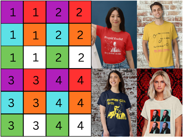
    Reece Shearsmith being confused and the design on a t shirt.
    Reece Shearsmith being confused and the design on a t shirt.

    The design here comes from the first task shown. Reece (who was 55 when the series was filmed) gets very confused at being asked to scan a QR code as part of the task. He is told to get his phone, and responds with a bewildered “My telephone?”

    In the studio, Greg (aged 56) rips the piss out of him for being a muddled, crotchety old man and wonders, “Who in this day and age calls it a telephone?” Greg even calls Reece “Gramps” at one point.

    So anyway, I took a screenshot of his confusion as the basis for the design. I have used the process before, for the Columbo pop art design.

    Once I had removed the background, I added the halftone effect (as I did for Dara) to make it look like a newpaper picture using Photopea. Then I traced over the image in Inkscape to make the background colours. I needed four Reeces for the design, so I changed the colours around so that the background, shirt and coat all rotated colours. I changed the shading of his face between each one as well. This is similar to the shading changes in Andy Warhol’s Shot Marilyns, the inspiration for this design.

    I then arranged each of the four Reeces using Canva and added the text “My telephone?” using Special Elite font.

    Buy the look!

    If you’ve made it this far, you might be wondering where to buy the t-shirts. All the designs are on my RedBubble shop, or click the buttons in the text.

  • We always hang in a casserole dance

    We always hang in a casserole dance

    Once again, I’ve turned to Taskmaster to provide inspiration for a new design for the Heath Way Prints shop. It’s the turn of Mike Wozniak, again. Previously I’d made a pop art-ish picture of him looking his toughest. This time, he’s got to dance.

    Going where mistakes lead you

    I started with a different design in mind. Mike Wozniak is one of the most quotable contestants on Taskmaster. I’ve seen a few designs on RedBubble that are collections of his quotes and nothing more. I wanted to go a bit further.

    I’ve made double exposure images already, such as this one of Michael Sheen. Initially I tried to add text over a double exposure of Mike doing his solo ‘Fart’ task1. But it didn’t look good, the text was too dim and the image behind wasn’t clear.

    Double exposure of Michael Sheen. The profile has been mucked around with, then a glow added behind the foreground image.

    While preparing the screenshot to act as one of the images, I saw that when Mike was trying to fart he was dancing. Why not collect some of these and make a dance montage?

    I took four screenshots, three with Mike at one or other extreme of the dance, and one where he actually farted. Using Canva, I deleted the backgrounds, added a duochrome filter, and arranged them in the order I wanted.

    I saved the collage of black-and-white dancing Mikes and opened it in Inkscape. Here, I traced around the shirts of the four Wozniaks and gave them different colours. The final one is blue, which is the original colour of his shirt. Pink, yellow and green seemed to be suitable choices for the other three. It also gives a bit of a Beatles ‘Sgt Peppers’ vibe.

    For the final design it was back to Canva. I had downloaded the colours as a single image, and also the monochrome version of the dancers. This made it easier to match up the colours and monochrome versions since I knew they were the same size and in the same position on the page. Hindsight is a wonderful thing.

    The three parts of the final design. Colour for the shirts, black and white Mikes and some text.

    Matching up the images, I placed the colour version on top and decreased the opacity until the colours were obvious and and folds of the shirts showed through. I’d used more intense colours in Inkscape than I was aiming for in the final design, because I had planned to use semi-transparent image.

    Final design

    Then, some text for the final design. The title of the episode where this task was shown was “Absolute casserole”. They always use quotes for episode titles; this was Mike’s description of his bum after the fart. So what better text to use? The font was Special Elite, a typewriter font I’ve used a lot, especially with Taskmaster related images. And a black background hides the cut-off of Mike’s legs.

    Extra points for making a design that has a lot of black show up on dark clothing. Re-uploading the design to Canva I added a think white outline, which does the job.

    The final design on white t-shirts.

    We always hang in a casserole dance

    I’d dubbed the design ‘Casserole Dance’ and regretted it throughout the design process. This was because Neneh Cherry’s 1988 song ‘Buffalo Stance’ started going through my head and wouldn’t shift. Not that I dislike that song, but a few hours of it gets a bit wearing.

    1. His task was : “Fart. Fartest wins.” He was the only contestant to do this. ↩︎

  • How to turn an idea into fake reality?

    How to turn an idea into fake reality?

    I think I’m getting better at doing stuff with Blender. One of the side effects of this is that I can think about Blender’s capabilities and apply them to designs and animations that I can use in the Heath Way Prints shop and as adverts for the shop.

    Turning blocks

    The sketch below is from my notebook1. I did this one evening and set about making it the next day. It took a few hours of a day I’d have otherwise spent doing the crossword2, watching the Tour de France3 or interacting with my family.

    Notes on the construction of the ‘six cubes’ workshop animation.

    I knew I could do the animation. However, some of the ‘how to’ bits needed me to dive back into the University of YouTube. In particular, the use of Drivers to simplify the animation needed a refresh.

    Blender Drivers

    Put simply, a Driver is an object that affect another object in an animation. For this animation, I had two drivers. One driver rotated 90° back and forth. The angle of this controls the position of four of the cubes, just as a real mechanical lever might. The second rotated through 360° throughout the animation. The angle of this driver’s rotation controlled the rotation of all six cubes.

    The video below shows how drivers work.

    Driver demo. I’ve animated the red cube to go up and down. The blue cube turns as the red cube moves, and the colour of the third cube also changes. You can control many different objects from one object. Not sure of the limit, but the six I’m using in the turning cubes design is well inside the capability of Blender.

    The animation of the drivers controls the movement of the cubes. Setting up the drivers makes timing the animation simpler than animating each cube individually.

    Display board images

    If you can decipher my writing, you’ll see that I planned to have one big image with four design adverts on to be displayed. I made the single image with four designs in Canva. The fiddly bit was making sure the faces on the cubes matched the parts of the image that had to show. This took a while to get right, but I plan to use this setup a few times, so it’s worthwhile making the effort.

    Each face of the six cubes is mapped to an area of the image. To set this up I made a grid with numbers and colours to stand in for the final image. I made sure each face that needed one had the right part of the right image in the right orientation, after which I could substitute the image I wanted to use for the advert.

    Calibration grid (left) and the four images that show on the cubes once they are rotated in place.

    Put it all together

    There’s a few extra bits I added to make it look like an item that’s been installed long-term in a workshop environment. Some grime, a bit of background noise and camera shake. Ferrules cover the holes where the rods at the top and bottom of the unit go into the floor and upper display. This is to hide the otherwise odd-looking holes where the rods disappear. It also gave objects for the grime to collect against.

    Future stuff

    Other things to add might be a lever in front or to on side of the cage and a control knob that turns to show which cube is being shown. But that’s for the future.

    1. Yes, that really is my handwriting. You won’t think of anything to say about it that I haven’t heard over the last 50 years. ↩︎
    2. This week’s Private Eye crossword is giving me trouble. ↩︎
    3. I can’t get used to the Channel 5 commentary. Rob Hatch leaning into the pronunciation of French and Spanish names is a big distraction. ↩︎

  • If that was love…

    If that was love…

    .. turns out I’ve not been in love before.

    This design pulls together three icons of art and humour: Taskmaster, Monty Python and Andy Warhol.

    The ‘Sit on a cake’ design on a t-shirt!

    He was a different man

    I’ve written about Taskmaster before. It’s my favourite programme at the moment, the last two series (19 and 20) rank among the best. It’s got astonishing longevity; Alex Horne has hit upon a winning formula and he carefully selects groups of comedians who make a concerted effort to make the whole thing as much fun as possible.

    Back in the distant past of Series 6 (broadcast in 2018), the final task of the series asked the contestants:

    Tell the Taskmaster you love him in the most meaningful way.

    As is typical, the contestants found wildly different ways to do complete the task. Tim Vine dressed as Greg’s mum and told Greg that he is her favourite child. Russell Howard didn’t have sex with Greg’s mum. Alice Levine got a toy aeroplane to fly a meaningful message for Greg. Asim Choudhry performed a rap declaring that he wanted to have Greg’s babies.

    Three of the five attempt at the ‘show your love’ task. Alice sent a heavily caveated declaration of love, Asim said he wanted to have Greg’s babies and Tim dressed as Greg’s mum. Not shown: Russell not having sex with Mrs Davies (not very interesting) and Lisa’s go, because that’s what this section is going on to talk about.

    Lisa Tarbuck, the series champion, hit the ball out of the park with her demonstration. She asked for a large cake topped with confectioner’s custard. Then she said to Alex:

    Take yourself somewhere private and put your bare arse into it.

    And so it was that Alex took himself to the shed, pulled down his pants and, with carefully positioned cameras recording the event, sat bare-arsed on a cake.

    His expression of horror/ delight has stayed with me for years. He had an experience unlike anything he had known before and changed him. “He was a different man1,” Lisa declared.

    Alex Horne’s life changes forever. He now knows what love is and also managed to absorb a profiterole. Don’t ask how.

    An equal part of the joy of this was Lisa’s reaction. She ran away, giggling when Alex came out of the shed, dripping cake from under a strategically placed towel.

    Andy Warhol’s Shot Marilyns

    With such an image in my head, I had to do something with it. One iconic image deserves another, and there are few more iconic faces than that of Marilyn Monroe.

    Andy Warhol certainly thought so. The silkscreen collection Shot Marilyns is one of his best-known works. This isn’t the name he gave the works – he called them Marilyns and made five in total. Each had a different background colour and slightly different colouring to the face. The “Shot” addition came about when the performance artist Dorothy Podber fired a single shot through a stack of four of the paintings. Her actions – a piece of performance art that Warhol did not appreciate – earned her a lifetime ban from The Factory.

    Four of the five Marilyn paintings that Andy Warhol made in 1964.

    Whether you’re a fan of pop art and the world of Andy Warhol, the colourful images of one of the greatest film starts of the 1950s, you can’t deny the paintings are memorable.

    I tribute to this, I found a way to make images in a similar manner to the Marilyns. Using this method, I made my own set of images of Little Alex Horne’s face.

    A triptych of Little Alex Horne – “Shocked Alex” – as he experiences love for the first time.

    I quite like the triptych as it is. For the final design that uses the ‘four images’ presentation that is often used for these paintings, I wanted some words to go with the image.

    Monty Python’s very rude song

    In one of my first blog posts2 I talked about what makes me laugh. Monty Python is firmly in that camp, especially when they get silly.

    The title of this section is a bit misleading. Python did a number of rude songs – the Not Noël Coward song from Meaning of Life springs to mind – but Sit on my Face is probably the rudest of all.

    If you’re easily offended, don’t go looking for it.

    However, the sentiment from the Python’s song and the sentiment from Lisa Tarbuck’s demonstration of love can find middle ground. A middle ground that, with a little tweaking, can enhance the four images of shocked Alex.

    The ‘Sit on a cake’ design on a t-shirt!
    1. This was also the episode title. ↩︎
    2. There’s an updated version with a few examples of stuff I think is funny. ↩︎

  • The huge importance of scoring in Taskmaster

    The huge importance of scoring in Taskmaster

    How important is it, really?

    Taskmaster scoreboard from Season 13, Episode 1.
    Taskmaster scoreboard from Season 13, Episode 1. Chris Ramsey – the person who enjoyed the experience the most of any contestant – set an early lead.

    A recent publication by David Silver1 discusses the scoring in Taskmaster and how this impacts on the enjoyment of the series. It also looks at other metrics, such as the use of Large Language Model (LLM, a sort-of primitive AI) to analyse the script and detect sarcasm, among other things2.

    The Abstract was enough for me to be sceptical about the study. Of all the metrics that were applied, the one that Little Alex Horne thinks is the most important was missed (from the abstract). It is the mix of people that’s the crucial element. I’ll come onto Silver’s treatment of that later.

    What struck me was that if you want to know why we enjoy the show, a survey would do the trick. From what I’ve seen on the Taskmaster subreddit, most people see the scores as one of the many parts of the show. If anyone wants to win too much, it can be bad – John Robins strayed close to the ‘too needy’ zone. If they don’t care and do well (Jo Brand, Sarah Millican3, Sam Campbell4) that’s even better.

    Or we get the joy of a contestant such as Julian Clarey, who clearly didn’t care until towards the end. There was more sitting forward in his seat as scores were given out in the later episodes. He lost by a few points, sacrificing the win for a gloriously calm meltdown in the road-sweeper task.

    The main attraction for winning is likely to be the chance to do it all again in Champion of Champions.

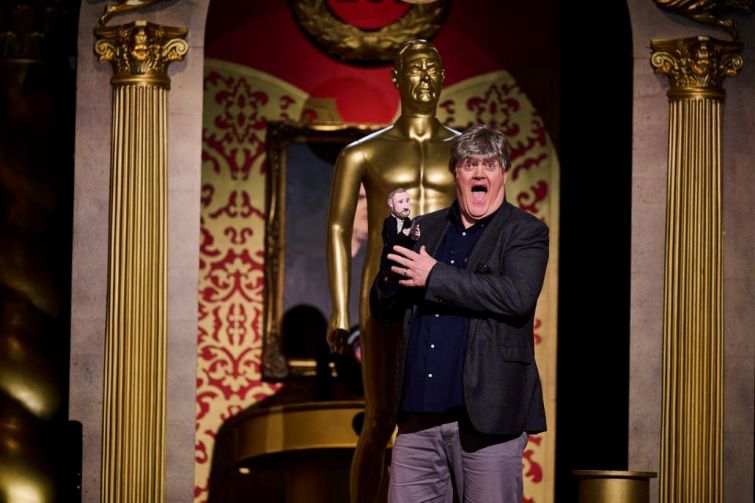
    Dara O Briain, delighted to win the third Taskmaster Champion of Champions.
    Dara O Briain, the winner of the third Champion of Champions with the Little Alex Horne puppet and his very convincing wig.

    Whose win is it anyway?

    Contestants are comedians (or comedy-adjacent) and they have different ideas about what winning is. Getting a laugh is the win and it’s this instant, honest feedback that many of them crave. That, and getting paid on time.

    Desiree Burch epitomises this attitude. There was a balloon-popping task in Series 12. She knew that the ‘correct’ way to do the task was to get the scissors, cut the string and release the portcullis. But she also knew the funny thing was to throw pebbles, rubber ducks, a bucket-load of forks and eventually the bucket itself at the balloon until finally taking the scissors.

    Desiree Burch explaining why winning isn't everything.
    Desiree Burch cementing herself as a contestant who understood the brief.

    Who? Who?

    So we come back to the most important of the many factors in Taskmaster – the cast and the cast mix.

    I’ve usually known a couple of the contestants, but then I’m a fan of comedy5. These will be well-established figures from stand-up (Dara Ó Briain, Mel Giedroyc, Sue Perkins) or related areas (Charlotte Ritchie, Steve Pemberton, Lisa Tarbuck). Add in some that I am not familiar with (Fern Brady6, Rose Matafeo), or I have seen a couple of times on other things (Rosie Jones, John Kearns, Katie Wix) plus unknowns and we have a cast.

    Eventually I get to know them all and their interaction is a major factor in the enjoyment. How the different minds complete the set-up that LAH wrote is the principal draw, that is the meat of the sandwich.

    Silver assigns five ‘types’ to the contestants based on how well they do points-wise, and then fits each contestant in each season into these types. He tries to force his five types into every cast, like Cinderella’s sisters trying to force their feet into the glass slipper.

    Assigning character types may be a better approach, but it gets very complex and I’m not a fan of assigning personality types7. There may be ten (or a different number) character traits that are needed in a cast, where each panellist has two or more components. Jack Dee is surly and competent. Julian Clary is sarcastic and insouciant. Kerry Godliman and Lisa Tarbuck were both straightforward ‘Bosh!’ merchants, but Godliman was competitive and Turbuck was laid back.

    A moment of unalloyed joy for Kerry and Greg.

    It’s a parody, innit?

    The main reason for the points is that the show is a parody of competition. In his book ‘Be Funny or Die’, Joel Morris points out that a good parody has to look and feel like the thing it’s parodying. Spinal Tap only works because the music is professional quality and it looks like a documentary8. Airplane! works so well because there is a real aeroplane disaster plot thrumming away in the background and the cast play this straight. We follow the events of Galaxy Quest because the Thermians face extinction at the hands of the genocidal Sarris and their only hope is a bunch of shop-soiled actors.

    There are points scored, so the show behaves like a panel show, the rhythms and beats are there to hang the chaos on. How the panellist behave is another matter and this is where the joy truly lies.

    1. https://doi.org/10.48550/arXiv.2505.02886
      ↩︎
    2. Artificial intelligence is really good at detecting sarcasm. ↩︎
    3. Who would have walked away with the win in any other series (except maybe John Robins’), all the while not really caring. ↩︎
    4. Sam won the most heart-warming series, with the two Sues forming an eternal friendship over a packet of NikNaks. ↩︎
    5. That term suggests that there are people who don’t like comedy. I think the phrase in this case means people who go out of their way to find out about comedy and comedians, and go so far as to occasionally blog about comedy. ↩︎
    6. Me Fern Brady! Me Fern Brady! I’m the rightful queen! ↩︎
    7. Maybe there are people who are fans and I should be designing Myers-Briggs t-shirts for my shop. ↩︎
    8. The, if you will, ‘rockumentary’. ↩︎
  • Taskmaster

    Taskmaster

    The best panel show ever. I bloody love it.

    It’s based in silliness, which I have come to realise is where my humour lies. If I think of all my favourite sketches and stand-ups, there is a strong thread of the silly about them. Morecambe & Wise with Andrew Preview. “Who’s That Girl” from Harry Enfield. Ray Alan and Lord Charles, with Lord Charles demonstrating the art of ventrickolism. Monty Python, The Goons. Etc.

    I’m not sure when I started watching it, I think I saw season 4 (Hugh ‘Desky’ Dennis and Mel Giedroyc were the two main draws) first.

    I’m pretty sure Season 7 (2018) was the first I watched as it came out. This is up there with the best of the seasons, absolute chaos all the way through.

    The strength of Taskmaster is the cast. With Season 7, they hit it right. In particular, we got Greg more involved due to his long-standing friendship with Rhod Gilbert. Oddly enough, I didn’t click with Jess Knappett to begin with. She was this vague, slightly annoying presence. That was until ‘Cul de Sac’.

    This seemed to transform her into a 3 dimensional person worthy of having a piece of the stage named after her, and from then on, I loved them all.

    There is an ongoing controversy about this series, centring on James Acaster’s performance. He maintains that he was the moral winner of his series, despite coming fourth.

    Final scores for series 7, clearly showing that James, finishing on 165, was fourth behind Rhod (167), Jess (175) and Kerry (176).

    However, I wouldn’t be a proper fan if I didn’t get a bit obsessive about the show. Is there any substance to James’ claim? Let’s have a think about another, inferior1, panel show hosted by someone who is far too tall – House of Games.

    House of Games runs for five nights with the same cast of four. At the end of each episode the contestants are awarded points depending on where they finish – winner gets four points, second three, etc. So winning by ten points doesn’t translate to a certain win. What if we apply this to Taskmaster and see how James would have done?

    Summary of the seventh series of Taskmaster using House of Games points scoring. The leader after each episode is highlighted.

    We can see that James had a shocking start to the series, coming last in the first two episodes. Even Phil was ahead of him!

    So using House of Games rules, Kerry and James would have been tied, Jessica Knappett would have been third with Rhod in fourth. Again. And then there’s Phil.

    However. On House of Games the last episode (broadcast on Friday) is worth double points. So, because James won the last episode his points total rises to 40 and he, therefore, is the champion, just edging out Kerry and leaving Jess in fourth place.

    Look me in the eyes and tell me I’m not a champion.
    1. Inferior, but still a lot of fun. I particularly like the song intro round, where they play the intro to a song, fade it out and you have to guess when the singing starts. ↩︎
  • Silliness above all in humour

    What makes you laugh?

    Mostly I laugh at what has no agenda and is mainly silly. Always punching up, heavy on the puns and wordplay with a side order of deserved frustration.

    This will be why I love Taskmaster, Morecambe & Wise, Bob Mortimer, Airplane!, Ghosts, Eddie Izzard, Monty Python and Stewart Lee.

    Silly songs, too!

    You could include Terry Pratchett, though the elevated level of silly hides sharp commentary and anger.

    An inherited sense of humour

    I think my sense of humour has remained unchanged since I was a teenager. My dad had a wicked sense of humour, one that four of the five of us1 have inherited. One of my fondest memories is when four of us were sitting at the dining room table with our parents. Someone said something (wish I could remember what) which set dad and three of us off in fits of laughter. My oldest sister had to leave the room. Mum and other child were left bemused.

    To get some flavour of his sense of humour, his favourite joke was the Headstone joke.

    Does time change a sense of humour?

    Things I enjoyed in the 80s are still funny. Red Dwarf, the film Clue, Monty Python’s Life of Brian, the Morecambe & Wise Andrew Preview sketch…

    The other day I went down a bit of a rabbithole about George Formby. This triggered the memory of the revelation that Formby – not Bob Dylan – is the original author of Subterranean Homesick Blues. This is from The Day Today, broadcast in 1994, where we also saw Alan Partridge for the first time.

    A lot of this is skewed towards older stuff, but that’s not to say there’s nothing new I like. We saw Bill Bailey last year2 and Mrs S was in pain laughing at the ‘cappuccino in Amsterdam’ story.

    To finish, here’s an extended dose of silly from Andrew O’Neill in 2023.

    If you need the Baker Street joke explained, leave a comment.

    1. I’m the third of five children. ↩︎
    2. We’ve seen him at least four times, first time in 1991, as part of the double act The Rubber Bishops. ↩︎
Verified by MonsterInsights