Tag: rendering

  • Baaa Humbug!

    Baaa Humbug!

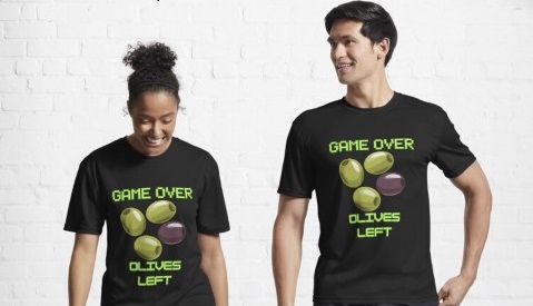
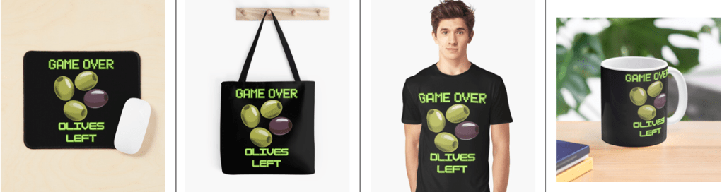
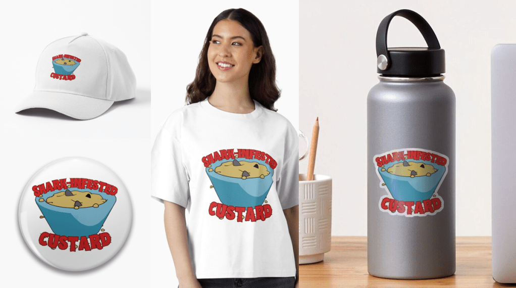
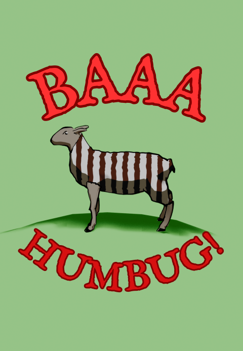
    A Heath Way Prints design.

    The ‘Baaa Humbug!’ design on a t-shirt, apron (with holly), cushion and pin badge.

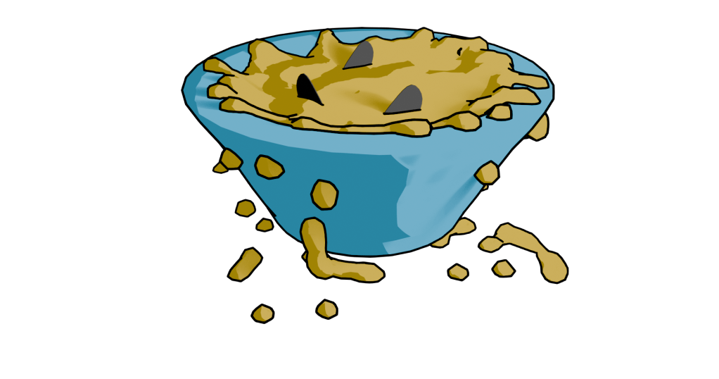
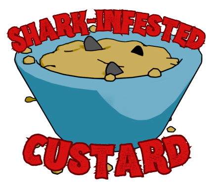
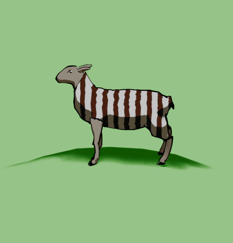
    This was an idea from Mrs S – a sheep with a humbug1 body.
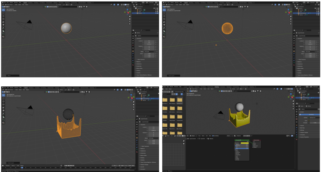
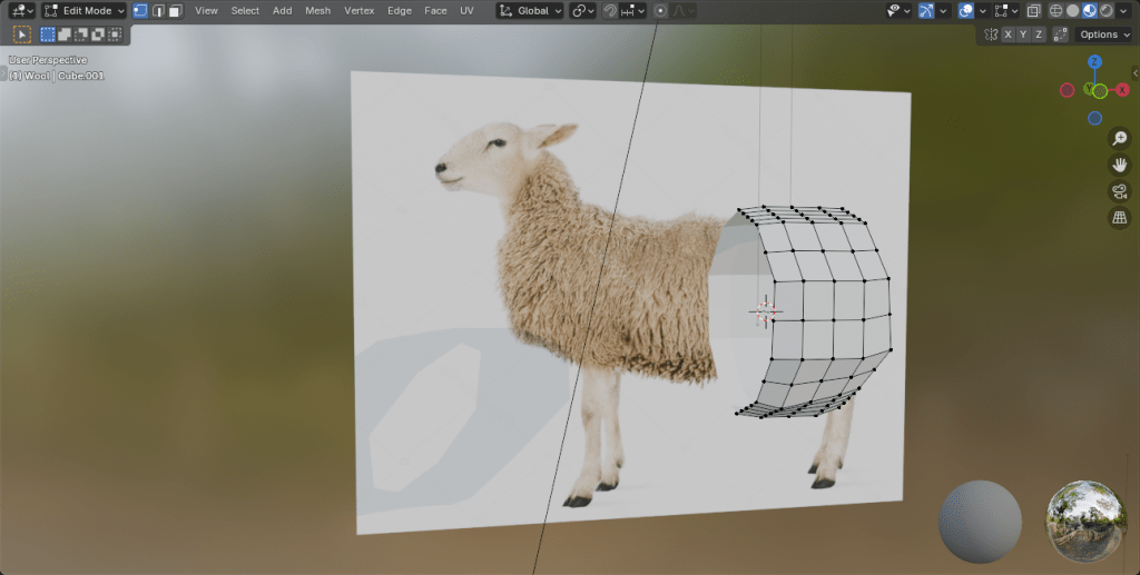
    Sheep building

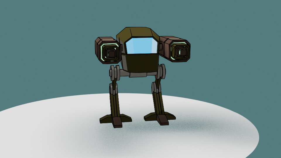
    The modelling of the sheep was the main challenge here. I decided to go for a ‘low poly’ design, similar to the fearsome dinosaur I made as part of the course I did in March ’25.

    Returning to the University of YouTube, I followed a video by Ryan King, who is a reliable tutor and another one who doesn’t skip the fiddly bits. He made a duck, a shark and a dog in this tutorial, the dog was the best one to follow for the sheep, what with having four legs and all.

    Making a low poly sheep is an exercise in making a tube and shaping it to match a sheep (I used a photo of a sheep as a guide) and then adding legs and ears.

    The start of the sheep construction process. Using a side-on view of a sheep, a tube is extended and squidged to make a sheepish body. Legs are added by extruding from the sides.

    Shading

    The shading was the complex bit. I wanted to have a cartoon look to the sheep because that’s an aesthetic I like and also makes the final print a bit clearer.

    I’ve done quite a lot of cartoon shading over the last couple of months, the tricky part was getting more than one colour onto a cartoon.

    The basic cartoon shader. It converts the original colour to RGB (not sure why), then the colour ramp restricts the colours to two shades, dark and light. This gives a cartoon shading effect that I’ve grown fond of.

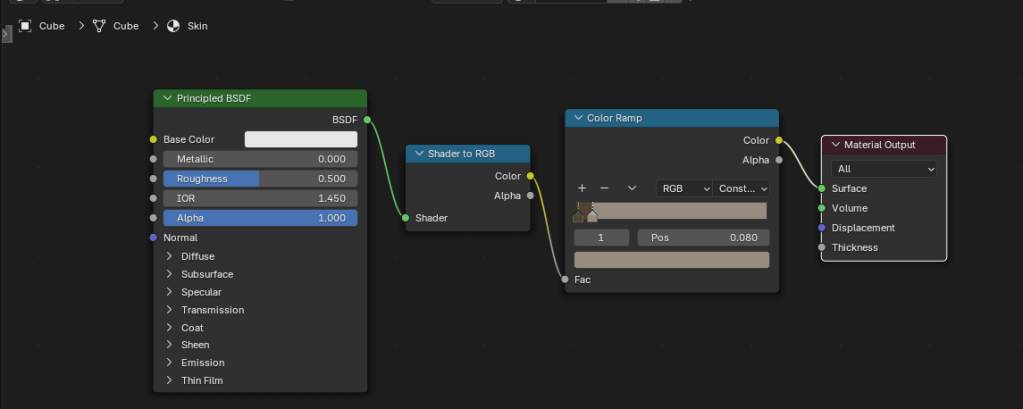
    Doing one colour is easy enough, it’s two shader nodes. Adding a striped pattern and getting the stripes to mimic a humbug was a bit of a thinker. In the end, I found a way of doing it using various shader nodes.

    The humbug shader. I used a photo of humbugs to get the right colours. This is a bit more complex than the single shader, since the system needs to be told where to put the brown and white colours.

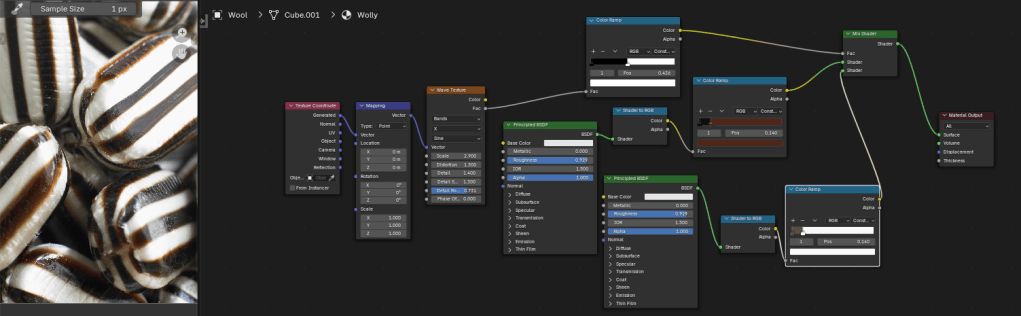
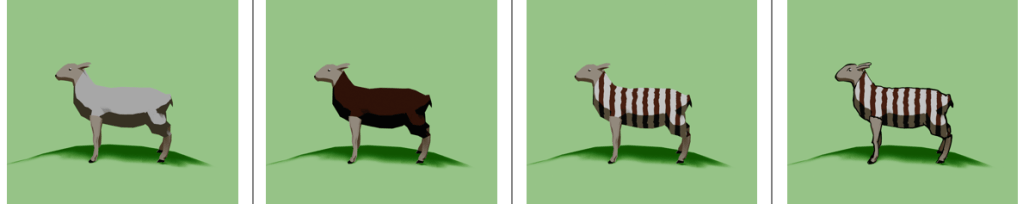
    So we can go from a plain white or brown sheep to a striped sheep. Then we need to add outlines.

    From left to right, a plain white coat, a brown coat (colour for the humbug stripes), stripes added and then with outline and frown drawn in.

    Outlines

    I’d previously used the system’s grease pencil to add lines to cartoons and it works well. For the cartoon mech, I just thickened the lines a bit but otherwise didn’t adjust the grease pencil added by Blender.

    Another variation of the two legged mech I made a few months ago. This cartoon version has ‘scene line art’ added, automatically adding lines to the model.

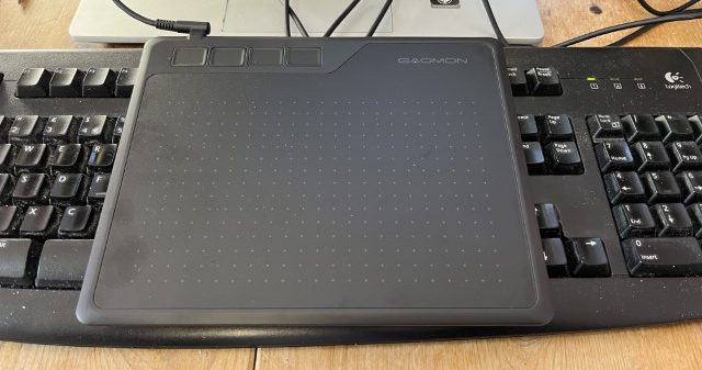
    Well, most of the time it works well. But this time it didn’t, adding lines where I didn’t want them and missing out other lines. So I had to draw the lines myself. I’m part way through an 2D animation course so I had learned about adding lines and editing them already. I applied this new knowledge to the sheep, using a drawing tablet I bought a few months ago. This meant I actually learned how to use it.

    My graphics tablet. This one cost £24, the ones professionals use can be in the hundreds of pounds, even over a grand. I’ve also just noticed that there are thumbprints on the left side where I hold it.

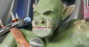
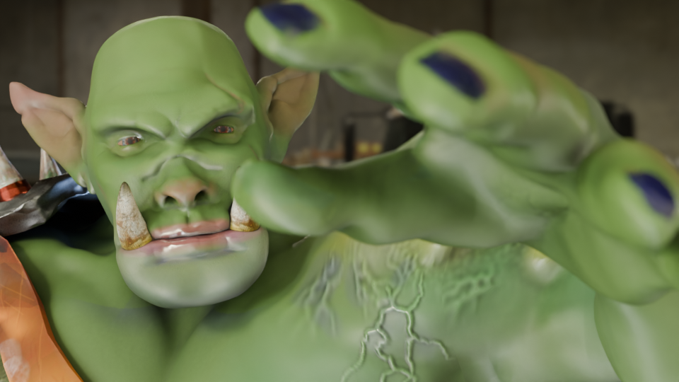
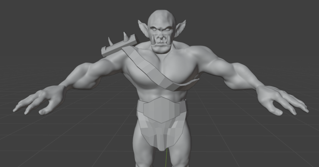
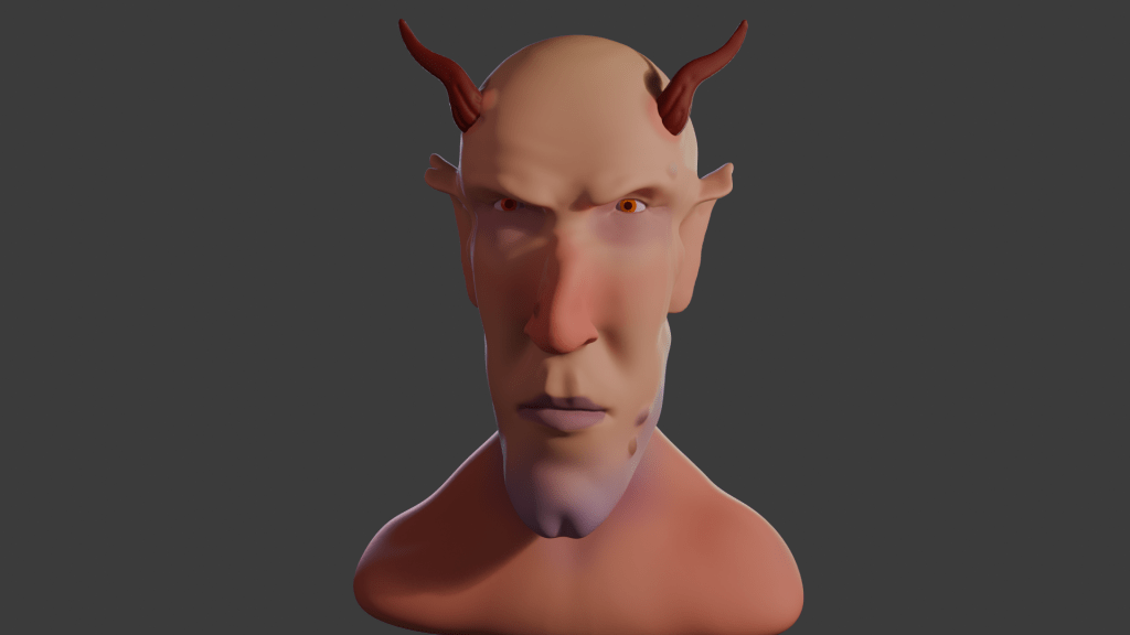
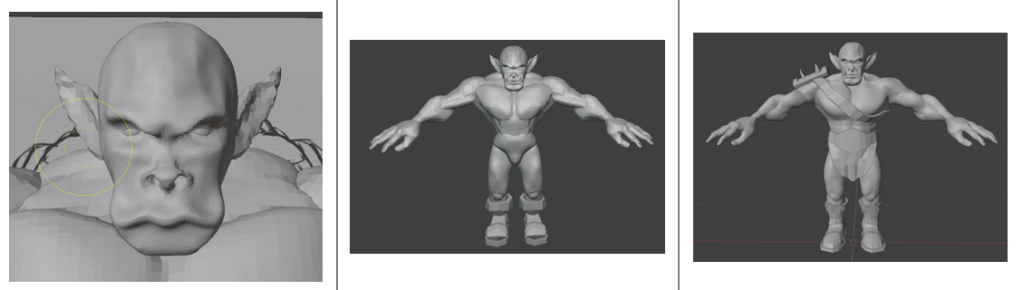
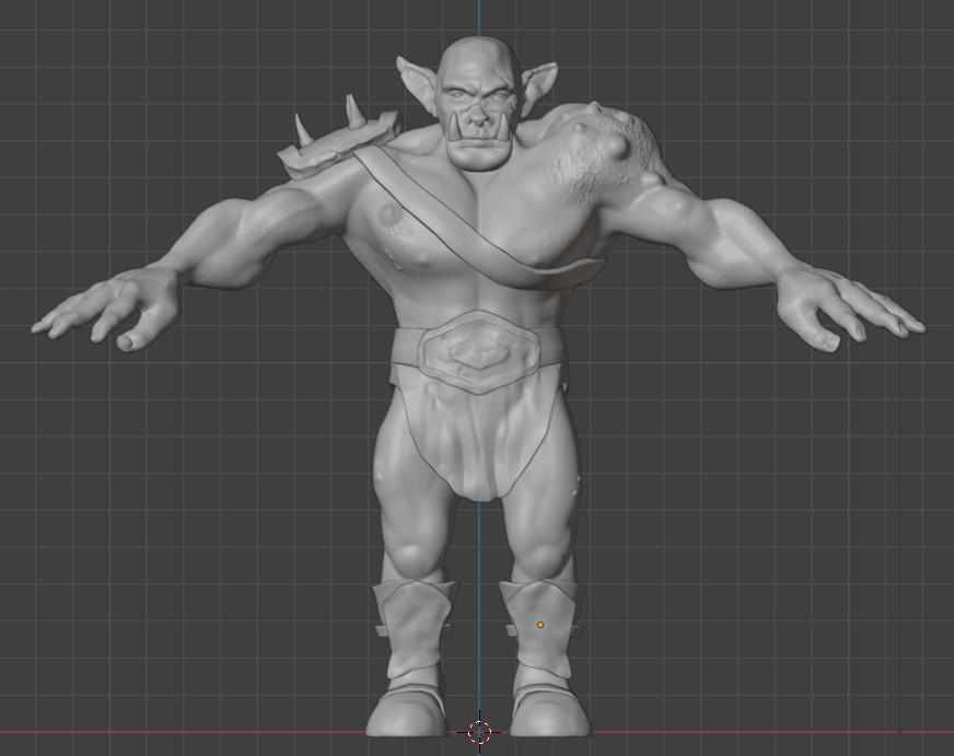
    Once I’d drawn the lines I was able to adjust them. Because I’m not much of an artist and I’m not used to the graphics tablet, the lines weren’t perfect. However, because they are digital, the lines are editable, so I could move and stretch them until I was happy with the look. This is similar to the way I sculpted the virtual clay to make Bob the demon and Steve the orc. I didn’t want it to be too perfect, just believably hand-drawn.

    Somehow, I managed to get the sheep looking really grumpy as well. A fortunate accident with the line I drew for the eye ridge.

    Final design

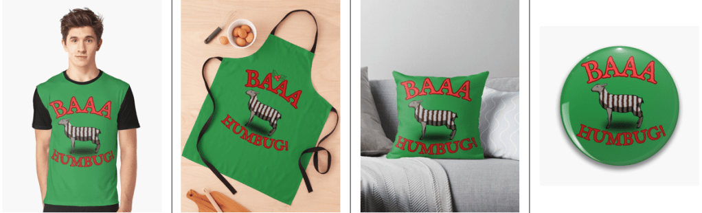
    I exported the final sheep into Canva to add the background and lettering. The font is IM Fell English, based on an 18th century script and so perfect for an olde worlde feel.

    One version of the “baa humbug” design.

    Because I’m using RedBubble rather than Etsy, I can offer the design on a variety of things. In RedBubble I can also specify the background colour to be used in the designs; I can do that in Canva, too, but the shape of the different products means that sometimes there can be white space at the sides or the design looks too small on the product.

    Baaa humbug design on an apron.

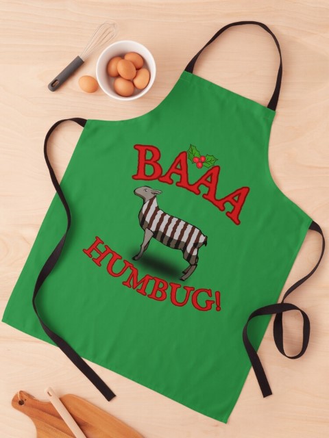
    At the suggestion of Mrs S, I added a sprig of holly to the design that goes on the apron. Not sure why, but it works for the apron but not for the other items such as t shirt and cards.

    1. Humbugs are striped, mint-flavoured sweets. ↩︎
  • Game over!

    Game over!

    Heath Way Prints design.

    This was a cryptic crossword clue I thought of some time ago, and realised recently it would make a good t shirt/ mug/ mouse pad etc.

    Canva design

    I think it took me about 20 minutes to do this, all in Canva. Deciding on the fonts to use was the tricky part. What I really wanted for the ‘Game Over’ part was the sort of font used in Rollerball1 and throughout the 1970s to indicate that a computer was involved. There is a font called Rollerball, though Westminster is also available for Word, but I couldn’t work out how to get that in to Canva. So I used Retropix for the Game over, and HK Modular for the Olives left. A nice neon green, reminiscent of the old green screens I spent my early computer years staring at completed the text design.

    Example text for the Westminster font.

    The olives were taken from a Canva catalogue of designs. There were plenty of olive designs to choose from, the three green and one black in a cartoon style was the best, and similar to what I might have designed myself.

    Once I was happy with the design I downloaded it from Canva then uploaded it to RedBubble. Making sure the design looked right on all the products and writing the description and keywords still takes me some time, but I hope I’m getting better at this.

    I finished a social media marketing course in November, this taught me several things I had hoped to learn. How to build a website, the importance of keywords and how to do search engine optimisation. I’m still a beginner, but I now understand why you need to spend time doing the SEO, though the rules change all the time.

    Cryptic crosswords

    The clue I had knocking around was:

    Game over for oil producers? (6)

    The answer is ‘OLIVES’, because when you have no lives left you finish a game, and olives produce oil. The O and the zero look similar, and that’s how cryptic crossword clues work. I sometimes struggle with cryptics, I attempt the Private Eye one and sometimes I can finish it, other times I can’t get more than two clues.

    Another clue I made up a while ago:

    Advances in fantastic trousers (5,7)

    Comment if you know the answer.

    1. A 1975 film starring James Caan, featuring the titular ultra-violent sport and a lot of moody electronic music, set in the far-off dystopian future of 2018. ↩︎
  • Return of the Mech

    Return of the Mech

    I’ve finally figured out rigging, which means I can animate the mech I made a few months ago. Yay me!

    Stylised two-legged mobile gun.
    Completed mech with colouring and glowing guns. The green glow around the windscreen is a classy touch.

    The mech I used had a bit of a different colour scheme, I have dubbed it ‘the fabulous mech’ due to the glittery guns and pink glow around the screen.

    Rigging involves adding bones to the design, linking those bones to the model, and moving the bones instead of moving the mesh of the body. This is just like how Aardman animate their models for stop motion.

    Blender viewport showing a two legged mechanoid with bone rigging.
    The grey shapes are the ‘bones’, they control parts of the Mech model. You can rotate the bones to make the head move and move the bones in the legs to make it walk.

    Moving the bones around using keyframes to control the timing of the mech and stuff. First trial was to have the Mech look around, notice the camera and step towards the camera.

    Mech stepping to the camera. Mean and pink.

    Getting a walk cycle for the thing was a bit fiddly. Moving the legs in a bird-like manner is easy enough, but getting the feet right and stopping them slipping needed a bit of fiddling about. Took me a while, but the result is pretty good. I wrote an Excel spreadsheet to help me with the timings of bone movement and getting the whole thing to move without ‘foot slip’, where the stationary foot moved backwards during the walk cycle.

    It’s a bit gloomy, but the fabulous mech is here to menace you!

    I’ll do some more on this later. The walk is mechanical (well, it would be). The lighting need to be improved so you can see the thing. I will add a swing to the hips and also movement of the head so it looks like the operators are searching for something.

    Stay tuned!

  • Falling cubes, tracking camera

    Falling cubes, tracking camera

    There are a few videos on YouTube (and elsewhere1) of piles cubes being dropped, weights being dropped on cubes and balls hitting piles of cubes. I’ve done one myself, and it’s quite satisfying. Destruction of things without actually wasting resources. I was asked if I was in need of some sort of catharsis. I don’t think so.

    I decided to mix it up a bit and have a series of groups of cubes dropping as the camera tracked past. The varying weights video (above) had a static camera. I rendered the different videos separately and spliced them together before adding sound to give it a bit of realism. The final bit where a flying cube hits the camera was the only camera movement I did. The shaking as the blocks hit the ground was done using an add-on called ‘camera shakify’2.

    Blocks of cubes

    First you make the cubes and then add physics. The easiest way to make a bunch of the same things is using an Array modifier, where you repeat an object a set number of times. So to make an 8 x 8 x 8 cube of cubes, I did three arrays of 8 in the X, Y and Z direction. Then the 1096 block need to be separated and given physics.

    ‘Physics’ in this sense means that the objects react to gravity and to other objects with physics. The video below shows how objects interact with ‘active’ physics, ‘passive’ physics and no physics. So the green cubes react to gravity and are stopped by the red passive objects. Passive objects don’t react to gravity or other forces but get in the way of active objects. The blue ‘no physics’ cube gets ignored.

    Initially I made four blocks of cubes: 2, 5, 8 and the 10-cubed blocks, and then set up the moving camera.

    Camera settings

    To get a camera to pan while it focuses on a moving spot you need two things. A line for the camera to follow and something for the camera to aim at. For this video, the line is a curve that runs mostly straight past the cubes and then curves around and up to finish with a view of all the fallen blocks. The camera is pointing at an ’empty’, which is an object that will not render in the final image. I animated the movement of the empty so that the camera would arrive just as the blocks started to fall.

    The camera itself has several settings, not all of which I understand. The one I do understand is ‘motion blur’, which adds a little realism to the falling blocks. The video below shows the effect in a simple scene. In the final frame of the video below you can see there is blurring of the cubes on the left and the animation looks a bit more realistic.

    Lights!

    Lights above the cubes turn on as the camera arrives. These are circular area lights, intense and powerful. I also added a ‘fog cube’ so the light beam could be seen. More lights, smaller yellow ones, and a back wall add some shape to the studio that all this is happening in. Getting this timed correctly is relatively easy, keyframes for the light intensity can be edited as needed.

    I noticed how high the blocks went for the 10 – cubed block and so I thought I’d see what happens with 12 cubed. And the cubes went everywhere. Drilling down into the narrative3, I thought that the set-up would have overlooked this and so the lights that come on as the camera tracks would be too low for the last pile and this light gets destroyed by the cubes.

    I added a cube above the light, did a cell fracture4 (only 20 pieces) and timed it so that the erupting cubes hit the fractured cubes as the physics takes over and the pieces fly everywhere. It just so happened that the end point of the camera track was just to the right of where one of the pieces flew.

    Video below is how the Blender screen looks as the final animation is playing. There are random colours added to each object so I can make them out. There is a small three-way axis that travels left to right – that’s the empty that the camera (the pyramid that travels along the black curve) is locked in on.

    Sound!

    Getting the sounds was difficult, it is usually the part I struggle with. I have various thumps, crashes and loud clicks saved, so they were easy to get. I wanted to have a director saying ‘action’ and then ‘CUT!” but could I find one? Could I bugger. So in the end I recorded myself as the director. The family don’t think it sounds like me, the microphone I used is a bit heavy on the treble.

    Two weeks after publishing it on YouTube it’s had about 500 views. The simple destruction videos seem to do a lot better than ones with a narrative. So I guess it’s back to explosions.

    1. Such as TikTok. I will post these videos there, see if I get any interest. ↩︎
    2. It shakes the camera. But you probably guessed that. ↩︎
    3. The narrative being that these demos are for real but the director is a bit hurried with his setting up and is under time and budget pressure to get the videos done. ↩︎
    4. I’d done a cell fracture demo, showing how a wall breaks with different levels of cell fracture. It’s had over 20,000 views. I guess people like things being destroyed. ↩︎
  • What’s yellow and dangerous?

    What’s yellow and dangerous?

    Shark-infested custard!

    It’s an old joke, but also a bad joke. It’s old enough to be the subject of a new design to go on the RedBubble shop.

    Finished design. Lumpy yellow custard in a blue bowl with three shark fins poking out.

    Blender fluids

    To make a bowl of custard with sharks in it, I used Blender. There was no other choice, apart from drawing it from scratch. This meant three things. One, model a bowl. Two, add fluid – viscous custard. Three, add shark fins.

    Simulating a viscous fluid in a bowl is theoretically easy. Making a bowl was quick enough to do with the experience I’ve built up over the last few months. I took a cylinder, fiddled with that and made a fairly crude bowl. I did a version that was more conventionally bowl-shaped, but Mrs S preferred the straight sided version.

    When using fluids you have to define the space where fluids can be simulated, a source for the fluid, and what objects interact with the fluid.

    The simplest thing in fluids is to have a sphere that lets liquid out constantly into a volume. It’s not very exciting, but it’s a start.

    Fluid simulation in Blender. Make a sphere, add fluid domain (the volume where the fluid will be simulated – not visible here), then press start on the animation and you get liquid flowing. Change colour as required.

    Then you can add a vessel or other object that the fluid can interact with and overflow. You also have the option- which I used for this – of making a given volume of liquid and only generating that. I used this to make a sphere of custard that flopped into the bowl. I could adjust the volume of the sphere so that the bowl filled, but didn’t overfill.

    Shading was next. Yellow is the obvious colour for custard and a blue bowl contrasts well with that. I think a cartoon style works well for this type of product design. It reduces the number of colours in the design and also allows a for a bold appearance. To get the fins, I just added some planes and adjusted to make into fin shapes.

    After that, I ran the animation to the point where I liked the look of the piece and rendered just that frame. I rendered this with a transparent background so that the design would look good on products and also allowed me to export to Canva to add text.

    Sharks in custard
    Not the design that I went with, but close enough. There is too much custard (or not enough bowl) in this one.

    I’ve mainly used Canva for the promotional videos I make for Facebook and for some t-shirt designs. Here I added text in Hellprint font with a brown outline and was able to curve the text to a circle. This was easier than the method I used for the chilli and caffeine designs, but there is less control.

    Finished design. Lumpy yellow custard in a blue bowl with three shark fins poking out.

    Because I’m using RedBubble rather than Etsy, I can offer the design on a variety of things. I think this one works best as a sticker or fridge magnet, but it doesn’t cost me any extra to make it available on t-shirts and other clothes.

    Let me know if you have any favourite old and bad jokes that you would like to see immortalised in cartoon form.

    A selection of the products available with the ‘Shark infested custard’ design. I think the sticker works best, though I like the badge too.

  • Blender part 12 – Steve’s back again!

    Blender part 12 – Steve’s back again!

    So I fixed his fingers somewhat – still not perfect, I can’t get a good fist, but the fingers no longer twist in an awkward way.

    Orc's hand, gripping with straight fingers.
    After a bit of fiddling around, I got Steve’s hand to look a lot better. The fingers are straight, at least.

    Stand-up comedian

    As mentioned in a previous post, I’m a fan of comedy. Also, I’m a fan of Stewart Lee1. To my mind, he elevates stand-up to an art form2 and is also hilarious. To Mrs S he just drones on about stuff3. Anyway, I have a picture of the man in full flow.

    Stewart Lee in action.

    This photo was the inspiration for Steve’s new job as a stand-up comedian. But to make it more obvious that Steve is in a comedy club, rather than giving a lecture (on the use of Lammas bread in recipes for hobbit), I thought it was necessary to add comedy club trappings. This means a curtain and lights such as Stew has and a neon sign so we know he’s in a comedy club. And a microphone, mike stand and a suitable pose.

    Aisling Bea wearing an orange hat under a neon sign reading 'Camden Comedy Club'.
    The sort of thing I was thinking of for the Mordor Improv stage. Sadly, Aisling Bea was not available for comment.

    The mike stand was the easiest part. A cylinder for the upright and another, cut in half lengthways, for the clip.

    The microphone was also fairly simple. I decided to just show the top of Steve’s hand, so I didn’t need to model the flex, mainly because the right arm looks a bit weird when it’s bent. So a cylinder, tapered a bit, a sphere as the inner part of the microphone and another sphere given a wireframe look as the input bit. And a flat cylinder as the metal ring around the bit you speak into4.

    Posing Steve wasn’t too hard since I’d done a bit of this already. Getting the hands to look reasonably realistic depended on getting the curl of the fingers right, which I had done already.

    Now I just needed to set the scene.

    Blender can add physics to an object, and the physics I needed for the curtain is the Cloth Modifier. Using this, an otherwise flat object can be made to act like cotton, silk, leather whatever you like. You can drop it, drape it or pin it in place to react to gravity and other forces.

    Cloth can be pinned in place to drape. You can also change how many faces are in the cloth. From left to right, there are 400, 4000 and 50000 faces. More faces means more drapable cloth.

    For this, I followed a tutorial to make a curtain which would hang behind Steve. And I decided that the Mordor Improv is a slightly down-at-heel establishment, so the curtain is drooping a bit.

    More interesting is the neon sign behind Steve. I had to go through a couple of tutorials to get from ‘I have this idea’ to ‘I can do this now’. Two fonts are in this – Bauhaus (Mordor) and Freestyle Script (Improv). The Eye of Sauron was originally the O of Mordor, pulled around a bit and given a different colour to look more evil eye-like.

    Curtain, original neon work, added plastic backing and as the sign appears in the final render after some bashing around.

    So now Steve has a job. He’s struggling to keep Sauron’s minions entertained at the Mordor Improv.

    Orc part way through a comedy routine. He's holding a mike, standing in front of a neon sign saying 'Mordor Improv'.
    “Two hobbits walk into a bar. Must have been a low bar.”

    If you have any Middle Earth jokes, let me know!

    1. Some would say the two are mutually exclusive. Mrs S, for one. ↩︎
    2. Strokey beard moment. ↩︎
    3. She’s right. But it’s the way he does it. ↩︎
    4. Sorry to get all technical with you, there. ↩︎
  • Blender part 11 – Banksy

    Blender part 11 – Banksy

    Now that I have Steve the orc, what can I do with him?

    Orc with Balloon

    One of the best-known British artists is Banksy. Best known, even if we don’t know who they are1. Most of the works attributed to Banksy are stencil-based, the work is in the preparation of the stencil, rather than the application of the paint which was done stealthily and quickly.

    Here, I’m redoing their ‘Girl with Balloon’, which first appeared on Waterloo Bridge in London in 2004.

    The original Girl with Balloon, on Waterloo Bridge, London. Photo by Dominic Robinson from Bristol, UK – Banksy Girl and Heart Balloon, CC BY-SA 2.0, https://commons.wikimedia.org/w/index.php?curid=73570221

    Blender allows you to add a reference image to the work so that you can use guides to pose or build the model you’re making. This was used in a couple of the earlier lessons, building the spitfire and also the original modelling of Steve was done using an outline provided as part of the lesson plan.

    Adding a version of Girl with Balloon, I used this to get the pose of the orc similar to the original. Not exact – Steve has longer arms and I wanted the balloon to be a bit closer.

    Original image of Steve with the balloon. The wall behind has been lit to look a bit like a wall – Banksy’s work appeared on several walls around the world, one of them must have looked like this.

    Modelling the heart-shaped balloon was done by using a Webding heart as the base. Text in Blender is treated as an editable object with access to all the fonts you have on your computer. For the caffeine molecule mug design, I had used Berlin and Bauhaus fonts and added a bit of a curve to the text. Here, I coloured the heart and added a curve to the top surface so it would look a bit more balloon-like.

    For the trailing ribbons I used Grease Pencil to draw black lines. I’d used grease pencil before in the caffeine molecule, adding lines automatically. This time they were hand drawn.

    The cartoon effect I used on the caffeine molecule was repurposed to give a stencil look to the posed orc. Instead of using one colour for the light parts and another for dark, I just used black and white. Shading in black and white wasn’t difficult, but getting the lighting right so that the finished figure would look like a stencil and be recognisable as an orc took a bit of fiddling around.

    Stencil image of an orc letting go of a red heart-shaped balloon. Similar to Banksy's Girl with Balloon.
    Orc with Balloon. Final image of Steve with his balloon.

    And finally, a short video of the transition from live orc to stencil.

    The transition of Steve from rendered to stencilled in four seconds.

    Next up, Steve has a go at stand-up comedy.

    1. According to Wikipedia, his name is Robin Gunningham, he’s from Yate near Bristol. ↩︎

  • Blender part 10 – Textures

    Blender part 10 – Textures

    Now that the GameDev course is complete – I even got a certificate! – I can have a look at other tutorials and find out more about what can be done with Blender.

    Green orc, staring at the camera, face partially obscured by a grabbing hand.
    Don’t forget about Steve. He will be back! I just need to fix his fingers.

    Textures featured in the previous course, not only in getting Steve’s skin and clothes looking good, but also in the mech when I added glitter. More interesting textures can be downloaded for use from several websites and the uses for these are only limited by your imagination.

    To keep this blog post short and to show some of the things you can do with textures, below are a few spheres with added textures. Despite their appearance in the rendered image, they are just spheres and can be edited and shifted around as such. Using these textures instead of trying to sculpt your own lava flow or mossy stone reduces the load on the computer and is a lot quicker. The downside is that you are restricted by what is available.

    Five textured spheres. Two types of rock and a hollow plastic ball (back) and snakeskin and leather (front).

    You can make your own textures, but that’s way too advanced for me. What’s interesting is that the shadows agree with the textures. The jagged rock (middle back) casts a jagged shadow. And also the hollow plastic red ball is see-through, the holes act as they would in real life.

    For further mucking around, I downloaded an anvil model and decided that it would be nice if the blacksmiths didn’t have to put up with all the noise of hammering metal all day. So I made an anvil with a soft furnishing texture – a Chesterfield anvil.

    Anvil with a Chesterfield texture. I don’t know why nobody thought of this before. Think how quiet forges would be with soft anvils to work on.

    You could also have a glass anvil, for those extra-delicate jobs. Or as the focus for a strokey-beard discussion about the juxtaposition of use and material as a Dadaist/surrealist concept1 , or as a satire on the impermanence of the permanent and the transparency of the solid.

    Glass anvil on a purple table with a workshop in the background.
    Anvil with a textured glass appearance. Add your own philosophical musings in the comments.

    Or an inflatable anvil, for the blacksmith on the move.

    Just because it looks like metal, doesn’t mean it has to behave like metal.

    I think I’ll step away from the artistic discussions, it’s well above my pay grade and makes my head hurt. I’m only a simple scientist!

    Next, more work with Steve, trying to get him to earn a living.

    1. See also Man Ray’s “Cadeau”, an iron with 14 nails glued to the base. ↩︎
  • Blender part 9 – GameDev III

    Blender part 9 – GameDev III

    Orc painting!

    Last time, I had made a nice looking orc1.

    The next stage was quite complex and not very visual for blogging purposes, except that the end result was obviously an image. It involved baking textures and it’s why we spent time on getting the musculature and the facial features right. It’s all to do with poly count.

    The number of faces (polygons) in a model is an important factor in 3D modelling. The more faces you have, the better your model will look. The drawback is that these polygons take some time for the computer to calculate. This slows down your work and can result in the computer crashing.

    By way of illustrating this, the face count for the model shown at the end of the last section and below was 14.5 million and a file size of 160 MB. By baking the textures onto a lower poly duplicate of the original, this comes down to 47,000 faces and a 64 MB file.

    Two orcs, one white the other painted.
    The unpainted orc on the left as 16 million polygons, the painted one on the right has 47,000 and more detail. The down side is that I can’t easily change anything about this model.

    Baking is the process where details from a highly detailed model, such as shadows from clothes and weird veins and scars, get painted onto a lower poly mesh. The details aren’t there, but look like they are.

    Baking textures allows you to use a low poly mesh that looks like a high poly mesh. The disadvantage is that you can’t change you mind about, for example, the position of the clothes once the bake is done. You can always repeat the bake, which takes a bit of time and isn’t very exciting.

    painted orc figure posed in a grabbing manner against an industrial backdrop.
    Now that the rigging is in place, I can move the orc to give it an action pose. Might need to move the loincloth, it looks like it’s digging into the thigh.

    In the end, I’m happy with how Steve turned out. There are a few mistakes with the painting, but if you can see them keep it to yourself. I should go back and re-do where I went wrong as an exercise.

    So I had an orc with bones that I could manipulate and pose in a threatening manner. But the hands were wrong – the fingers looked awful when I tried to make them grab anything. That was the next thing, because I wanted to make Steve grab things and make a fist. That was for another time, though.

    Two views of the orc’s right hand. The rigging allows you to move body parts and the controls for curling the fingers are simple enough. However, I did something wrong when I set the fingers up because the fingers don’t move properly.

    So that was the course finished. Next up, I’ll have a look at getting realistic textures onto objects and then I’ll try and get those hands looking right so I can pose and animate Steve. And don’t forget to look for science-related opportunities for Blender.

    1. You know what I mean. ↩︎

  • Blender part 8 – GameDev II

    Blender part 8 – GameDev II

    Let the orc begin!

    When I made Bob the non-demon (see below) I was introduced to sculpting in Blender. Virtual clay you manipulate with a mouse without having to consider gravity and then paint any colour you like offers huge opportunity for creativity.

    3D rendered image of a demon with orange eyes and horns.
    After lighting and colouring, here’s Bob.

    This promised to be a longer sculpt, since we were making not only a head, but a body and some rudimentary clothes – boots and a loincloth. I’ll split into three parts. Second part will look at the finishing of the sculpt, the third will look at some of the other stuff we can do with posable figures.

    We used squashed spheres to block out the main shape of the head, body and hands. It’s the hands that proved the most tricky to get looking good. Later, the hands were to cause quite a lot of frustration when it came to rigging. But I’m getting ahead of myself.

    Triple image showing progression of orc sculpt.
    Progression of the orc sculpt. From blobs, to a bit of shape, to rough definition of muscles and hand. We only did one half because we can apply a mirror to the sculpt once we’d done fiddly stuff.

    The body was the first part that got any proper attention. We added clay to the spheres and built up the main muscle groups. For much of the lessons I wasn’t sure what the end goal was, other than the final orc. So we spent some hours adding and refining the musculature, getting the boots right and sculpting a loincloth and belt shield.

    Progress of the sculpt. The face was a detailed task, since we want to give the orc some personality. Then adding detail to the body muscles and then adding clothes to cover such bits as an orc feels it necessary to cover.

    I’m not sure why, but I didn’t save any of the progress during the face sculpt; it followed a similar path to the work we did to create Bob, but adding tusks and shaping the mouth around them was different.

    Next was to make the basic figure a bit more characterful. As with Bob, this involved adding asymmetry, scars and general wonkiness to the face. Further, this time we added ugly lumps and diseased parts to the orc. It was a shame to do this, I’d spent some time getting the musculature of the shoulders right and they were covered by the shoulder plate and the hideous growth that I added.

    To make the orc a bit more interesting and to seem like he’d had a bit of a life, we added unsightly lumps and a horrible growth to his left shoulder. That’s what happens when you mess with wizards.

    Raised veins were added using a texture brush – basically paint on a texture and it makes whatever shape is on the brush. I’d need to go back and be reminded how to do that again.

    As part of the messification of the sculpt, we had added some detail to the belt boss and bashed the metal bits around because this orc has seen action.

    It was about here that I showed the sculpt to our daughter, who named him ‘Steve’.

    So I had an orc ready to colour in and use to learn about animating characters. But that’s for next time.