Tag: Redbubble

  • Holding Columbo to ransom

    Holding Columbo to ransom

    I’ve been exploring Inkscape a bit more recently. On the back of the pop art images I did previously for Columbo and Murder, She Wrote, I found that I can take an image and posterise it using Inkscape. I’d already done this using Blender, to make a Jason Mantzoukas / Taskmaster design (which I realise I haven’t blogged about) to celebrate his energy in Season Series 19. I wanted to see what Inkscape could do. But what to make?

    Posterised image of Jason Mantzoukas from Taskmaster Series 19.

    Ransom note

    Looking around for inspiration, I had a found some Punk aesthetic boards on Pinterest. One, a poster for Blondie from 1976, popped out. This might not be an original image, but the aesthetic and the colouring – vivid yellow on black – are what drew me to it. The ‘ransom note’ style is also seen in the merch of punk and indie bands to give a home-made feel to posters, fanzines and other advertising.

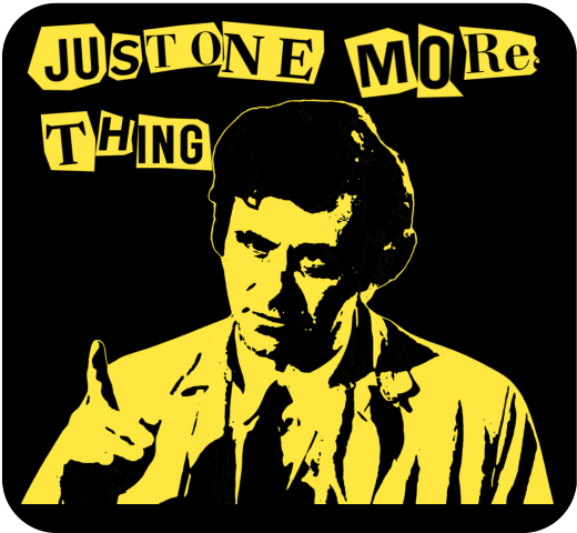
    Inspiration (left) and end result (right) for the ‘Columbo ransom note’ design.

    Columbo’s catchphrase – “just one more thing” – would arrive when he knew he had the killer and had found the weak spot in their story. That, and Columbo whistling This Old Man, were the signs that the clues were there. But had we, the viewer, seen what Columbo had seen?1

    Making the catchphrase into a ransom note makes it rather more sinister than Peter Falk would ever dream of. I had a few options of how to make the letter, the simplest is to use a ransom font such as Hit me, punk! and Fanzine. The drawback is that the letters are regular, so all the ‘a’s will look the same. So I did a slightly more complex route so I could have random shapes around the letters.

    I typed out ‘just one more thing’ in Canva, duplicated it a few times and changed the font for each repeat. There’s a mix of serif and sans-serif, to mimic headlines and banners in newspapers, then downloaded the page of text. Letter spacing is varied a bit, and I also added letters to make it possible to clip a neighbouring letter to add a bit of realism.

    Source text for the ransom note.

    I used an app in Canva called ‘choppy crop’ to roughly cut around an image. I took the page of text and, using choppy crop, cut out letters and small groups of letters to use in the final design.

    Columbo stencil

    To get the image of Columbo himself I used Inkscape. I had a go in Blender, but I fond the Inkscape image slightly better. There is a yellow outline in the Inkscape version (right, below) that sets the image off against the black background.

    Columbo ‘stencil’ done using Blender (left) and Inkscape (right). The Inkscape version took a bit longer to do, but the result is better. If I could have found a way to add a yellow outline around the Blender version, that may have been preferred.

    I’ve used this to make patent images by removing background, but the ‘Trace bitmap’ function can be used to posterise an image. In this, the colours or grey levels (you can chose which) are fitted into bands of similar shades/ colours. You can determine how many shades; to remove a white background on a black printed document you would chose two and delete the white bit. For images of people I used more; in Columbo’s case it was 19. That’s 18 for him plus one to be deleted for the background.

    With 18 layers of varying grey, you have to determine how many shades to keep yield an image that is interesting but also recognisably Peter Falk when it’s rendered as a yellow on black.

    The easy way to do that is to turn all the layers yellow, add a black background and hide the layers from ‘dark’ to ‘light’ until it looks good. In the end you’re left with black areas of shadows, yellow highlights and – if you’ve done it right – a recognisable picture.

    Video fun

    One of the more popular types of video on YouTube shows simulations of walls of blocks being smashed. I’ve done a few of these; Mrs S suggested I try to make a video with my designs on a wall that gets smashed down.

    The simulation – done in Blender – collected a few different techniques. To add some realism, I had two walls – one of bricks and one of plaster – both of which get smashed by a ball and also interact with each other. There’s dust and also some grime around the edges of the wall and dust and debris that gets thrown out.

    1. Of course, we knew who the killer was, but how did Columbo catch them? There is a theory that Columbo was actually a hopeless incompetent who only got the killer because a TV crew was there to film the murder. ↩︎
  • More meeples than you can shake a stick at

    More meeples than you can shake a stick at

    Following on from a previous post about meeple and designs featuring these things, I’ve made more meeple-related stuff for my RedBubble shop.

    As well as the da Vinci inspired designs (plain and with text), there’s a multiple meeple and a meeple of meeples.

    What’s a meeple when it’s at home?

    The meeple is an iconic figure within the board gaming community. They are a humanoid (or other-oid) playing piece that originated in the game Carcassone, but they escaped the confines of the game and now appear everywhere that board games appear.

    Wooden meeple. This is what they normally look like, used in many board games as a substitute for more decorative pieces.

    After the da Vinci ‘Vitruvian Meeple‘ design, I made a meeple of meeples and what started as just a load of meeples but ended up with a Parklife-inspired slogan.

    Meeple of Meeples

    A Meeple of Meeples. A simple-looking design that took a bit of thinking through to get right.

    I turned to Blender to make both designs. With the meeple original as a .svg (Scalable vector graphic) I imported this to Blender. After some faffing around, I created a solid meeple, ready for manipulation.

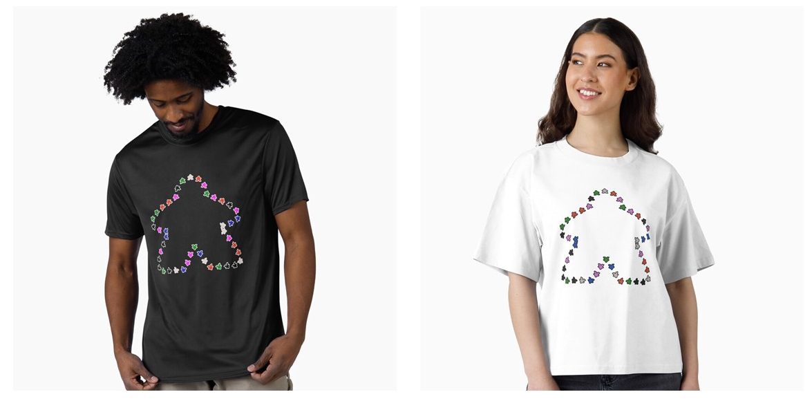
    I used a geometry nodes set-up. The original curve that I imported became the framework for the design. The solid meeple that I made is then distributed around the curve. A bit of jiggery-pokery and the meeple point outwards1. I learned how to randomise colour when I made the wizard’s workshop. I applied this technique to the 42 meeple, and the design was ready.

    The Meeple of meeples, outline of a meeple made of meeples.

    Parklife!

    There are a lot of meeple in the Parklife design. 232, to be exact.

    For a few years in the 90s, Blur’s song Parklife was everywhere. With narration by Phil Daniels, it is an ode to the joys of easy access to a public park and the importance of regular exercise. But not jogging.

    Black outline and white outline versions of the ‘Parklife’ meeple design.

    As a side note, the white outline version of this is the 100th design on the shop. Go me!

    The basic Meeple that I used for the Meeple of Meeples was used again. This time, a function called Array was used to make about 200 Meeples in an offset pattern. The same setup for random colours was the same shader node setup as for the Meeple of Meeples.

    We the Meeple

    With the 250th birthday of the USA coming up, what better way to celebrate than with a Meeple flag? Go on, name one better way!

    The Array function was my friend here, again. It’s a 9 x 7 array of Meeples with colours added to make a sort-of stars and stripes pattern.

    This flag isn’t on the Redbubble shop. Redbubble don’t do flags, so I’ve expanded to using Printify as an additional supplier and I’ve set up another shop on the WordPress site. I’ll be adding designs there over the next few weeks.

    The plan is to keep the RedBubble shop as my main site for designs, with the shop here on Grim Up North Heath for special items such as flags, bandanas and embroidered items.

    And the Village Meeple are also on the shop, but that’s another post.

    1. I will do a video to explain how all this was done. ↩︎

  • Koffein -Redbubble

    Koffein -Redbubble

    Having done a design with caffeine, I thought I’d go multilingual with a German-language version of the design.

    This is on RedBubble, so it is available on a wide range of items.

    Cartoon of a caffeine molecule with the word 'Koffein' underneath.
    The German language version of the Caffeine design. There’s some tweaks to the lighting and a change in font, but the aesthetic is the same.

    As discussed in the previous post, this uses Bauhaus, a slightly different font to Berliner that I used in the English language version. I’ve kept the same aesthetic as before, I like the ligne clair look of the cartoon and the ball and stick molecular model is a design classic that has served chemists for decades.

    The ball and stick model was first used by August Wilhelm von Hofmann in 1865, so this year is the 160th anniversary of the ball and stick model. Hofmann’s is a name familiar to all organic chemists, with several organic reactions named after him as well as a device for electrolysing water.

Verified by MonsterInsights