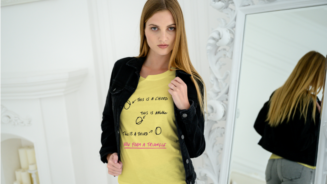
A lot of the designs I make are mashing two disparate things together. Punk and Taskmaster, pop art and Columbo, pop songs and mathematicians.

What can I mash up next?
Casablanca (1942) is often in the list of greatest films ever made. In among the intrigue, humour, double-dealing and secrecy, there is Ingrid Bergan. There is a strong case that Bergman in Casablanca is the most beautiful woman to appear on screen. She has a luminous quality in this film, grace and poise and the ability to wear even the most outrageous hat and still look gorgeous.

I had the image of Ilsa with the hat imported into Inkscape, but didn’t really know what to do with it. That was, until I saw a poster for Young Frankenstein, Mel Brooks’ 1974 comedy horror.

I’ve done a couple of punk style designs already. One featuring Columbo, the other with Alex Horne of Taskmaster.
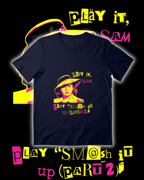
This is a posterised image using three colours. Why not see what happens if I make Ilsa’s mid-tones pink? Why pink? Because the combination of black, yellow and pink is punk.
Well, adding pink improved the image. Her eyes have some shape, the hat and her hair get some mid tones and also the fabric on the coat appears.

Caption time
Now I had to decide what caption to go for. It was clear that Ilsa would ask for a song from the early punk era, since that is the vibe of the design. But what song?
Ideally I would have gone for a song whose title has the same rhythm as “As Time Goes By” – four syllables, emphasis on the second and fourth. And it had to be reasonably well-known, at least to music fans, and not too obvious otherwise it doesn’t appeal to those in the know. Songs such as New Rose, Teenage Kicks, and Blitzkrieg Bop have the wrong rhythm. Anarchy in the UK, God Save the Queen and London Calling are all well-known.
In the end, I had a choice of three: Oh Bondage, Up Yours (X-Ray Spex), Too Drunk to Fuck (Dead Kennedys) and Smash It Up (Part 2) (The Damned). The Dead Kennedys would fall foul of RedBubble’s non-rude-things policy1, so it was one of the other two. I tried them both (see below) and plumped for The Damned, since the song name looks good and they’re an excellent band.

The font used here is mostly Drunken Hour, a ransom note font. I added a 2 in pink Gagalin (the original 2 wasn’t very clear) and the word ‘up’ is an upside-down ‘dn’ in Special Elite, the typewriter font I make a lot of use of.
Final design looks best on dark clothing.

The Damned
The Damned are one of the earliest English punk bands, they released New Rose on the 22nd October 19762. This was the first single released by a UK punk band. Note the adjective – ‘UK’ is important, because American punk acts such as Ramones (Blitzkreig Bop), New York Dolls (Personality Crisis) and Television (Little Johnny Jewel) had released singles earlier. In the case of the New York Dolls, they had released two albums and broken up3 by the time New Rose was released.

The Damned are still going, they have been doing some 50-year concerts recently and even did a gig at Wembley. They have drifted away from punk over the years and are more a rock band with gothic-horror overtones4. But they still play the very old stuff. To do otherwise wouldn’t be sensible.
Target audience for the design
I had to explain both parts of the design to our 22-year-old. Neither Casablanca nor The Damned are on their radar5. I always say that the best jokes are the ones you have to explain.
- I could have written “F@ck” or something, but I hate that type of self-censoring. Swear if you want, don’t swear if you don’t have to, but don’t allude to rude words. It’s not big and it’s not clever. ↩︎
- Link to performance on The Jonathan Ross Show in 2002, when Patricia Morrison was bassist. ↩︎
- For the first time. ↩︎
- They even appeared on The Young Ones, playing a specially-written song in the horror episode Nasty. ↩︎
- Though they do know of Patricia Morrison, since Sisters of Mercy are in their orbit. ↩︎