Tag: pop art

  • Columbo – just one more pop art design

    Columbo – just one more pop art design

    Pop art style

    I’ve blogged already about the pop art style Jessica Fletcher design. This time, I’m having a go at some Columbo designs.

    I’ve done a few designs based around Columbo, now. The first were pop art style, using a halftone filter and then colouring in the image as required. These were based on Andy Warhol prints – Shot Marilyns and the Elvis triptych.

    Two of Warhol’s best known works – Elvis and the Shot Marilyns. Also the man himself, after a close encounter with an electric socket.

    The original images for my designs were taken from a Google Image search for pictures of Peter Falk as Columbo. I used two – one full length and the other of him in the classic “Just one more thing” pose.

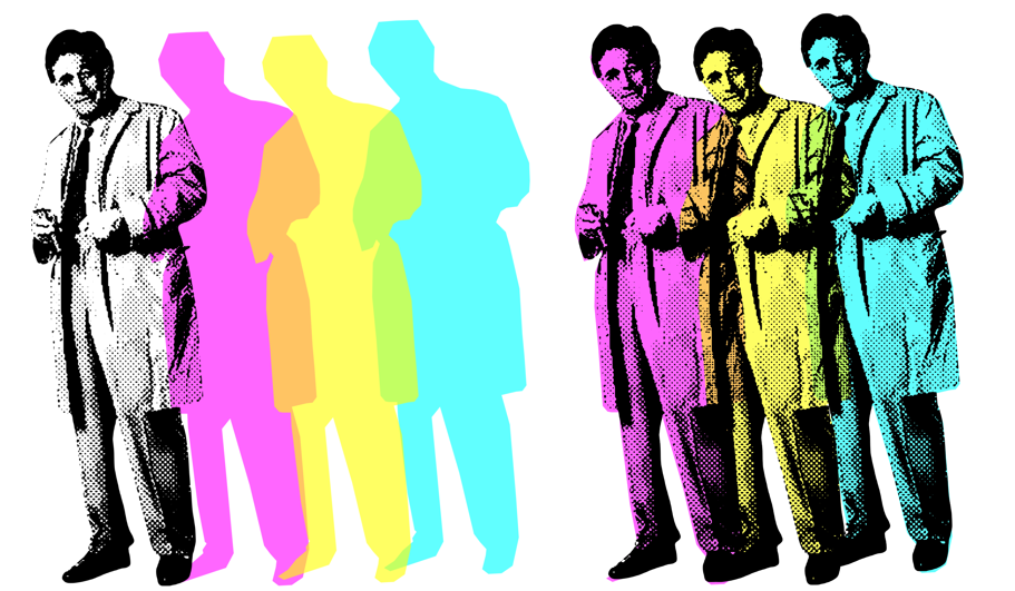
    Columbo triptych

    I processed the original full length to get the “Three Columbos” using Canva, then Inkscape. In Canva, I removed the background of the Peter Falk full-length, desatured the image (made it black and white) and then applied the “Screen” filter to make it look like an old newspaper. You end up with an image that resembles Warhol’s Elvis.

    Four Columbos, decreasing image quality.
    The journey from the original to the processed halftone image.

    I could have stopped there, I suppose. But I wanted to have an image that had three overlapping Columbos. I could do this in Canva; the ‘screened’ image is only the black dots, so it’s effectively transparent. What I also wanted, to take it a bit further, was to have coloured overlapping Columbos.

    A weakness in Canva is that I can’t find a way to make freeform shapes. I’m sure there is a way, but I’ve not found it. So I took the screened Columbo and exported it to Inkscape.

    The components used to make the Columbo triptych.
    The components used to make the Columbo triptych. The coloured parts have a flat top, this is hidden behind Falk’s hair.

    Once I had the image in Inkscape I could draw around the image and then colour in the outline. This outline was then put back into Canva, copied twice and recoloured to magenta, yellow and cyan. By making the coloured images slightly transparent, I got orange and green in the overlap.

    The black and white and the coloured versions are for sale on the RedBubble shop.

    One more thing

    The second Columbo used the same process as I used for the Jessica Fletcher design. The image was a screengrab from an early episode (I forget which one), just as he’s saying his catchphrase.

    “Just one more thing” aka “Pop art Columbo” from start to finish and also how it looks on t-shirt and mug.

    Instagram adverts

    As an alternative to the animated adverts I’ve done for Facebook, I’ve made some fancier static adverts. These will go onto Facebook and Instagram, and will also be featured in the Pinterest site I will be launching soon.

    Changing up the adverts that I use on Instagram and Facebook. This is a ‘grid’ style advert, with a model as focus and some mock-ups to go with it.
    This advert uses the artwork as the background. With small adverts – for example, a Facebook ad on a mobile – it can be hard to see any details of the design. Here, the design is blown up and overlaid with a flat t shirt mock-up.

  • If that was love…

    If that was love…

    .. turns out I’ve not been in love before.

    This design pulls together three icons of art and humour: Taskmaster, Monty Python and Andy Warhol.

    The ‘Sit on a cake’ design on a t-shirt!

    He was a different man

    I’ve written about Taskmaster before. It’s my favourite programme at the moment, the last two series (19 and 20) rank among the best. It’s got astonishing longevity; Alex Horne has hit upon a winning formula and he carefully selects groups of comedians who make a concerted effort to make the whole thing as much fun as possible.

    Back in the distant past of Series 6 (broadcast in 2018), the final task of the series asked the contestants:

    Tell the Taskmaster you love him in the most meaningful way.

    As is typical, the contestants found wildly different ways to do complete the task. Tim Vine dressed as Greg’s mum and told Greg that he is her favourite child. Russell Howard didn’t have sex with Greg’s mum. Alice Levine got a toy aeroplane to fly a meaningful message for Greg. Asim Choudhry performed a rap declaring that he wanted to have Greg’s babies.

    Three of the five attempt at the ‘show your love’ task. Alice sent a heavily caveated declaration of love, Asim said he wanted to have Greg’s babies and Tim dressed as Greg’s mum. Not shown: Russell not having sex with Mrs Davies (not very interesting) and Lisa’s go, because that’s what this section is going on to talk about.

    Lisa Tarbuck, the series champion, hit the ball out of the park with her demonstration. She asked for a large cake topped with confectioner’s custard. Then she said to Alex:

    Take yourself somewhere private and put your bare arse into it.

    And so it was that Alex took himself to the shed, pulled down his pants and, with carefully positioned cameras recording the event, sat bare-arsed on a cake.

    His expression of horror/ delight has stayed with me for years. He had an experience unlike anything he had known before and changed him. “He was a different man1,” Lisa declared.

    Alex Horne’s life changes forever. He now knows what love is and also managed to absorb a profiterole. Don’t ask how.

    An equal part of the joy of this was Lisa’s reaction. She ran away, giggling when Alex came out of the shed, dripping cake from under a strategically placed towel.

    Andy Warhol’s Shot Marilyns

    With such an image in my head, I had to do something with it. One iconic image deserves another, and there are few more iconic faces than that of Marilyn Monroe.

    Andy Warhol certainly thought so. The silkscreen collection Shot Marilyns is one of his best-known works. This isn’t the name he gave the works – he called them Marilyns and made five in total. Each had a different background colour and slightly different colouring to the face. The “Shot” addition came about when the performance artist Dorothy Podber fired a single shot through a stack of four of the paintings. Her actions – a piece of performance art that Warhol did not appreciate – earned her a lifetime ban from The Factory.

    Four of the five Marilyn paintings that Andy Warhol made in 1964.

    Whether you’re a fan of pop art and the world of Andy Warhol, the colourful images of one of the greatest film starts of the 1950s, you can’t deny the paintings are memorable.

    I tribute to this, I found a way to make images in a similar manner to the Marilyns. Using this method, I made my own set of images of Little Alex Horne’s face.

    A triptych of Little Alex Horne – “Shocked Alex” – as he experiences love for the first time.

    I quite like the triptych as it is. For the final design that uses the ‘four images’ presentation that is often used for these paintings, I wanted some words to go with the image.

    Monty Python’s very rude song

    In one of my first blog posts2 I talked about what makes me laugh. Monty Python is firmly in that camp, especially when they get silly.

    The title of this section is a bit misleading. Python did a number of rude songs – the Not Noël Coward song from Meaning of Life springs to mind – but Sit on my Face is probably the rudest of all.

    If you’re easily offended, don’t go looking for it.

    However, the sentiment from the Python’s song and the sentiment from Lisa Tarbuck’s demonstration of love can find middle ground. A middle ground that, with a little tweaking, can enhance the four images of shocked Alex.

    The ‘Sit on a cake’ design on a t-shirt!
    1. This was also the episode title. ↩︎
    2. There’s an updated version with a few examples of stuff I think is funny. ↩︎

Verified by MonsterInsights