Tag: Heath Way Prints

  • Just one more Minimalist Columbo

    Just one more Minimalist Columbo

    I’ve been exploring Inkscape a bit more recently. On the back of the pop art images I did previously for Columbo and Murder, She Wrote, I found that I can replace a photograph with an unshaded version with a restricted colour palette.

    Columbo and Blender

    I’ve had a lot of fun with the image of Columbo saying ‘one more thing’. There’s a pop art version, and I also made a minimalist version in Inkscape. What I also did with this one is play around in Blender.

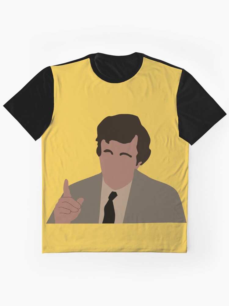
    Minimalist Columbo on a mustard background. This colour fits the 70s aesthetic that the show embodies.

    Inkscape’s native file format is .svg (scalable vector graphics). This type of file is scalable (as the name says) which means the image will not be degraded by being enlarged. However, it needs certain types of software to produce images from. For this reason, when I make something in Inkscape I have to export it as a .png file for use in other software.

    Blender, though, has the capacity to import .svg files for use in 3D designs. One of the first things I did in Blender that I blogged about was importing a beer logo and mucking around with the colours and the refractive index of the glass.

    The Columbo file from Inkscape has seven individual pieces – one for each part of Columbo (hair, face, raincoat, hand, shirt, tie and the lines for his hands). These seven object could be coloured and animated as separate objects.

    With animation there’s a huge choice of what paths an object can take, I can scale the object as it moves and change the colour as well. But I wanted this to be a simple animation, in part taking inspiration from TV station idents such as ATV, where the logo would appear. So the parts start off invisible, thin edge to the camera and then turn on various axes to show the hair, face and clothes. The hand is the last thing to come in, from one side as if remonstrating with the criminal.

    Video advert

    I’ve not done one of these for a while. Taking the animation I did for the Columbo Minimalist design, I used CapCut to make a short advert. The advert is bookended with the animation above and the ‘cloth reveal‘ animation I made some time ago.

    Three products are shown – two t-shirts (a ‘lay-flat’ and modelled version), a cushion and a tote bag. The tote bag animation was something I had the idea for and then wished I hadn’t.

    The static image of the tote bag isn’t very exciting, however much I like the Columbo image against the mustard background. So to add a little interest I thought I could use Blender to make a realistic swinging animation. I was right on that, wrong on how easy it was going to be.

    But, I did it after a couple of hours thinking ‘why the hell did I start this?’ It’s a thin cube with the image from RedBubble projected onto it. The cube is given physics and a hole at the top. This is off-screen, where the handles of the bag would go over a peg. There is a cylinder through the hole, around which the bag swings.

    All fairly simple in concept, but I had to do quite a lot of fiddling around with various settings – including how much air drag was involved – to get a nice, slow swing.

    For the final video, I added a background scene to all the images except the pillow. The scene is a postcard from the 1970s of Moscow, Idaho. With a Sears store and a Chevy pick-up, it could only be America and the colour quality spoke of the 1970s.

  • Return to Cabot Cove – murder capital of the world!

    Return to Cabot Cove – murder capital of the world!

    Cabot Cove, Maine, USA, witnessed a murder spree like no other from 1984 to 1996. 64 murders in a population of 3,500 puts it above any place in the USA in terms of murder rate1. But who was really to blame?

    Murder, She Wrote

    I’ve blogged before about Murder, She Wrote, the detective series that starred Angela Lansbury as the successful mystery writer Jessica “JB” Fletcher.

    We like to joke that Jessica is the real killer in all the episodes and manages to frame some poor schmuck who is gaslit into confessing. I made a design that celebrates Murder, She Wrote and uses a snowclone to explain this.

    ‘Cabot Cove is calling’ design.

    Snowclones

    There is a rhetorical device that you will be familiar with, but may not know the name of: the snowclone. These are sayings where the sentence format is well known enough that the subject can be changed2. For example:

    Orange is the new black

    In space, nobody can see you boogie

    Have spacesuit, will travel

    Horsey McHorseface

    A phrase I’ve seen on a lot of t shirts is a variation on the original “The mountains are calling, and I must go.” This comes from a letter the naturalist and mountaineer John Muir wrote to his sister, Sarah, in 1873. On t shirts, ‘the mountains’ is replaced by Australia, London, Lagos, the ocean, adventure… anywhere, really.

    The design

    This is a simple enough design. It features an image of Angela Lansbury as Jessica, a New England-type scene in the background and the phase ‘Cabot Cove is calling and I must kill’.

    The font choice was the main sticking point. I’ve used Badhorse here, though I used Art Nuvo in the previous Murder She Wrote design. The show itself used Art Gothic, but that’s not available in Canva.

    The ‘Cabot Cove’ t shirt, modelled by the model I think of as Ryan.

    I’ve added a white outline to some of the designs to help it stand out against some backgrounds. As it is, it works well with light backgrounds, but I like a colour on things like mousemats and phone cases, so a white outline and a default sky blue background is what I’ve gone with.

    1. Above anywhere in the world. The Turks and Caicos Islands have a homicide rate of 76 per 100,000 inhabitants. For the twelve years of Jessica’s spree, that figure was 143 per 100,000 in Cabot Cove. ↩︎
    2. According to Wikipedia, they are a phrasal template based on a cliché. They are both memes and clichés. ↩︎
  • Holding Columbo to ransom

    Holding Columbo to ransom

    I’ve been exploring Inkscape a bit more recently. On the back of the pop art images I did previously for Columbo and Murder, She Wrote, I found that I can take an image and posterise it using Inkscape. I’d already done this using Blender, to make a Jason Mantzoukas / Taskmaster design (which I realise I haven’t blogged about) to celebrate his energy in Season Series 19. I wanted to see what Inkscape could do. But what to make?

    Posterised image of Jason Mantzoukas from Taskmaster Series 19.

    Ransom note

    Looking around for inspiration, I had a found some Punk aesthetic boards on Pinterest. One, a poster for Blondie from 1976, popped out. This might not be an original image, but the aesthetic and the colouring – vivid yellow on black – are what drew me to it. The ‘ransom note’ style is also seen in the merch of punk and indie bands to give a home-made feel to posters, fanzines and other advertising.

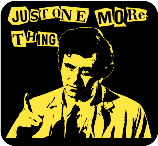
    Inspiration (left) and end result (right) for the ‘Columbo ransom note’ design.

    Columbo’s catchphrase – “just one more thing” – would arrive when he knew he had the killer and had found the weak spot in their story. That, and Columbo whistling This Old Man, were the signs that the clues were there. But had we, the viewer, seen what Columbo had seen?1

    Making the catchphrase into a ransom note makes it rather more sinister than Peter Falk would ever dream of. I had a few options of how to make the letter, the simplest is to use a ransom font such as Hit me, punk! and Fanzine. The drawback is that the letters are regular, so all the ‘a’s will look the same. So I did a slightly more complex route so I could have random shapes around the letters.

    I typed out ‘just one more thing’ in Canva, duplicated it a few times and changed the font for each repeat. There’s a mix of serif and sans-serif, to mimic headlines and banners in newspapers, then downloaded the page of text. Letter spacing is varied a bit, and I also added letters to make it possible to clip a neighbouring letter to add a bit of realism.

    Source text for the ransom note.

    I used an app in Canva called ‘choppy crop’ to roughly cut around an image. I took the page of text and, using choppy crop, cut out letters and small groups of letters to use in the final design.

    Columbo stencil

    To get the image of Columbo himself I used Inkscape. I had a go in Blender, but I fond the Inkscape image slightly better. There is a yellow outline in the Inkscape version (right, below) that sets the image off against the black background.

    Columbo ‘stencil’ done using Blender (left) and Inkscape (right). The Inkscape version took a bit longer to do, but the result is better. If I could have found a way to add a yellow outline around the Blender version, that may have been preferred.

    I’ve used this to make patent images by removing background, but the ‘Trace bitmap’ function can be used to posterise an image. In this, the colours or grey levels (you can chose which) are fitted into bands of similar shades/ colours. You can determine how many shades; to remove a white background on a black printed document you would chose two and delete the white bit. For images of people I used more; in Columbo’s case it was 19. That’s 18 for him plus one to be deleted for the background.

    With 18 layers of varying grey, you have to determine how many shades to keep yield an image that is interesting but also recognisably Peter Falk when it’s rendered as a yellow on black.

    The easy way to do that is to turn all the layers yellow, add a black background and hide the layers from ‘dark’ to ‘light’ until it looks good. In the end you’re left with black areas of shadows, yellow highlights and – if you’ve done it right – a recognisable picture.

    Video fun

    One of the more popular types of video on YouTube shows simulations of walls of blocks being smashed. I’ve done a few of these; Mrs S suggested I try to make a video with my designs on a wall that gets smashed down.

    The simulation – done in Blender – collected a few different techniques. To add some realism, I had two walls – one of bricks and one of plaster – both of which get smashed by a ball and also interact with each other. There’s dust and also some grime around the edges of the wall and dust and debris that gets thrown out.

    1. Of course, we knew who the killer was, but how did Columbo catch them? There is a theory that Columbo was actually a hopeless incompetent who only got the killer because a TV crew was there to film the murder. ↩︎
  • How to turn an idea into fake reality?

    How to turn an idea into fake reality?

    I think I’m getting better at doing stuff with Blender. One of the side effects of this is that I can think about Blender’s capabilities and apply them to designs and animations that I can use in the Heath Way Prints shop and as adverts for the shop.

    Turning blocks

    The sketch below is from my notebook1. I did this one evening and set about making it the next day. It took a few hours of a day I’d have otherwise spent doing the crossword2, watching the Tour de France3 or interacting with my family.

    Notes on the construction of the ‘six cubes’ workshop animation.

    I knew I could do the animation. However, some of the ‘how to’ bits needed me to dive back into the University of YouTube. In particular, the use of Drivers to simplify the animation needed a refresh.

    Blender Drivers

    Put simply, a Driver is an object that affect another object in an animation. For this animation, I had two drivers. One driver rotated 90° back and forth. The angle of this controls the position of four of the cubes, just as a real mechanical lever might. The second rotated through 360° throughout the animation. The angle of this driver’s rotation controlled the rotation of all six cubes.

    The video below shows how drivers work.

    Driver demo. I’ve animated the red cube to go up and down. The blue cube turns as the red cube moves, and the colour of the third cube also changes. You can control many different objects from one object. Not sure of the limit, but the six I’m using in the turning cubes design is well inside the capability of Blender.

    The animation of the drivers controls the movement of the cubes. Setting up the drivers makes timing the animation simpler than animating each cube individually.

    Display board images

    If you can decipher my writing, you’ll see that I planned to have one big image with four design adverts on to be displayed. I made the single image with four designs in Canva. The fiddly bit was making sure the faces on the cubes matched the parts of the image that had to show. This took a while to get right, but I plan to use this setup a few times, so it’s worthwhile making the effort.

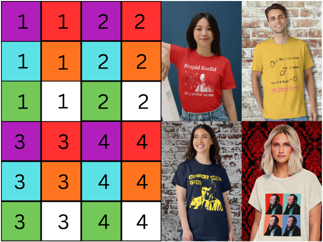
    Each face of the six cubes is mapped to an area of the image. To set this up I made a grid with numbers and colours to stand in for the final image. I made sure each face that needed one had the right part of the right image in the right orientation, after which I could substitute the image I wanted to use for the advert.

    Calibration grid (left) and the four images that show on the cubes once they are rotated in place.

    Put it all together

    There’s a few extra bits I added to make it look like an item that’s been installed long-term in a workshop environment. Some grime, a bit of background noise and camera shake. Ferrules cover the holes where the rods at the top and bottom of the unit go into the floor and upper display. This is to hide the otherwise odd-looking holes where the rods disappear. It also gave objects for the grime to collect against.

    Future stuff

    Other things to add might be a lever in front or to on side of the cage and a control knob that turns to show which cube is being shown. But that’s for the future.

    1. Yes, that really is my handwriting. You won’t think of anything to say about it that I haven’t heard over the last 50 years. ↩︎
    2. This week’s Private Eye crossword is giving me trouble. ↩︎
    3. I can’t get used to the Channel 5 commentary. Rob Hatch leaning into the pronunciation of French and Spanish names is a big distraction. ↩︎

  • Columbo – just one more pop art design

    Columbo – just one more pop art design

    Pop art style

    I’ve blogged already about the pop art style Jessica Fletcher design. This time, I’m having a go at some Columbo designs.

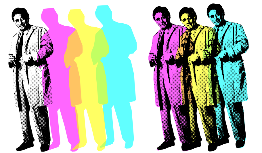
    I’ve done a few designs based around Columbo, now. The first were pop art style, using a halftone filter and then colouring in the image as required. These were based on Andy Warhol prints – Shot Marilyns and the Elvis triptych.

    Two of Warhol’s best known works – Elvis and the Shot Marilyns. Also the man himself, after a close encounter with an electric socket.

    The original images for my designs were taken from a Google Image search for pictures of Peter Falk as Columbo. I used two – one full length and the other of him in the classic “Just one more thing” pose.

    Columbo triptych

    I processed the original full length to get the “Three Columbos” using Canva, then Inkscape. In Canva, I removed the background of the Peter Falk full-length, desatured the image (made it black and white) and then applied the “Screen” filter to make it look like an old newspaper. You end up with an image that resembles Warhol’s Elvis.

    Four Columbos, decreasing image quality.
    The journey from the original to the processed halftone image.

    I could have stopped there, I suppose. But I wanted to have an image that had three overlapping Columbos. I could do this in Canva; the ‘screened’ image is only the black dots, so it’s effectively transparent. What I also wanted, to take it a bit further, was to have coloured overlapping Columbos.

    A weakness in Canva is that I can’t find a way to make freeform shapes. I’m sure there is a way, but I’ve not found it. So I took the screened Columbo and exported it to Inkscape.

    The components used to make the Columbo triptych.
    The components used to make the Columbo triptych. The coloured parts have a flat top, this is hidden behind Falk’s hair.

    Once I had the image in Inkscape I could draw around the image and then colour in the outline. This outline was then put back into Canva, copied twice and recoloured to magenta, yellow and cyan. By making the coloured images slightly transparent, I got orange and green in the overlap.

    The black and white and the coloured versions are for sale on the RedBubble shop.

    One more thing

    The second Columbo used the same process as I used for the Jessica Fletcher design. The image was a screengrab from an early episode (I forget which one), just as he’s saying his catchphrase.

    “Just one more thing” aka “Pop art Columbo” from start to finish and also how it looks on t-shirt and mug.

    Instagram adverts

    As an alternative to the animated adverts I’ve done for Facebook, I’ve made some fancier static adverts. These will go onto Facebook and Instagram, and will also be featured in the Pinterest site I will be launching soon.

    Changing up the adverts that I use on Instagram and Facebook. This is a ‘grid’ style advert, with a model as focus and some mock-ups to go with it.
    This advert uses the artwork as the background. With small adverts – for example, a Facebook ad on a mobile – it can be hard to see any details of the design. Here, the design is blown up and overlaid with a flat t shirt mock-up.

  • More meeples than you can shake a stick at

    More meeples than you can shake a stick at

    Following on from a previous post about meeple and designs featuring these things, I’ve made more meeple-related stuff for my RedBubble shop.

    As well as the da Vinci inspired designs (plain and with text), there’s a multiple meeple and a meeple of meeples.

    What’s a meeple when it’s at home?

    The meeple is an iconic figure within the board gaming community. They are a humanoid (or other-oid) playing piece that originated in the game Carcassone, but they escaped the confines of the game and now appear everywhere that board games appear.

    Wooden meeple. This is what they normally look like, used in many board games as a substitute for more decorative pieces.

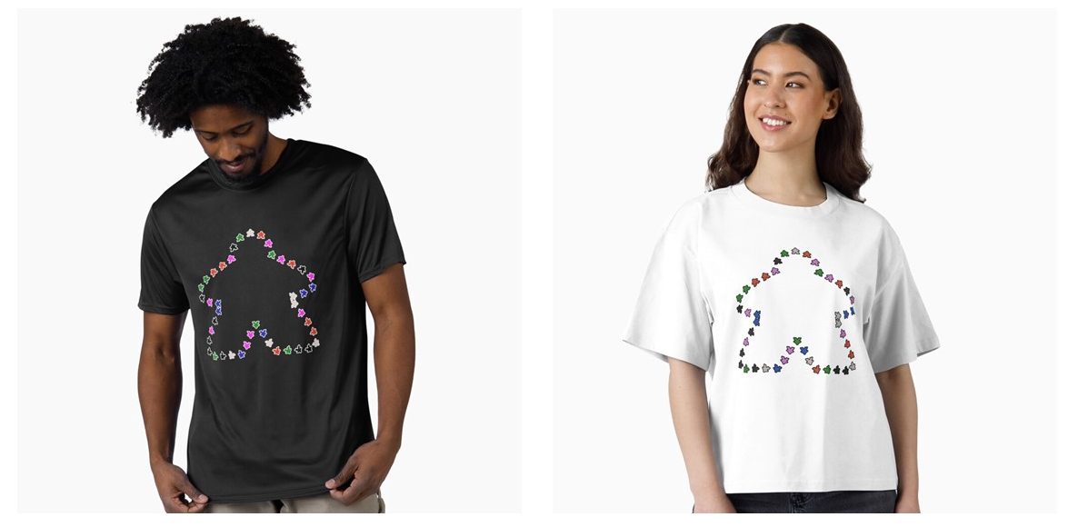
    After the da Vinci ‘Vitruvian Meeple‘ design, I made a meeple of meeples and what started as just a load of meeples but ended up with a Parklife-inspired slogan.

    Meeple of Meeples

    A Meeple of Meeples. A simple-looking design that took a bit of thinking through to get right.

    I turned to Blender to make both designs. With the meeple original as a .svg (Scalable vector graphic) I imported this to Blender. After some faffing around, I created a solid meeple, ready for manipulation.

    I used a geometry nodes set-up. The original curve that I imported became the framework for the design. The solid meeple that I made is then distributed around the curve. A bit of jiggery-pokery and the meeple point outwards1. I learned how to randomise colour when I made the wizard’s workshop. I applied this technique to the 42 meeple, and the design was ready.

    The Meeple of meeples, outline of a meeple made of meeples.

    Parklife!

    There are a lot of meeple in the Parklife design. 232, to be exact.

    For a few years in the 90s, Blur’s song Parklife was everywhere. With narration by Phil Daniels, it is an ode to the joys of easy access to a public park and the importance of regular exercise. But not jogging.

    Black outline and white outline versions of the ‘Parklife’ meeple design.

    As a side note, the white outline version of this is the 100th design on the shop. Go me!

    The basic Meeple that I used for the Meeple of Meeples was used again. This time, a function called Array was used to make about 200 Meeples in an offset pattern. The same setup for random colours was the same shader node setup as for the Meeple of Meeples.

    We the Meeple

    With the 250th birthday of the USA coming up, what better way to celebrate than with a Meeple flag? Go on, name one better way!

    The Array function was my friend here, again. It’s a 9 x 7 array of Meeples with colours added to make a sort-of stars and stripes pattern.

    This flag isn’t on the Redbubble shop. Redbubble don’t do flags, so I’ve expanded to using Printify as an additional supplier and I’ve set up another shop on the WordPress site. I’ll be adding designs there over the next few weeks.

    The plan is to keep the RedBubble shop as my main site for designs, with the shop here on Grim Up North Heath for special items such as flags, bandanas and embroidered items.

    And the Village Meeple are also on the shop, but that’s another post.

    1. I will do a video to explain how all this was done. ↩︎

  • What’s new in the shop?

    What’s new in the shop?

    Recently, I updated the Facebook site and the Wix site. I designed a new banner for the shops to showcase recent designs. What I haven’t done for a while is make a new advert. But I fixed that.

    Previous adverts only had a few designs on them. This time I think I put twelve designs on, because I decided to re-use some of the videos I made a while ago and I have learned a few more tricks in CapCut.

    New banner

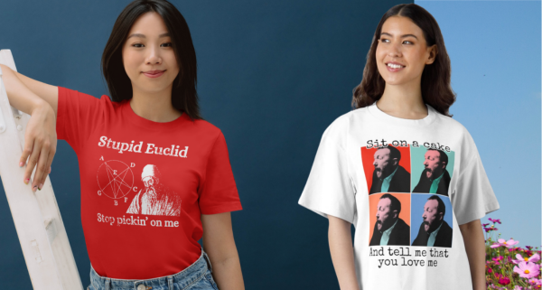
    This features four recent designs: One disc golf, the Vitruvian Meeple, “Stupid Euclid, stop pickin’ on me”, and “Sit on a Cake“.

    It’s only now that I’m doing this post that I realise I’ve not blogged about disc golf1. That will have to change2. I also know I’ve not written about the ‘Stupid Euclid’ design; that’s because I only completed it yesterday.

    Stupid Euclid

    The inspiration for this is pretty obvious – there’s a song from 1958 sung by Connie Francis called Stupid Cupid. Cupid and Euclid sort of rhyme. But where does an ancient Greek Philosopher, the father of geometry, come into it?

    I’m not unique in having done maths at school; it’s a compulsory subject. I took it further than most, I studied it for A level. I did OK, but I realised early on that I don’t have a maths brain. For those who do, maths lessons are an exercise in being shown the obvious. For me, I could do calculus and learned how to use the chain rule, differentiation by parts, I got the hang of surds quickly enough. But it was never a natural thing, as it is for my brother3 and oldest child4. It was more like following a recipe than knowing how to cook something.

    So Euclid, the man whose “Elements” is the oldest textbook that is still useful, personifies the trials of maths and gets to be the target for this design (white printing – black printing also available).

    Designs in the video

    Old and new designs – Game over, Outpaced by snails, Caffeine!, Blue neon meeple, “I will not be shushed” and “How did that get there?” sticker.
    Further designs – small disc golf, Quinoa and fist, ‘Sit on a cake’, Thinking about disc golf, Vitruvian Meeple and ‘Stupid Euclid’.

    I’ve blogged about some of these designs, and will write about others that I’ve missed. The Game Over design is one of my favourites; the How did that get there is popular, as is the Sit on a cake – both part of the growing Taskmaster collection.

    1. It’s like ball golf, but you throw frisbees at a basket instead of hitting a ball into a hole with a stick. ↩︎
    2. Although I’ve done a pretty full summary of the sport in the previous footnote. ↩︎
    3. Who’s a maths lecturer. ↩︎
    4. Who is about to start a Masters in Mathematics. ↩︎
  • Easy boiled fruit cake recipe

    Easy boiled fruit cake recipe

    A boiled fruit loaf, perfect with tea or to fill up the corners1 after dinner.

    Eat the cake, buy the apron!

    Ingredients

    225 g self-raising flour

    175 g soft brown sugar

    500 g mixed dried fruit and peel

    125 g unsalted buter

    225 ml tea (or water)

    2 teaspoons mixed spice

    ½ teaspoon bicarb

    2 eggs (beaten)

    Method

    Line a loaf tin with parchment paper

    Melt the butter and the sugar with the tea2 in a large saucepan. Add the dried fruit and peel, then boil gently3 for about ten minutes to let the fruit rehydrate.

    Fruit, sugar, butter and tea boiling gently. This rehydrates the fruit and lets it absorb the flavour of the tea.

    Remove from the heat and allow to cool.

    Preheat the oven: 140 °C (fan), gas mark 3.

    Tip the flour, mixed spice and bicarb into a bowl. Add a pinch of salt and the cooled fruit mixture. Stir well.

    Flour, bicarbonate of soda, mixed spice and a little salt.

    Add the eggs and mix in.

    Finished batter and the prepared loaf tin. I used premade loaf tin liners because cutting and folding parchment to fit is a right faff.

    Pour the batter into the prepared loaf tin and bake for about 50 minutes. It’s done when a skewer comes out clean.

    It’s had 30 minutes, needs longer.

    Leave in the tin for ten minutes to cool a bit before turning it out to cool properly on a baking rack.

    Serve sliced by itself, spread with butter, or with some strong cheese.

    Finished fruit cake.

    Have it on an apron!

    This might be unusual, but you can also have the recipe on a apron, from the Heath Way Prints shop.

    Fruit cake recipe on an apron. Can you spot the spelling mistake? I didn’t!

    I did the design work in Canva. The cartoon of the cake is the photo above rendered by AI. I don’t normally use AI for design work, but this saved some time and it’s my original photo so no copyright issues.

    You can also get the recipe on a t-shirt or art prints, if you like! Just click on the buttons to go to the shop.

    Nutritional advice

    Serving size: Slice
    Servings: 8
    Amount per serving 
    Calories520
    % Daily Value*
    Total Fat 15.7g20%
    Saturated Fat 8.9g44%
    Cholesterol 127mg42%
    Sodium 223mg10%
    Total Carbohydrate 92.6g34%
    Dietary Fiber 3.1g11%
    Total Sugars 58.5g 
    Protein 8.1g 
    Vitamin D 18mcg88%
    Calcium 155mg12%
    Iron 3mg17%
    Potassium 593mg13%
    1. From The Lord of the Rings after the main feast for Bilbo’s 111st birthday party, guests were “at that delightful stage which they called ‘filling up the corners’. They were sipping their favourite drinks and nibbling at their favourite dainties.” ↩︎
    2. Choose whatever tea you like. I used PG Tips since that is what we drink. Earl Grey would add its own particular flavour to the cake. If you’re daring, go for something smoky like lapsang souchong or perhaps a green tea for variety. ↩︎
    3. Hence the description of the recipe as a ‘boiled fruit cake’. You don’t boil the cake. Only an idiot would think that. ↩︎
  • If that was love…

    If that was love…

    .. turns out I’ve not been in love before.

    This design pulls together three icons of art and humour: Taskmaster, Monty Python and Andy Warhol.

    The ‘Sit on a cake’ design on a t-shirt!

    He was a different man

    I’ve written about Taskmaster before. It’s my favourite programme at the moment, the last two series (19 and 20) rank among the best. It’s got astonishing longevity; Alex Horne has hit upon a winning formula and he carefully selects groups of comedians who make a concerted effort to make the whole thing as much fun as possible.

    Back in the distant past of Series 6 (broadcast in 2018), the final task of the series asked the contestants:

    Tell the Taskmaster you love him in the most meaningful way.

    As is typical, the contestants found wildly different ways to do complete the task. Tim Vine dressed as Greg’s mum and told Greg that he is her favourite child. Russell Howard didn’t have sex with Greg’s mum. Alice Levine got a toy aeroplane to fly a meaningful message for Greg. Asim Choudhry performed a rap declaring that he wanted to have Greg’s babies.

    Three of the five attempt at the ‘show your love’ task. Alice sent a heavily caveated declaration of love, Asim said he wanted to have Greg’s babies and Tim dressed as Greg’s mum. Not shown: Russell not having sex with Mrs Davies (not very interesting) and Lisa’s go, because that’s what this section is going on to talk about.

    Lisa Tarbuck, the series champion, hit the ball out of the park with her demonstration. She asked for a large cake topped with confectioner’s custard. Then she said to Alex:

    Take yourself somewhere private and put your bare arse into it.

    And so it was that Alex took himself to the shed, pulled down his pants and, with carefully positioned cameras recording the event, sat bare-arsed on a cake.

    His expression of horror/ delight has stayed with me for years. He had an experience unlike anything he had known before and changed him. “He was a different man1,” Lisa declared.

    Alex Horne’s life changes forever. He now knows what love is and also managed to absorb a profiterole. Don’t ask how.

    An equal part of the joy of this was Lisa’s reaction. She ran away, giggling when Alex came out of the shed, dripping cake from under a strategically placed towel.

    Andy Warhol’s Shot Marilyns

    With such an image in my head, I had to do something with it. One iconic image deserves another, and there are few more iconic faces than that of Marilyn Monroe.

    Andy Warhol certainly thought so. The silkscreen collection Shot Marilyns is one of his best-known works. This isn’t the name he gave the works – he called them Marilyns and made five in total. Each had a different background colour and slightly different colouring to the face. The “Shot” addition came about when the performance artist Dorothy Podber fired a single shot through a stack of four of the paintings. Her actions – a piece of performance art that Warhol did not appreciate – earned her a lifetime ban from The Factory.

    Four of the five Marilyn paintings that Andy Warhol made in 1964.

    Whether you’re a fan of pop art and the world of Andy Warhol, the colourful images of one of the greatest film starts of the 1950s, you can’t deny the paintings are memorable.

    I tribute to this, I found a way to make images in a similar manner to the Marilyns. Using this method, I made my own set of images of Little Alex Horne’s face.

    A triptych of Little Alex Horne – “Shocked Alex” – as he experiences love for the first time.

    I quite like the triptych as it is. For the final design that uses the ‘four images’ presentation that is often used for these paintings, I wanted some words to go with the image.

    Monty Python’s very rude song

    In one of my first blog posts2 I talked about what makes me laugh. Monty Python is firmly in that camp, especially when they get silly.

    The title of this section is a bit misleading. Python did a number of rude songs – the Not Noël Coward song from Meaning of Life springs to mind – but Sit on my Face is probably the rudest of all.

    If you’re easily offended, don’t go looking for it.

    However, the sentiment from the Python’s song and the sentiment from Lisa Tarbuck’s demonstration of love can find middle ground. A middle ground that, with a little tweaking, can enhance the four images of shocked Alex.

    The ‘Sit on a cake’ design on a t-shirt!
    1. This was also the episode title. ↩︎
    2. There’s an updated version with a few examples of stuff I think is funny. ↩︎

  • If Leonardo da Vinci played board games

    If Leonardo da Vinci played board games

    Meet the Meeple

    The meeple is an iconic object within the board gaming community. They are a stylised humanoid figures, used as a playing piece in board games. Slightly fancier than the pieces we used in Cludeo all those years ago, but not much.

    I’ve taken the outline of the Meeple and made a version of Leonardo da Vinci’s ‘Vitruvian Man‘, and called it ‘Vitruvian Meeple’. It’s available as a t-shirt and printed on other things (click the button to go to the shop).

    White print Vitruvian meeple on black t-shirt.
    Black print Vitruvian meeple on white t-shirt.

    Meeple differ wildly from the pieces used in role playing games, which are detailed metal sculptures and often carefully painted by players.

    Painted figures, as used in table top role playing games. You wouldn’t normally see such models used in board games. No reason you couldn’t, though.

    The design came to me after I’d spent a day at a board games convention in Worthing. My main reason for going was to get inspiration and to see if there were any other people selling printed goods to board game enthusiasts. I’d seen the meeple design before, and it has been used on t-shirts. I don’t want to do things that someone else has already done, so I know what to avoid.

    Design process

    The idea of the Vitruvian Meeple came to me while I was sketching out another idea – The Village Meeple – so I sketched the idea (see below).

    Original sketch for the Vitruvian Meeple.

    I used Inkscape to do the design after I tried to get the design made in Canva and Blender. With Inkscape I could control and edit curves a bit more easily than in either of the other two apps. Colour changes are easy, too, so I could do the design in black, white, or any other colour for a good contrast if I want to specify a t-shirt colour.

    Adding a circle (actually an ellipse, the meeple dimensions aren’t perfect) and a square was easy enough, then all I had to do was export it and do the keywords and description in RedBubble. I still find these bits difficult to do, I don’t like relying on AI to do this.

    I may do another version with reverse script above and below to make it look more like the da Vinci original. This will be the deluxe version.

    And as for The Village Meeple? Watch this space…

    Coming soon – The Village Meeple!
Verified by MonsterInsights