Tag: Etsy shop

  • Philo Farnsworth

    Philo Farnsworth

    Electronics pioneer – celebrated with a new t-shirt design!

    Young female model wearing the new T-shirt design discussed in the blog post. She is standing outside a modern building.
    Mock-up of a model wearing the black version of the Farnsworth fusion patent image.

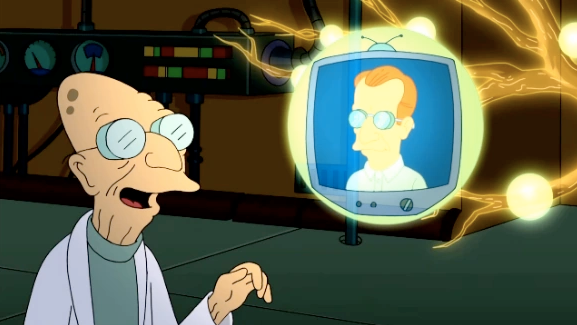
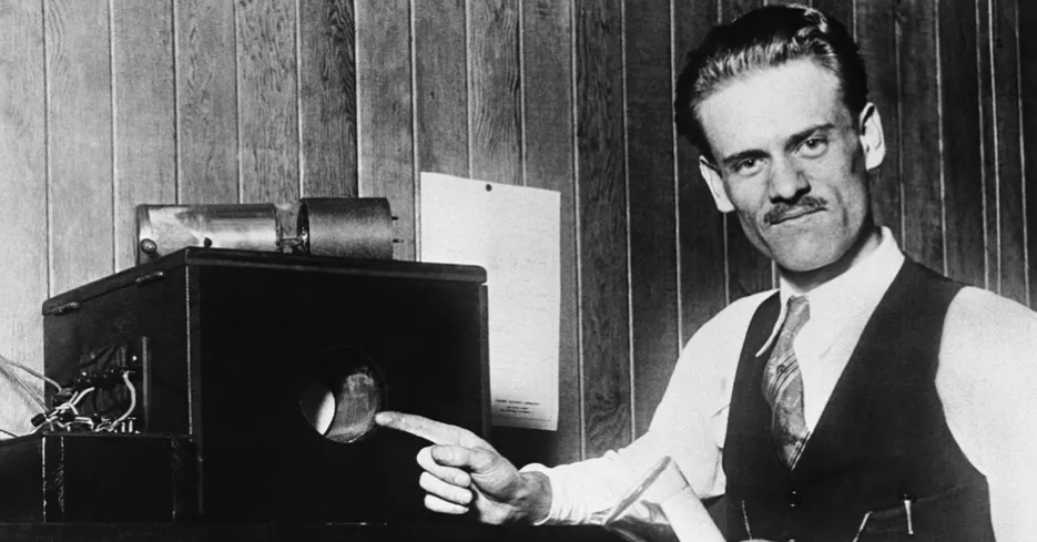
    Philo T Farnsworth (1906 -1971) is likely best known for two things. First, he was the inventor of the fully electronic display which is the basis of cathode ray tubes – he invented the all-electronic television1. Second, his name is the inspiration for Prof Farnsworth from Futurama.

    Cartoon image of Prof Farnsworth - a very old man - looking at a floating futuristic television with his namesake, Philo Farnsworth, show on the screen.
    Hubert J. Farnsworth off of Futurama. He is the 160-year-old nephew thirty times removed of the protagonist, Philip J. Fry.

    What’s less well known is his work on nuclear fusion.

    Biography

    Born on a farm in Utah, he was by any measure a genius. Some people express surprise that the son of a farmer could be the man who invented television, but then he had the sort of mind that makes the best of the opportunities presented to him. The farm his family moved to happened to have some disused electrical equipment which he was free to investigate. From this and with a like-minded friend he learned about electronics and electricity and became one of the pioneers of what was, in the 1920s, a young field.

    Black and white photo of Philo Farnsworth and one of his very early televisions. The screen is about 10 cm in diameter.
    Philo Farnsworth pointing at his most famous invention, the electronic television screen.

    Electronics and electrical power

    Like all geniuses, Farnsworth didn’t concentrate on one invention. By the time he died in 1971 he had patents in several fields, including light sensors, amplifiers and nuclear fusion.

    His work on fusion reactors didn’t result in limitless free energy, as you may have noticed. But the reactor has had applications for the generation of neutrons. Why do we need neutrons? Most of us don’t need them, which is why they don’t sell them as such at Waitrose2. However, they are needed in nuclear power, medical neutron radiography, material inspection and to stimulate gamma radiation among other things.

    Black and white patent image of a nuclear fusion reactor, invented by Philo Farnsworth in 1968.
    Image from US patent 3386883, Philo Farnsworth’s Nuclear Fusion apparatus.

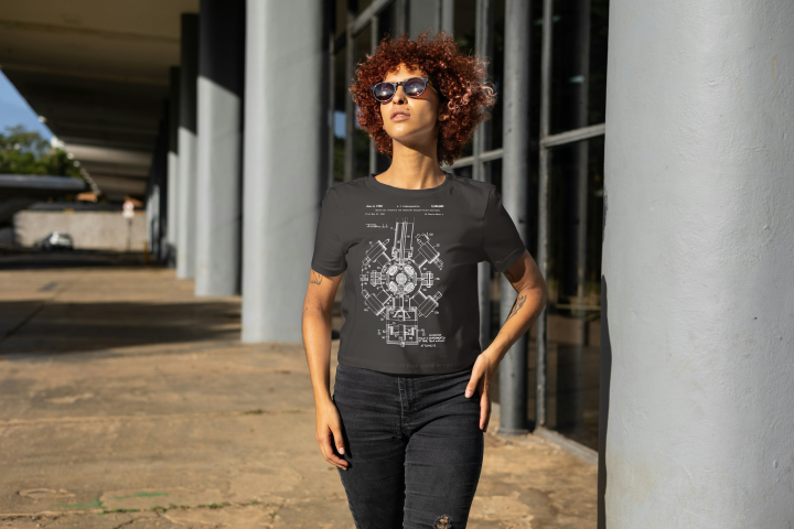
    The exact model shown in the t-shirt design, the Farnsworth-Hirsch fusor – is no longer used. After over 50 years, it should be assumed that progress has been made in this field, and indeed there has. Benchtop fusors have been made for demonstration purposes and there is a fusor hobbyist network whose website has far more information on these devices.

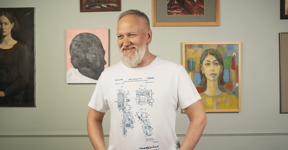
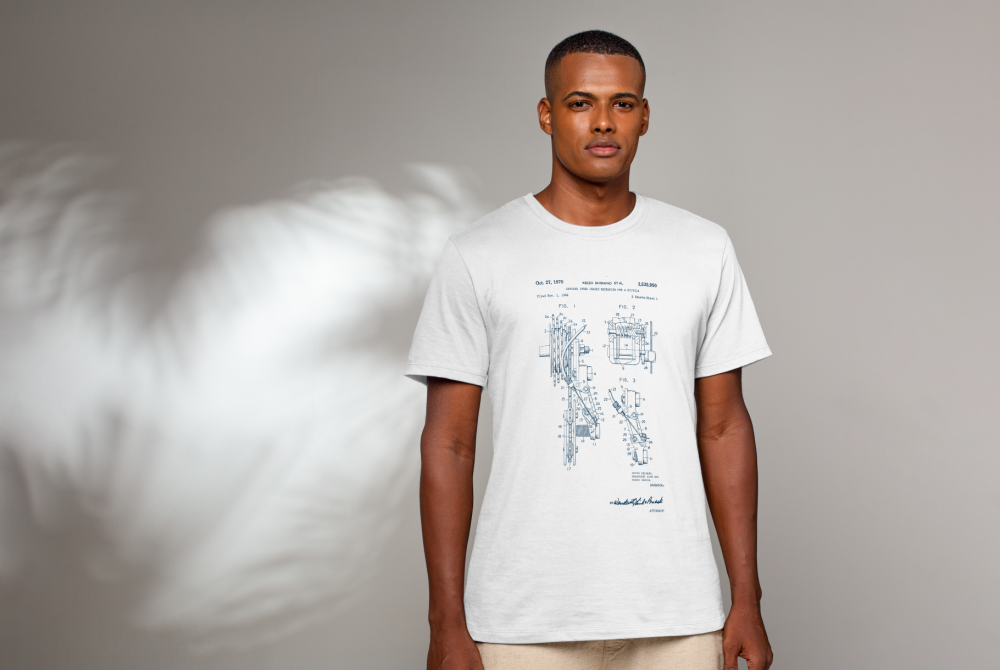
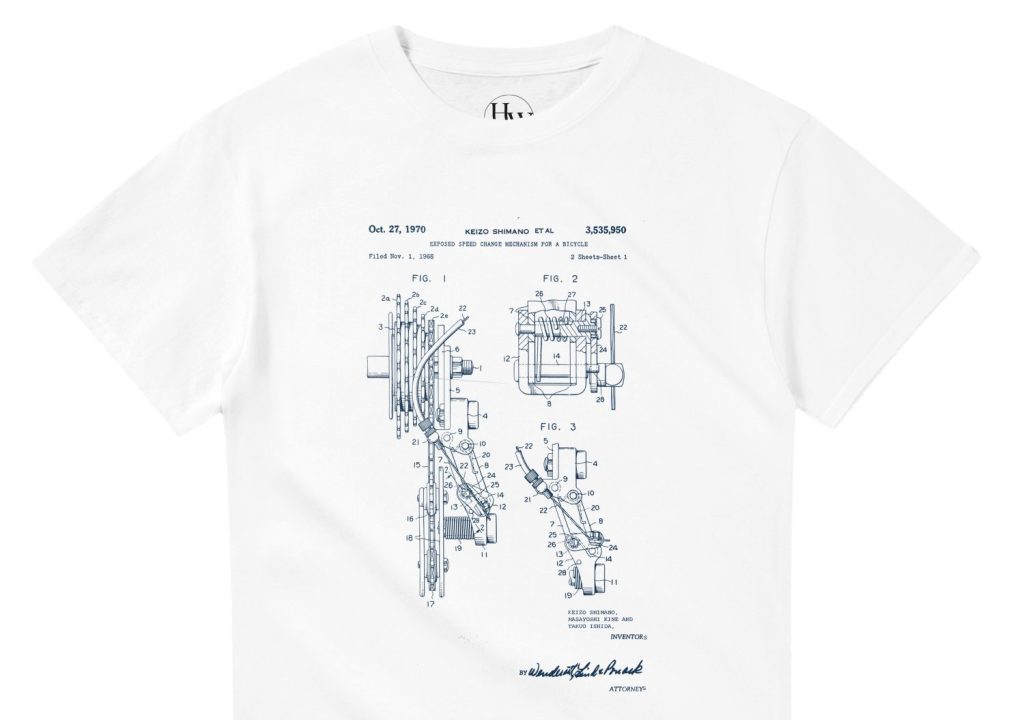
    What we have is a striking patent image from Farnsworth’s 1968 patent. I used the techniques used previously to strip the background from the image and make a file suitable for uploading onto a t-shirt in Gelato.

    Young female model wearing the new T-shirt design discussed in the blog post. She is standing outside a modern building.
    Mock-up of a model wearing the black version of the Farnsworth fusion patent image.

    I also put this design on a sweatshirt, mainly to see how that would look and if it would sell.

    This is also available with white print on a blue sweatshirt.

    1. John Logie Baird’s earlier system used a mechanical spinning disk at its core. This imparted limitations on the line count and frame rate because the holes in the disk determined both these values. The size, weight and durability of this system and the wear and tear on the parts meant that this pioneering system could never achieve the resolution people were used to in the cinema. ↩︎
    2. Neutrons are at the core of almost all atoms, so Waitrose do sell them, but mixed up with protons and electrons to form fresh ziti and other everyday essentials. ↩︎
  • Caffeine! mug

    Caffeine! mug

    A slight departure, this time I’ve designed a mug. I was thinking about what molecules would look good on a coffee mug and the obvious answer was ‘caffeine’.

    One of the things I had planned to use Blender for was to make scientific models and diagrams as well as protein and molecular models. How to do these things was another matter and how to make anything of them when the market for scientific diagrams is (a) small and (b) a closed shop were further matters.

    Having had the idea of caffeine-on-a-mug1 I hit the University of YouTube and found out how to get from a molecule to a 3D design, and then from a 3D design to a cartoonised version. This latter was a design choice – I thought it would look bold and also it would be a way of cutting down on the number of colours required for the design.

    I found a good tutorial by CG Figures who went through the two-step process to get from molecule name to a file that can be read by Blender.

    I was already familiar with one of the websites that was recommended – molview.org – and the software to convert the SMILES file into a protein database (.pdb) file was easy enough to use. The SMILES format is a standardised way of representing organic molecules and it was the format I used to input molecules of interest into a molecular modelling tool to predict the pharmacokinetics of drugs – SwissADME is the website, if you’re interested.

    Once I’d got the molecule model into Blender, there were a bunch of further steps to clean up the file into something that didn’t take up too much filespace and have extraneous faces that could give odd results when the image is finally rendered.

    Molecular ball and stick model of caffeine.
    The caffeine molecule after some tweaking of the initial file. The software adds colours by default, in this case grey is carbon, blue is nitrogen, red is oxygen and white is hydrogen.

    It didn’t take long to get to the point where I had a model that I could use as a basis for a design. Next, I wanted to turn it into a cartoon version. This means that the light and shade are demarcated by sharp lines with no fading.

    In Blender there is a function called a “color ramp” which takes a colour or a shade and changes it. Using this I could control which parts of the atoms were darker and which had highlights. By moving the light around I could change where the light spots landed and also change the size of the highlights. And because the software sees the molecular model as a three dimensional object, the highlights vary around the model, making the model look more three dimensional, even though the idea is to create a two dimensional image.

    Three cartoonised images of a monkey head.
    Three cartoon monkey heads. Turning the head changes the cartoon lighting and adding grease pencil adds definition to the image.

    In order to add a more cartoony look, a function called grease pencil can be used to add black lines to the scene. There are two ways to do this. Blender can add grease pencil automatically, which is what I’ve done here. You can also add it manually so that you can put details on the image.

    Anyway, back to the caffeine image. Not only did I add the cartoon effect and grease pencil, but the molecule needed a caption so we know what it is.

    Caffeine molecule against a pink-purple background. The molecule has the caption in two fonts, Bauhaus and Berlin.
    Alternative fonts for the caption. I like the Bauhaus font (left) as a design choice, but the capital C is a bit too closed to read easily. Berlin font (right) has a similar vibe and a more open C.

    Looking through font choices I tried Bauhaus – it’s bold and has a historic feel to it. After showing this to Mrs S, I changed to Berlin. She pointed out that the C in the Bauhaus font is a bit too closed, and the Berlin version looks better in this application.

    As an alternative, there’s also the molecule on a mustard-coloured background and in German. I’ve yet to offer these alternatives in the shop, I don’t know how big the German market for nerdy science mugs is2. I will likely keep the Bauhaus font for this, since the K looks echt cool, oder? I’ll need to use either Berlin or another font for the French (caféine), Spanish and Portuguese (cafeína) and Italian (caffeina) versions.

    Two view of caffeine (Bauhaus font) and Koffein. Mustard yellow background or pinky purple? Which is better?

    I can try other background colours, but I’m not sure what works best. Any suggestions are welcome.

    The finished design could then be uploaded to Gelato so I could put that onto a mug and then get it published on Etsy.

    White mug with a cartoon caffeine molecule on a pale purple background, and the word 'Caffeine!' underneath.
    Mock-up of the finished mug nestled in a bed of curly brown stuff.
    1. It’s not an original idea. There are plenty of other places that sell this sort of thing, but I wanted to use a different style. ↩︎
    2. Caffeine translates as ‘koffein’ Danish, Dutch, Finnish, Polish, Swedish and Norwegian as well. ↩︎
  • Vintage Patent T-Shirts for Cycling Fans

    Vintage Patent T-Shirts for Cycling Fans

    New t-shirt design!

    Young man in a white t shirt
    This is the latest in the series of Patent-inspired t-shirts.

    I want to ride my bicycle

    I want to ride my bike

    I want to ride my bicycle

    I want to ride it where I like

    I’ve not ridden a bike for over 30 years (last one was stolen in 1993) so I’ve missed out on a lot of the developments in bicycle technology. I do enjoy watching the Tour de France, though, and one thing I was well aware of is the use of derailleur gears – they’ve been around since before I was born.

    I was maybe 13 when I got my first multi-gear (10 speed, as I recall) bike after I’d outgrown the 3-speed one I got when I was 81. We’d moved to England by then, and where we lived wasn’t very hilly but also not so busy that I was in danger when out on the roads.

    The rear wheel of a bike is probably not considered much by non-riders. It’s the wheel that turns when you turn the pedals. But the mechanism that controls the gears is the subject of much debate and engineering over the years.

    Read axle of a bicycle, showing the derailleur system.
    Rear gear bit of a bike. The derailleur is the black Z-shaped thing which controls the chain as it hops between the spoke wheels on the axle and also maintains chain tension as the gear size changes.

    Back in the old days (very old days) bikes didn’t have gears. The penny-farthing had a huge wheel and, if you found the hill was too steep, you hopped off and pushed.

    Variable gearing initially involved having two gear spokes on either side of the back wheel and then getting off and turning your wheel around to go uphill (or downhill). I don’t know if there’s any footage of Tour de France competitors doing this, but your skills in fixing a bike were at least as important as your riding ability2.

    The derailleur is a remarkably old invention, with the first rod-based systems being invented in the late 19th century. There is a book on this called ‘The Dancing Chain’ by Frank Berto, but it’s at least £75 and I’m not that into cycling.

    Never an organisation to rush into making things easy for competitors, the Tour de France resisted such new-fangled innovations for many decades. Finally, in 1937, competitors in the Tour were allowed to use derailleur gearing. The effect this had on the average speed of the cyclists was minimal – an increase from 31.1 kph to 31.8 kph was about average for the speed year-on-year speed increase at the time (BikeRaceInfo.com).

    Shimano gears

    Founded in 1921 by Shozaburo Shimano, Shimano is one of the watch-words in the bike community. Their gears and groupsets (gears, gear changers, etc) are regarded as the best by many riders.

    Pro teams currently using Shimano gears include fourteen of the eighteen UCI men’s World Tour (the top ranking pro teams) and four of the fifteen UCI Women’s World Tour teams.

    So in honour of this, I researched the early stages of derailleur gears and found the 1970 patent co-authored by Shozaburo’s son, Keizo Shimano. I think this was the basis of the Dura-Ace gear set that remained popular for a couple of decades.

    Blue patent design on a white t-shirt
    Shimano derailleur gearing patent, blue on a white t-shirt.

    The patent design is now available as blue on white or (coming soon) white on blue or black in my Etsy shop.

    Now in black or blue, after a bit of a delay.

    Disraeli Gears

    As I said at the top derailleurs have been around since before I was born. Indeed, Cream’s 1967 album Disraeli Gears was so called when one of the group’s roadies dropped this malapropism when he heard that Eric Clapton was buying a racing bike.

    Let’s listen to one of their songs from that album.

    1. This had hub gears, which I never worked out the mechanism for, there’s just a chain that disappears into the axle. It’s probably magic. ↩︎
    2. The spirit of the individual cyclist riding the Tour is typified by the story of Eugène Christophe from the 1913 Tour. He was leading by 18 minutes and descending the Tourmalet when his front forks broke. It took him two hours to reach the village at the foot of the mountain. He found a blacksmith who would let him use his forge – the rules stated he had to make repairs alone – and, after three more hours he set off with a mended bike. Race officials gave him a 10 minute penalty because a local boy pumped the bellows of the forge for him.
      He eventually finished seventh overall. ↩︎