Tag: columbo

  • Just one more Minimalist Columbo

    Just one more Minimalist Columbo

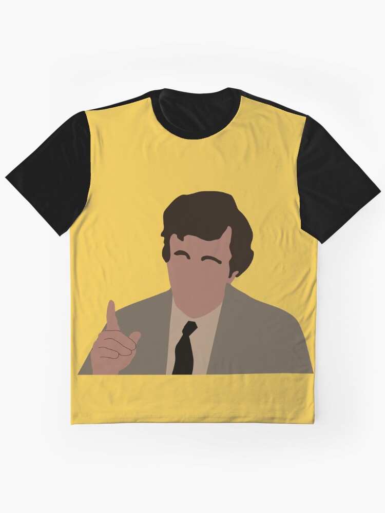
    I’ve been exploring Inkscape a bit more recently. On the back of the pop art images I did previously for Columbo and Murder, She Wrote, I found that I can replace a photograph with an unshaded version with a restricted colour palette.

    Columbo and Blender

    I’ve had a lot of fun with the image of Columbo saying ‘one more thing’. There’s a pop art version, and I also made a minimalist version in Inkscape. What I also did with this one is play around in Blender.

    Minimalist Columbo on a mustard background. This colour fits the 70s aesthetic that the show embodies.

    Inkscape’s native file format is .svg (scalable vector graphics). This type of file is scalable (as the name says) which means the image will not be degraded by being enlarged. However, it needs certain types of software to produce images from. For this reason, when I make something in Inkscape I have to export it as a .png file for use in other software.

    Blender, though, has the capacity to import .svg files for use in 3D designs. One of the first things I did in Blender that I blogged about was importing a beer logo and mucking around with the colours and the refractive index of the glass.

    The Columbo file from Inkscape has seven individual pieces – one for each part of Columbo (hair, face, raincoat, hand, shirt, tie and the lines for his hands). These seven object could be coloured and animated as separate objects.

    With animation there’s a huge choice of what paths an object can take, I can scale the object as it moves and change the colour as well. But I wanted this to be a simple animation, in part taking inspiration from TV station idents such as ATV, where the logo would appear. So the parts start off invisible, thin edge to the camera and then turn on various axes to show the hair, face and clothes. The hand is the last thing to come in, from one side as if remonstrating with the criminal.

    Video advert

    I’ve not done one of these for a while. Taking the animation I did for the Columbo Minimalist design, I used CapCut to make a short advert. The advert is bookended with the animation above and the ‘cloth reveal‘ animation I made some time ago.

    Three products are shown – two t-shirts (a ‘lay-flat’ and modelled version), a cushion and a tote bag. The tote bag animation was something I had the idea for and then wished I hadn’t.

    The static image of the tote bag isn’t very exciting, however much I like the Columbo image against the mustard background. So to add a little interest I thought I could use Blender to make a realistic swinging animation. I was right on that, wrong on how easy it was going to be.

    But, I did it after a couple of hours thinking ‘why the hell did I start this?’ It’s a thin cube with the image from RedBubble projected onto it. The cube is given physics and a hole at the top. This is off-screen, where the handles of the bag would go over a peg. There is a cylinder through the hole, around which the bag swings.

    All fairly simple in concept, but I had to do quite a lot of fiddling around with various settings – including how much air drag was involved – to get a nice, slow swing.

    For the final video, I added a background scene to all the images except the pillow. The scene is a postcard from the 1970s of Moscow, Idaho. With a Sears store and a Chevy pick-up, it could only be America and the colour quality spoke of the 1970s.
  • Holding Columbo to ransom

    Holding Columbo to ransom

    I’ve been exploring Inkscape a bit more recently. On the back of the pop art images I did previously for Columbo and Murder, She Wrote, I found that I can take an image and posterise it using Inkscape. I’d already done this using Blender, to make a Jason Mantzoukas / Taskmaster design (which I realise I haven’t blogged about) to celebrate his energy in Season Series 19. I wanted to see what Inkscape could do. But what to make?

    Posterised image of Jason Mantzoukas from Taskmaster Series 19.

    Ransom note

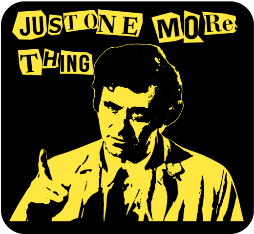
    Looking around for inspiration, I had a found some Punk aesthetic boards on Pinterest. One, a poster for Blondie from 1976, popped out. This might not be an original image, but the aesthetic and the colouring – vivid yellow on black – are what drew me to it. The ‘ransom note’ style is also seen in the merch of punk and indie bands to give a home-made feel to posters, fanzines and other advertising.

    Inspiration (left) and end result (right) for the ‘Columbo ransom note’ design.

    Columbo’s catchphrase – “just one more thing” – would arrive when he knew he had the killer and had found the weak spot in their story. That, and Columbo whistling This Old Man, were the signs that the clues were there. But had we, the viewer, seen what Columbo had seen?1

    Making the catchphrase into a ransom note makes it rather more sinister than Peter Falk would ever dream of. I had a few options of how to make the letter, the simplest is to use a ransom font such as Hit me, punk! and Fanzine. The drawback is that the letters are regular, so all the ‘a’s will look the same. So I did a slightly more complex route so I could have random shapes around the letters.

    I typed out ‘just one more thing’ in Canva, duplicated it a few times and changed the font for each repeat. There’s a mix of serif and sans-serif, to mimic headlines and banners in newspapers, then downloaded the page of text. Letter spacing is varied a bit, and I also added letters to make it possible to clip a neighbouring letter to add a bit of realism.

    Source text for the ransom note.

    I used an app in Canva called ‘choppy crop’ to roughly cut around an image. I took the page of text and, using choppy crop, cut out letters and small groups of letters to use in the final design.

    Columbo stencil

    To get the image of Columbo himself I used Inkscape. I had a go in Blender, but I fond the Inkscape image slightly better. There is a yellow outline in the Inkscape version (right, below) that sets the image off against the black background.

    Columbo ‘stencil’ done using Blender (left) and Inkscape (right). The Inkscape version took a bit longer to do, but the result is better. If I could have found a way to add a yellow outline around the Blender version, that may have been preferred.

    I’ve used this to make patent images by removing background, but the ‘Trace bitmap’ function can be used to posterise an image. In this, the colours or grey levels (you can chose which) are fitted into bands of similar shades/ colours. You can determine how many shades; to remove a white background on a black printed document you would chose two and delete the white bit. For images of people I used more; in Columbo’s case it was 19. That’s 18 for him plus one to be deleted for the background.

    With 18 layers of varying grey, you have to determine how many shades to keep yield an image that is interesting but also recognisably Peter Falk when it’s rendered as a yellow on black.

    The easy way to do that is to turn all the layers yellow, add a black background and hide the layers from ‘dark’ to ‘light’ until it looks good. In the end you’re left with black areas of shadows, yellow highlights and – if you’ve done it right – a recognisable picture.

    Video fun

    One of the more popular types of video on YouTube shows simulations of walls of blocks being smashed. I’ve done a few of these; Mrs S suggested I try to make a video with my designs on a wall that gets smashed down.

    The simulation – done in Blender – collected a few different techniques. To add some realism, I had two walls – one of bricks and one of plaster – both of which get smashed by a ball and also interact with each other. There’s dust and also some grime around the edges of the wall and dust and debris that gets thrown out.

    1. Of course, we knew who the killer was, but how did Columbo catch them? There is a theory that Columbo was actually a hopeless incompetent who only got the killer because a TV crew was there to film the murder. ↩︎
  • How to turn an idea into fake reality?

    How to turn an idea into fake reality?

    I think I’m getting better at doing stuff with Blender. One of the side effects of this is that I can think about Blender’s capabilities and apply them to designs and animations that I can use in the Heath Way Prints shop and as adverts for the shop.

    Turning blocks

    The sketch below is from my notebook1. I did this one evening and set about making it the next day. It took a few hours of a day I’d have otherwise spent doing the crossword2, watching the Tour de France3 or interacting with my family.

    Notes on the construction of the ‘six cubes’ workshop animation.

    I knew I could do the animation. However, some of the ‘how to’ bits needed me to dive back into the University of YouTube. In particular, the use of Drivers to simplify the animation needed a refresh.

    Blender Drivers

    Put simply, a Driver is an object that affect another object in an animation. For this animation, I had two drivers. One driver rotated 90° back and forth. The angle of this controls the position of four of the cubes, just as a real mechanical lever might. The second rotated through 360° throughout the animation. The angle of this driver’s rotation controlled the rotation of all six cubes.

    The video below shows how drivers work.

    Driver demo. I’ve animated the red cube to go up and down. The blue cube turns as the red cube moves, and the colour of the third cube also changes. You can control many different objects from one object. Not sure of the limit, but the six I’m using in the turning cubes design is well inside the capability of Blender.

    The animation of the drivers controls the movement of the cubes. Setting up the drivers makes timing the animation simpler than animating each cube individually.

    Display board images

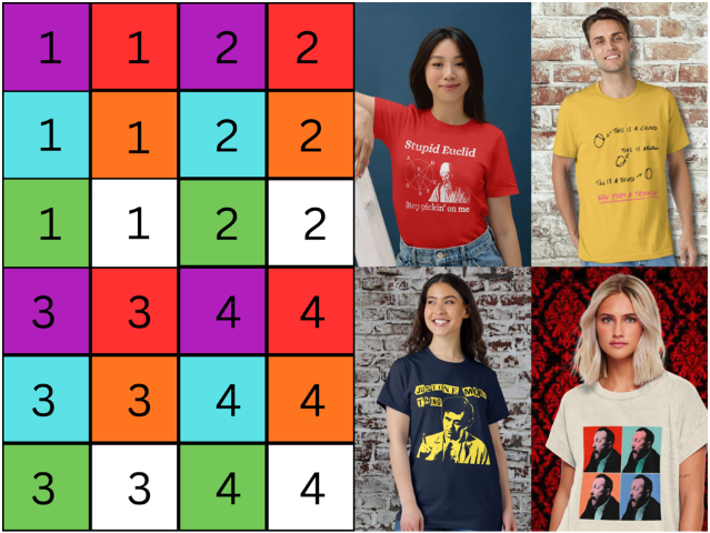
    If you can decipher my writing, you’ll see that I planned to have one big image with four design adverts on to be displayed. I made the single image with four designs in Canva. The fiddly bit was making sure the faces on the cubes matched the parts of the image that had to show. This took a while to get right, but I plan to use this setup a few times, so it’s worthwhile making the effort.

    Each face of the six cubes is mapped to an area of the image. To set this up I made a grid with numbers and colours to stand in for the final image. I made sure each face that needed one had the right part of the right image in the right orientation, after which I could substitute the image I wanted to use for the advert.

    Calibration grid (left) and the four images that show on the cubes once they are rotated in place.

    Put it all together

    There’s a few extra bits I added to make it look like an item that’s been installed long-term in a workshop environment. Some grime, a bit of background noise and camera shake. Ferrules cover the holes where the rods at the top and bottom of the unit go into the floor and upper display. This is to hide the otherwise odd-looking holes where the rods disappear. It also gave objects for the grime to collect against.

    Future stuff

    Other things to add might be a lever in front or to on side of the cage and a control knob that turns to show which cube is being shown. But that’s for the future.

    1. Yes, that really is my handwriting. You won’t think of anything to say about it that I haven’t heard over the last 50 years. ↩︎
    2. This week’s Private Eye crossword is giving me trouble. ↩︎
    3. I can’t get used to the Channel 5 commentary. Rob Hatch leaning into the pronunciation of French and Spanish names is a big distraction. ↩︎

  • Columbo – just one more pop art design

    Columbo – just one more pop art design

    Pop art style

    I’ve blogged already about the pop art style Jessica Fletcher design. This time, I’m having a go at some Columbo designs.

    I’ve done a few designs based around Columbo, now. The first were pop art style, using a halftone filter and then colouring in the image as required. These were based on Andy Warhol prints – Shot Marilyns and the Elvis triptych.

    Two of Warhol’s best known works – Elvis and the Shot Marilyns. Also the man himself, after a close encounter with an electric socket.

    The original images for my designs were taken from a Google Image search for pictures of Peter Falk as Columbo. I used two – one full length and the other of him in the classic “Just one more thing” pose.

    Columbo triptych

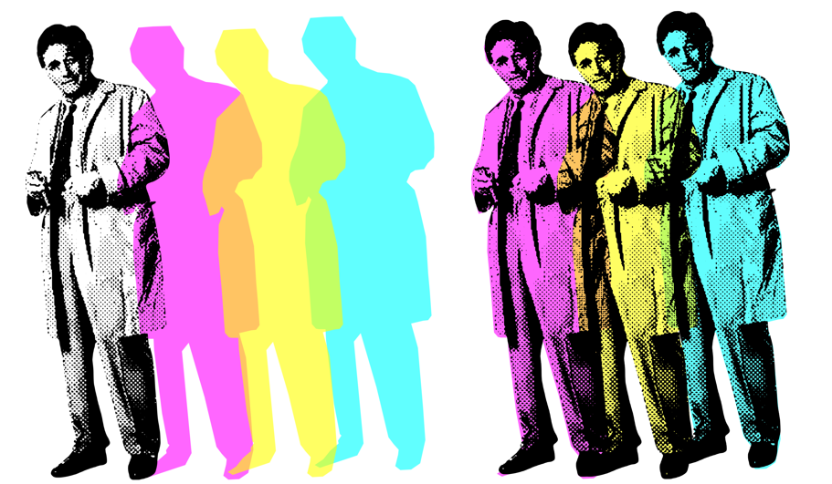
    I processed the original full length to get the “Three Columbos” using Canva, then Inkscape. In Canva, I removed the background of the Peter Falk full-length, desatured the image (made it black and white) and then applied the “Screen” filter to make it look like an old newspaper. You end up with an image that resembles Warhol’s Elvis.

    Four Columbos, decreasing image quality.
    The journey from the original to the processed halftone image.

    I could have stopped there, I suppose. But I wanted to have an image that had three overlapping Columbos. I could do this in Canva; the ‘screened’ image is only the black dots, so it’s effectively transparent. What I also wanted, to take it a bit further, was to have coloured overlapping Columbos.

    A weakness in Canva is that I can’t find a way to make freeform shapes. I’m sure there is a way, but I’ve not found it. So I took the screened Columbo and exported it to Inkscape.

    The components used to make the Columbo triptych.
    The components used to make the Columbo triptych. The coloured parts have a flat top, this is hidden behind Falk’s hair.

    Once I had the image in Inkscape I could draw around the image and then colour in the outline. This outline was then put back into Canva, copied twice and recoloured to magenta, yellow and cyan. By making the coloured images slightly transparent, I got orange and green in the overlap.

    The black and white and the coloured versions are for sale on the RedBubble shop.

    One more thing

    The second Columbo used the same process as I used for the Jessica Fletcher design. The image was a screengrab from an early episode (I forget which one), just as he’s saying his catchphrase.

    “Just one more thing” aka “Pop art Columbo” from start to finish and also how it looks on t-shirt and mug.

    Instagram adverts

    As an alternative to the animated adverts I’ve done for Facebook, I’ve made some fancier static adverts. These will go onto Facebook and Instagram, and will also be featured in the Pinterest site I will be launching soon.

    Changing up the adverts that I use on Instagram and Facebook. This is a ‘grid’ style advert, with a model as focus and some mock-ups to go with it.
    This advert uses the artwork as the background. With small adverts – for example, a Facebook ad on a mobile – it can be hard to see any details of the design. Here, the design is blown up and overlaid with a flat t shirt mock-up.

  • Tonight on Murder, She Wrote: the killing continues

    Tonight on Murder, She Wrote: the killing continues

    One of Mrs S’s favourite genre of telly and book is the cosy crime.

    How to define this? Murder happens, but we don’t see any blood. The case is solved by an agreeable character who might be an amiable old lady (Miss Marple, Jessica Fletcher), an avuncular older man (Diagnosis: Murder, Father Brown), a group of middle class chums (The Marlow Murder Club, The Thursday Murder Club) or a quirky detective (Poirot, Columbo, Death in Paradise). What is missing is grittiness, angst and suspense.

    Columbo

    Of all the programmes listed above, Columbo stands out. Columbo is one of the greatest telly programmes ever. Peter Falk brought an impish charm to the title character: a common man prying into the world of the upper classes of San Francisco and always being underestimated.

    Watching Columbo lead the murderer into a false sense of security remains a delight. He has them believing that they are going to get away with it, until Columbo finds that one clue (lack of paint on the floor where an artist was supposed to have been), or the killer gives the game away (realising that his stock of wine has been ruined by a heatwave) and Columbo starts to whistle ‘This Old Man’ and we know he’s got the killer.

    There is the theory that Columbo wasn’t all that as a detective, and only ever caught the killer when there was a TV crew to film the murder. But what kind of sick mind would come up with that theory?

    Murder, She Wrote

    With Murder, She Wrote we get to see a stalwart of Hollywood – Angela Lansbury – act a succession of actors off the screen while solving crimes. Jessica Fletcher starts as a dowdily-dressed widow mooching around the little New England town of Cabot Cove. Later, as her crime-writing career takes off, she glams up and travels widely. We see her in New York, New Orleans, London and, my favourite, Ireland.

    This isn’t the Ireland you’d recognise if you visited. This is Oireland, where de accents are laid on tick as you loike, to be sure, from actors with at least one Irish great grandparent, an’ all an’ all.

    There is a theory that Jessica is not as innocent as she seems. We believe that it is Jessica who commits all the murders (286 over the twelve years of the run) and had Doc Hazlit and Sheriff Tupper cover for her. Maybe she had blackmailed them.

    In some cases the killer wasn’t Jessica, but her oh-so-innocent nephew Grady or his wife, who wasn’t really as wet and irritating as she pretended to be.

    New design!

    After all that, we need a new design for the shop.

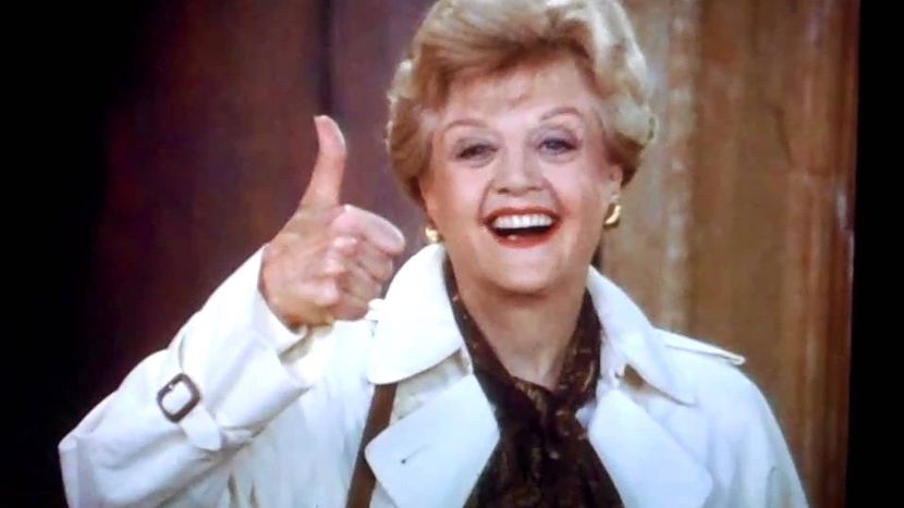
    Got away with it again! JB Fletcher gives the thumbs up as she gaslights another innocent into confessing to a murder she herself committed.

    The image is a still from the end of one of the episodes. A big, happy thumbs-up. Not only did she get away with another murder, but she pinned the blame on some other sap. And furthermore, she managed to gaslight this poor soul into confessing. An evil genius, by any measure.

    I used a combination of Canva (processing the image of Jessica to get the half-tone, newspaper effect), Inkscape (colouring in to get the silk screen effect) and Canva again (arranging silk screen images and adding the text). I like the pop-art silkscreen look. The Alex Horne design works with and without text, I think Jessica needs text to set the design off.

    Finished design, and a mock-up of one option from the RedBubble shop.

    This blue t shirt is on the WordPress site (Grim Up North Heath shop) and the design is also on RedBubble, on a variety of items.

Verified by MonsterInsights