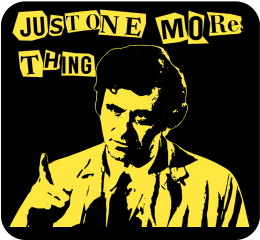
I’ve been exploring Inkscape a bit more recently. On the back of the pop art images I did previously for Columbo and Murder, She Wrote, I found that I can take an image and posterise it using Inkscape. I’d already done this using Blender, to make a Jason Mantzoukas / Taskmaster design (which I realise I haven’t blogged about) to celebrate his energy in Season Series 19. I wanted to see what Inkscape could do. But what to make?

Ransom note
Looking around for inspiration, I had a found some Punk aesthetic boards on Pinterest. One, a poster for Blondie from 1976, popped out. This might not be an original image, but the aesthetic and the colouring – vivid yellow on black – are what drew me to it. The ‘ransom note’ style is also seen in the merch of punk and indie bands to give a home-made feel to posters, fanzines and other advertising.

Columbo’s catchphrase – “just one more thing” – would arrive when he knew he had the killer and had found the weak spot in their story. That, and Columbo whistling This Old Man, were the signs that the clues were there. But had we, the viewer, seen what Columbo had seen?1
Making the catchphrase into a ransom note makes it rather more sinister than Peter Falk would ever dream of. I had a few options of how to make the letter, the simplest is to use a ransom font such as Hit me, punk! and Fanzine. The drawback is that the letters are regular, so all the ‘a’s will look the same. So I did a slightly more complex route so I could have random shapes around the letters.
I typed out ‘just one more thing’ in Canva, duplicated it a few times and changed the font for each repeat. There’s a mix of serif and sans-serif, to mimic headlines and banners in newspapers, then downloaded the page of text. Letter spacing is varied a bit, and I also added letters to make it possible to clip a neighbouring letter to add a bit of realism.

I used an app in Canva called ‘choppy crop’ to roughly cut around an image. I took the page of text and, using choppy crop, cut out letters and small groups of letters to use in the final design.
Columbo stencil
To get the image of Columbo himself I used Inkscape. I had a go in Blender, but I fond the Inkscape image slightly better. There is a yellow outline in the Inkscape version (right, below) that sets the image off against the black background.

I’ve used this to make patent images by removing background, but the ‘Trace bitmap’ function can be used to posterise an image. In this, the colours or grey levels (you can chose which) are fitted into bands of similar shades/ colours. You can determine how many shades; to remove a white background on a black printed document you would chose two and delete the white bit. For images of people I used more; in Columbo’s case it was 19. That’s 18 for him plus one to be deleted for the background.
With 18 layers of varying grey, you have to determine how many shades to keep yield an image that is interesting but also recognisably Peter Falk when it’s rendered as a yellow on black.
The easy way to do that is to turn all the layers yellow, add a black background and hide the layers from ‘dark’ to ‘light’ until it looks good. In the end you’re left with black areas of shadows, yellow highlights and – if you’ve done it right – a recognisable picture.
Video fun
One of the more popular types of video on YouTube shows simulations of walls of blocks being smashed. I’ve done a few of these; Mrs S suggested I try to make a video with my designs on a wall that gets smashed down.
The simulation – done in Blender – collected a few different techniques. To add some realism, I had two walls – one of bricks and one of plaster – both of which get smashed by a ball and also interact with each other. There’s dust and also some grime around the edges of the wall and dust and debris that gets thrown out.
- Of course, we knew who the killer was, but how did Columbo catch them? There is a theory that Columbo was actually a hopeless incompetent who only got the killer because a TV crew was there to film the murder. ↩︎