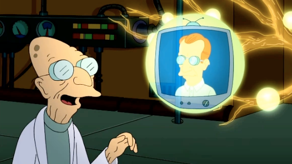
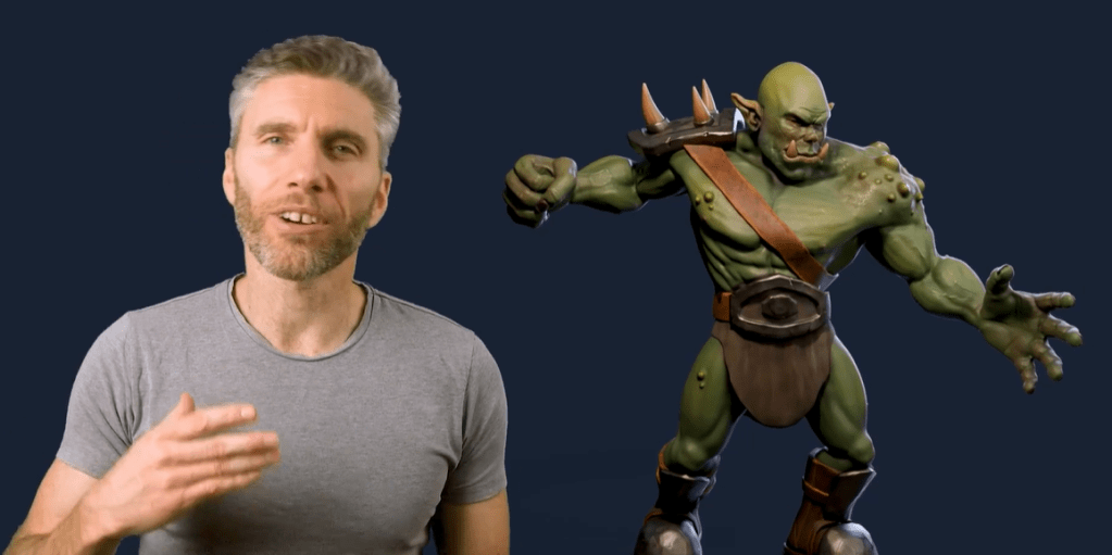
Now that I have Steve the orc, what can I do with him?
Orc with Balloon
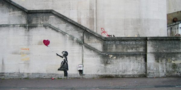
One of the best-known British artists is Banksy. Best known, even if we don’t know who they are1. Most of the works attributed to Banksy are stencil-based, the work is in the preparation of the stencil, rather than the application of the paint which was done stealthily and quickly.
Here, I’m redoing their ‘Girl with Balloon’, which first appeared on Waterloo Bridge in London in 2004.
Blender allows you to add a reference image to the work so that you can use guides to pose or build the model you’re making. This was used in a couple of the earlier lessons, building the spitfire and also the original modelling of Steve was done using an outline provided as part of the lesson plan.
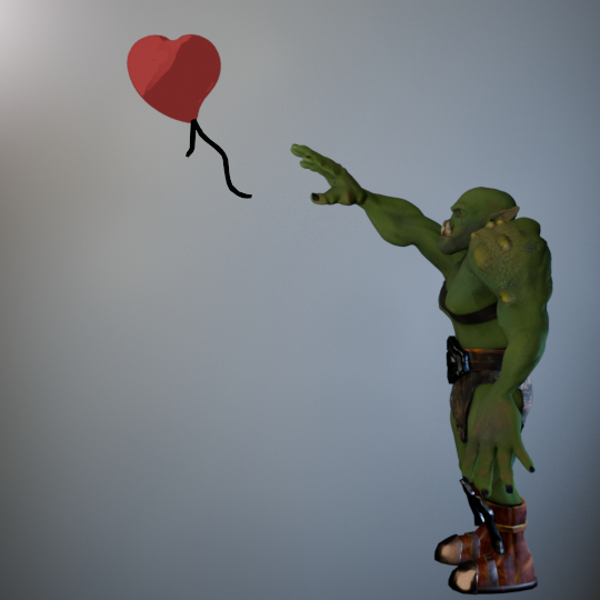
Adding a version of Girl with Balloon, I used this to get the pose of the orc similar to the original. Not exact – Steve has longer arms and I wanted the balloon to be a bit closer.
Original image of Steve with the balloon. The wall behind has been lit to look a bit like a wall – Banksy’s work appeared on several walls around the world, one of them must have looked like this.
Modelling the heart-shaped balloon was done by using a Webding heart as the base. Text in Blender is treated as an editable object with access to all the fonts you have on your computer. For the caffeine molecule mug design, I had used Berlin and Bauhaus fonts and added a bit of a curve to the text. Here, I coloured the heart and added a curve to the top surface so it would look a bit more balloon-like.
For the trailing ribbons I used Grease Pencil to draw black lines. I’d used grease pencil before in the caffeine molecule, adding lines automatically. This time they were hand drawn.
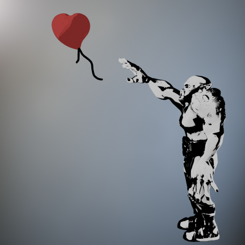
The cartoon effect I used on the caffeine molecule was repurposed to give a stencil look to the posed orc. Instead of using one colour for the light parts and another for dark, I just used black and white. Shading in black and white wasn’t difficult, but getting the lighting right so that the finished figure would look like a stencil and be recognisable as an orc took a bit of fiddling around.
Orc with Balloon. Final image of Steve with his balloon.
And finally, a short video of the transition from live orc to stencil.
The transition of Steve from rendered to stencilled in four seconds.
Next up, Steve has a go at stand-up comedy.
According to Wikipedia, his name is Robin Gunningham, he’s from Yate near Bristol. ↩︎
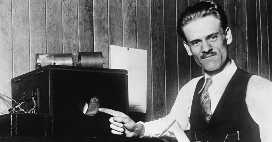
Philo T Farnsworth (1906 -1971) is likely best known for two things. First, he was the inventor of the fully electronic display which is the basis of cathode ray tubes – he invented the all-electronic television1. Second, his name is the inspiration for Prof Farnsworth from Futurama.
Hubert J. Farnsworth off of Futurama. He is the 160-year-old nephew thirty times removed of the protagonist, Philip J. Fry.
What’s less well known is his work on nuclear fusion.
Biography
Born on a farm in Utah, he was by any measure a genius. Some people express surprise that the son of a farmer could be the man who invented television, but then he had the sort of mind that makes the best of the opportunities presented to him. The farm his family moved to happened to have some disused electrical equipment which he was free to investigate. From this and with a like-minded friend he learned about electronics and electricity and became one of the pioneers of what was, in the 1920s, a young field.
Philo Farnsworth pointing at his most famous invention, the electronic television screen.
Electronics and electrical power
Like all geniuses, Farnsworth didn’t concentrate on one invention. By the time he died in 1971 he had patents in several fields, including light sensors, amplifiers and nuclear fusion.
His work on fusion reactors didn’t result in limitless free energy, as you may have noticed. But the reactor has had applications for the generation of neutrons. Why do we need neutrons? Most of us don’t need them, which is why they don’t sell them as such at Waitrose2. However, they are needed in nuclear power, medical neutron radiography, material inspection and to stimulate gamma radiation among other things.
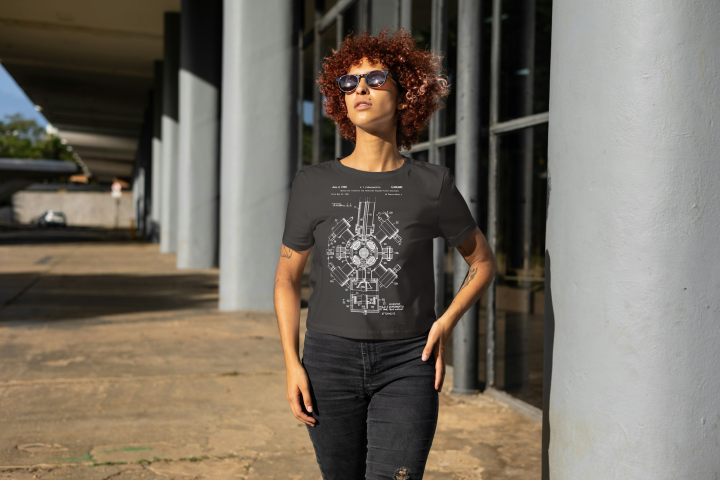
Image from US patent 3386883, Philo Farnsworth’s Nuclear Fusion apparatus.
The exact model shown in the t-shirt design, the Farnsworth-Hirsch fusor – is no longer used. After over 50 years, it should be assumed that progress has been made in this field, and indeed there has. Benchtop fusors have been made for demonstration purposes and there is a fusor hobbyist network whose website has far more information on these devices.
What we have is a striking patent image from Farnsworth’s 1968 patent. I used the techniques used previously to strip the background from the image and make a file suitable for uploading onto a t-shirt in Gelato.
Mock-up of a model wearing the black version of the Farnsworth fusion patent image.
John Logie Baird’s earlier system used a mechanical spinning disk at its core. This imparted limitations on the line count and frame rate because the holes in the disk determined both these values. The size, weight and durability of this system and the wear and tear on the parts meant that this pioneering system could never achieve the resolution people were used to in the cinema. ↩︎
Neutrons are at the core of almost all atoms, so Waitrose do sell them, but mixed up with protons and electrons to form fresh ziti and other everyday essentials. ↩︎
Now that the GameDev course is complete – I even got a certificate! – I can have a look at other tutorials and find out more about what can be done with Blender.
Don’t forget about Steve. He will be back! I just need to fix his fingers.
Textures featured in the previous course, not only in getting Steve’s skin and clothes looking good, but also in the mech when I added glitter. More interesting textures can be downloaded for use from several websites and the uses for these are only limited by your imagination.
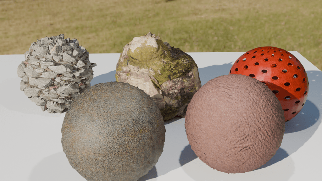
To keep this blog post short and to show some of the things you can do with textures, below are a few spheres with added textures. Despite their appearance in the rendered image, they are just spheres and can be edited and shifted around as such. Using these textures instead of trying to sculpt your own lava flow or mossy stone reduces the load on the computer and is a lot quicker. The downside is that you are restricted by what is available.
Five textured spheres. Two types of rock and a hollow plastic ball (back) and snakeskin and leather (front).
You can make your own textures, but that’s way too advanced for me. What’s interesting is that the shadows agree with the textures. The jagged rock (middle back) casts a jagged shadow. And also the hollow plastic red ball is see-through, the holes act as they would in real life.
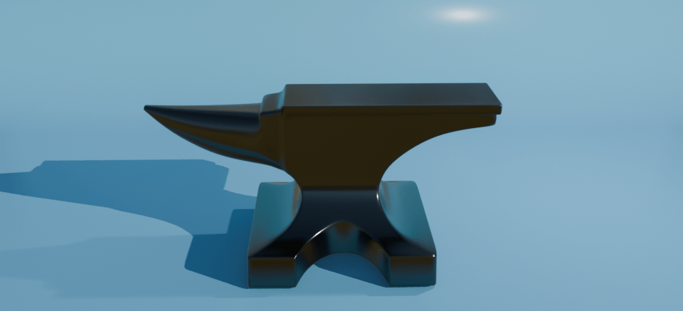
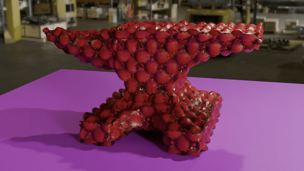
For further mucking around, I downloaded an anvil model and decided that it would be nice if the blacksmiths didn’t have to put up with all the noise of hammering metal all day. So I made an anvil with a soft furnishing texture – a Chesterfield anvil.
Anvil with a Chesterfield texture. I don’t know why nobody thought of this before. Think how quiet forges would be with soft anvils to work on.
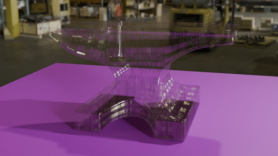
You could also have a glass anvil, for those extra-delicate jobs. Or as the focus for a strokey-beard discussion about the juxtaposition of use and material as a Dadaist/surrealist concept1 , or as a satire on the impermanence of the permanent and the transparency of the solid.
Anvil with a textured glass appearance. Add your own philosophical musings in the comments.
Or an inflatable anvil, for the blacksmith on the move.
Just because it looks like metal, doesn’t mean it has to behave like metal.
I think I’ll step away from the artistic discussions, it’s well above my pay grade and makes my head hurt. I’m only a simple scientist!
Next, more work with Steve, trying to get him to earn a living.
See also Man Ray’s “Cadeau”, an iron with 14 nails glued to the base. ↩︎
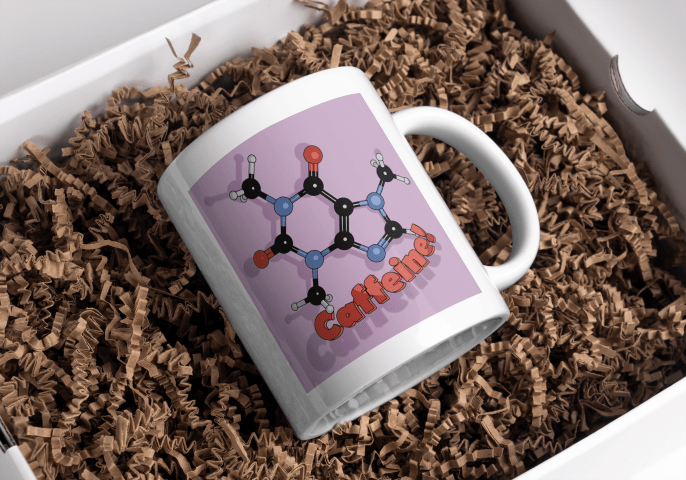
A slight departure, this time I’ve designed a mug. I was thinking about what molecules would look good on a coffee mug and the obvious answer was ‘caffeine’.
One of the things I had planned to use Blender for was to make scientific models and diagrams as well as protein and molecular models. How to do these things was another matter and how to make anything of them when the market for scientific diagrams is (a) small and (b) a closed shop were further matters.
Having had the idea of caffeine-on-a-mug1 I hit the University of YouTube and found out how to get from a molecule to a 3D design, and then from a 3D design to a cartoonised version. This latter was a design choice – I thought it would look bold and also it would be a way of cutting down on the number of colours required for the design.
I found a good tutorial by CG Figures who went through the two-step process to get from molecule name to a file that can be read by Blender.
I was already familiar with one of the websites that was recommended – molview.org – and the software to convert the SMILES file into a protein database (.pdb) file was easy enough to use. The SMILES format is a standardised way of representing organic molecules and it was the format I used to input molecules of interest into a molecular modelling tool to predict the pharmacokinetics of drugs – SwissADME is the website, if you’re interested.
Once I’d got the molecule model into Blender, there were a bunch of further steps to clean up the file into something that didn’t take up too much filespace and have extraneous faces that could give odd results when the image is finally rendered.
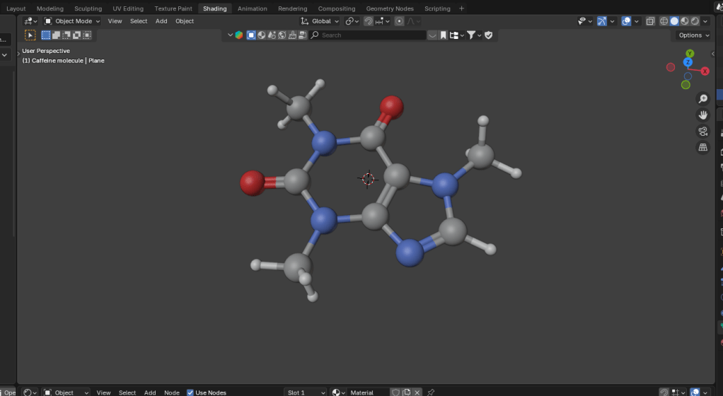
The caffeine molecule after some tweaking of the initial file. The software adds colours by default, in this case grey is carbon, blue is nitrogen, red is oxygen and white is hydrogen.
It didn’t take long to get to the point where I had a model that I could use as a basis for a design. Next, I wanted to turn it into a cartoon version. This means that the light and shade are demarcated by sharp lines with no fading.
In Blender there is a function called a “color ramp” which takes a colour or a shade and changes it. Using this I could control which parts of the atoms were darker and which had highlights. By moving the light around I could change where the light spots landed and also change the size of the highlights. And because the software sees the molecular model as a three dimensional object, the highlights vary around the model, making the model look more three dimensional, even though the idea is to create a two dimensional image.
Three cartoon monkey heads. Turning the head changes the cartoon lighting and adding grease pencil adds definition to the image.
In order to add a more cartoony look, a function called grease pencil can be used to add black lines to the scene. There are two ways to do this. Blender can add grease pencil automatically, which is what I’ve done here. You can also add it manually so that you can put details on the image.
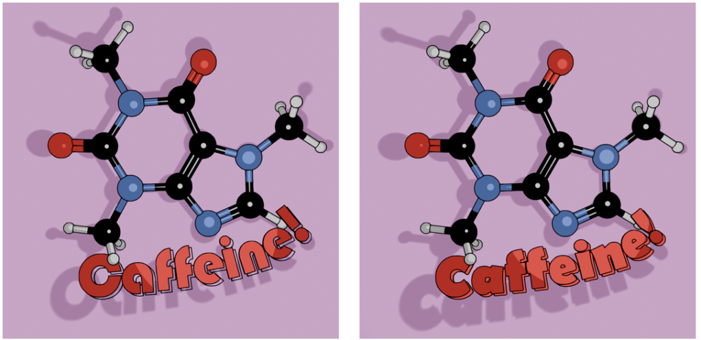
Anyway, back to the caffeine image. Not only did I add the cartoon effect and grease pencil, but the molecule needed a caption so we know what it is.
Alternative fonts for the caption. I like the Bauhaus font (left) as a design choice, but the capital C is a bit too closed to read easily. Berlin font (right) has a similar vibe and a more open C.
Looking through font choices I tried Bauhaus – it’s bold and has a historic feel to it. After showing this to Mrs S, I changed to Berlin. She pointed out that the C in the Bauhaus font is a bit too closed, and the Berlin version looks better in this application.
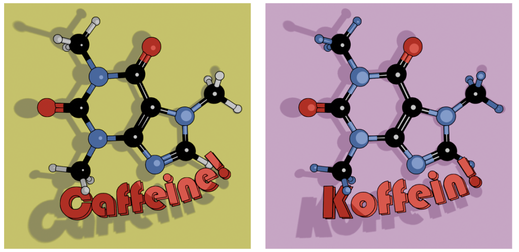
As an alternative, there’s also the molecule on a mustard-coloured background and in German. I’ve yet to offer these alternatives in the shop, I don’t know how big the German market for nerdy science mugs is2. I will likely keep the Bauhaus font for this, since the K looks echt cool, oder? I’ll need to use either Berlin or another font for the French (caféine), Spanish and Portuguese (cafeína) and Italian (caffeina) versions.
Two view of caffeine (Bauhaus font) and Koffein. Mustard yellow background or pinky purple? Which is better?
I can try other background colours, but I’m not sure what works best. Any suggestions are welcome.
The finished design could then be uploaded to Gelato so I could put that onto a mug and then get it published on Etsy.
Mock-up of the finished mug nestled in a bed of curly brown stuff.
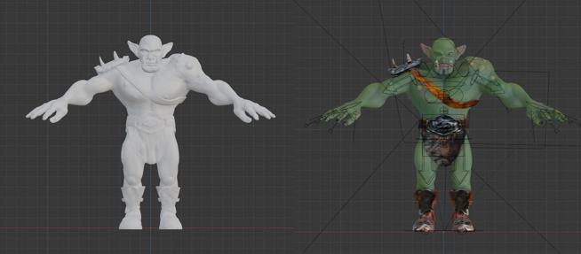
The next stage was quite complex and not very visual for blogging purposes, except that the end result was obviously an image. It involved baking textures and it’s why we spent time on getting the musculature and the facial features right. It’s all to do with poly count.
The number of faces (polygons) in a model is an important factor in 3D modelling. The more faces you have, the better your model will look. The drawback is that these polygons take some time for the computer to calculate. This slows down your work and can result in the computer crashing.
By way of illustrating this, the face count for the model shown at the end of the last section and below was 14.5 million and a file size of 160 MB. By baking the textures onto a lower poly duplicate of the original, this comes down to 47,000 faces and a 64 MB file.
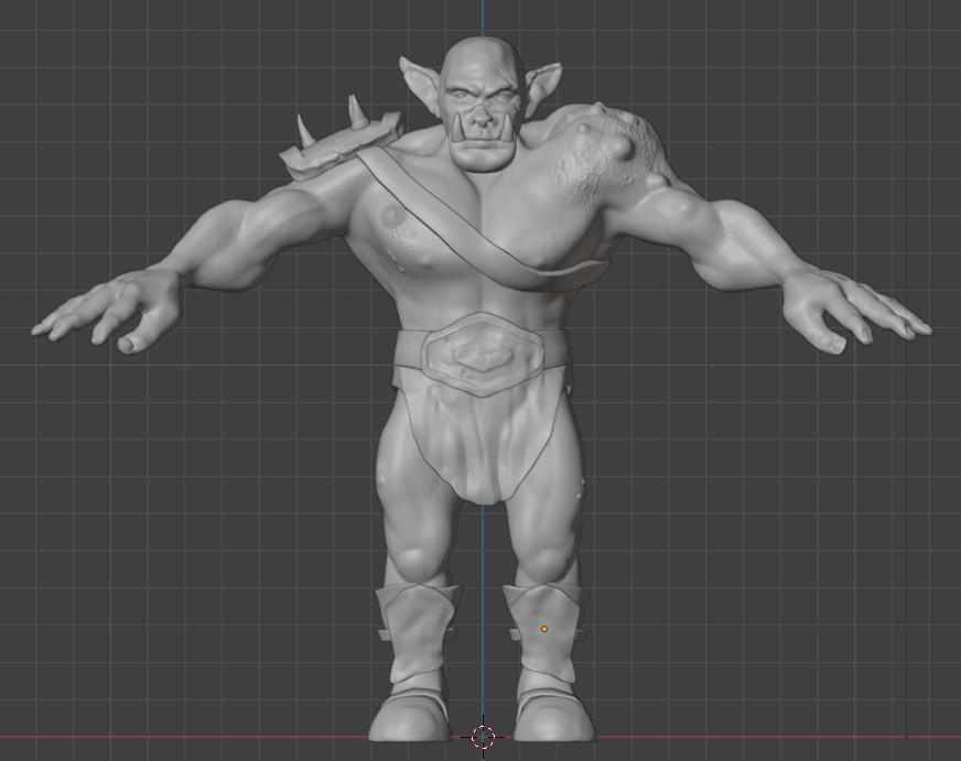
The unpainted orc on the left as 16 million polygons, the painted one on the right has 47,000 and more detail. The down side is that I can’t easily change anything about this model.
Baking is the process where details from a highly detailed model, such as shadows from clothes and weird veins and scars, get painted onto a lower poly mesh. The details aren’t there, but look like they are.
Baking textures allows you to use a low poly mesh that looks like a high poly mesh. The disadvantage is that you can’t change you mind about, for example, the position of the clothes once the bake is done. You can always repeat the bake, which takes a bit of time and isn’t very exciting.
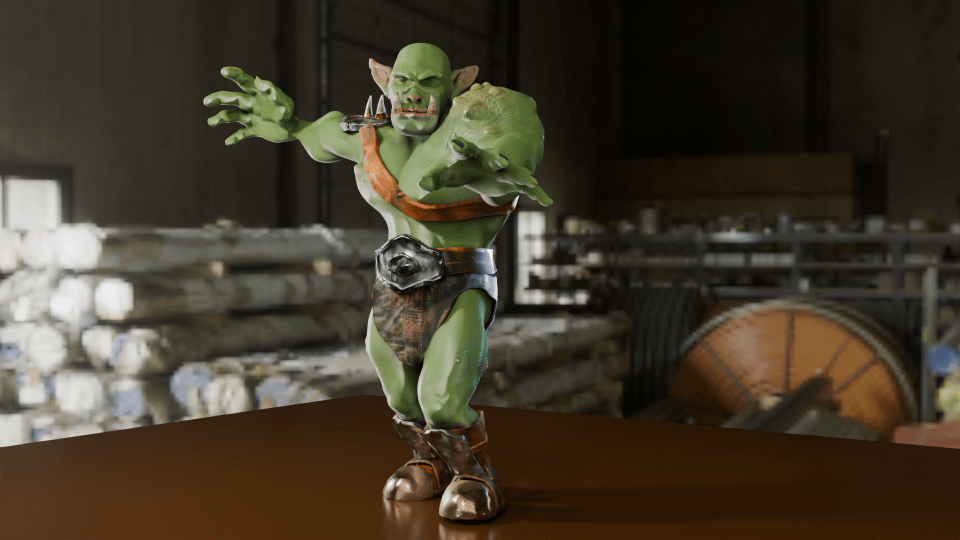
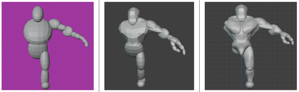
Now that the rigging is in place, I can move the orc to give it an action pose. Might need to move the loincloth, it looks like it’s digging into the thigh.
In the end, I’m happy with how Steve turned out. There are a few mistakes with the painting, but if you can see them keep it to yourself. I should go back and re-do where I went wrong as an exercise.
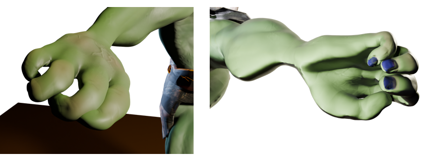
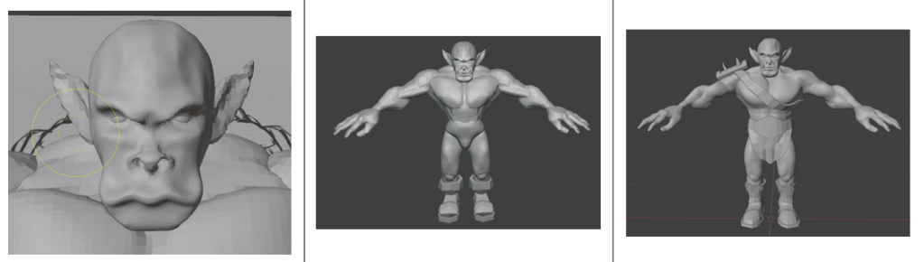
So I had an orc with bones that I could manipulate and pose in a threatening manner. But the hands were wrong – the fingers looked awful when I tried to make them grab anything. That was the next thing, because I wanted to make Steve grab things and make a fist. That was for another time, though.
Two views of the orc’s right hand. The rigging allows you to move body parts and the controls for curling the fingers are simple enough. However, I did something wrong when I set the fingers up because the fingers don’t move properly.
So that was the course finished. Next up, I’ll have a look at getting realistic textures onto objects and then I’ll try and get those hands looking right so I can pose and animate Steve. And don’t forget to look for science-related opportunities for Blender.
When I made Bob the non-demon (see below) I was introduced to sculpting in Blender. Virtual clay you manipulate with a mouse without having to consider gravity and then paint any colour you like offers huge opportunity for creativity.
After lighting and colouring, here’s Bob.
This promised to be a longer sculpt, since we were making not only a head, but a body and some rudimentary clothes – boots and a loincloth. I’ll split into three parts. Second part will look at the finishing of the sculpt, the third will look at some of the other stuff we can do with posable figures.
We used squashed spheres to block out the main shape of the head, body and hands. It’s the hands that proved the most tricky to get looking good. Later, the hands were to cause quite a lot of frustration when it came to rigging. But I’m getting ahead of myself.
Progression of the orc sculpt. From blobs, to a bit of shape, to rough definition of muscles and hand. We only did one half because we can apply a mirror to the sculpt once we’d done fiddly stuff.
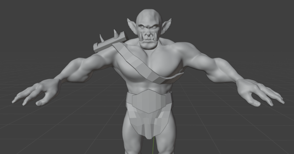
The body was the first part that got any proper attention. We added clay to the spheres and built up the main muscle groups. For much of the lessons I wasn’t sure what the end goal was, other than the final orc. So we spent some hours adding and refining the musculature, getting the boots right and sculpting a loincloth and belt shield.
Progress of the sculpt. The face was a detailed task, since we want to give the orc some personality. Then adding detail to the body muscles and then adding clothes to cover such bits as an orc feels it necessary to cover.
I’m not sure why, but I didn’t save any of the progress during the face sculpt; it followed a similar path to the work we did to create Bob, but adding tusks and shaping the mouth around them was different.
Next was to make the basic figure a bit more characterful. As with Bob, this involved adding asymmetry, scars and general wonkiness to the face. Further, this time we added ugly lumps and diseased parts to the orc. It was a shame to do this, I’d spent some time getting the musculature of the shoulders right and they were covered by the shoulder plate and the hideous growth that I added.
To make the orc a bit more interesting and to seem like he’d had a bit of a life, we added unsightly lumps and a horrible growth to his left shoulder. That’s what happens when you mess with wizards.
Raised veins were added using a texture brush – basically paint on a texture and it makes whatever shape is on the brush. I’d need to go back and be reminded how to do that again.
As part of the messification of the sculpt, we had added some detail to the belt boss and bashed the metal bits around because this orc has seen action.
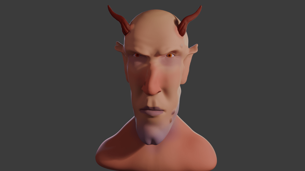
It was about here that I showed the sculpt to our daughter, who named him ‘Steve’.
So I had an orc ready to colour in and use to learn about animating characters. But that’s for next time.
Oven cooked meatballs! Remember to use a big pan for the tomato sauce or the meatballs won’t fit in.
Feeds four.
Timings: Prep: 20 min. Cooking: 40 min Eat: 10 min
Ingredients
500 g chicken mince
100 g breadcrumbs
A good pinch of salt
One egg
100g chorizo
A can of tomatoes
Onion and garlic
Vegetable stock cube/ stock pot
About a teaspoon each of dried oregano, thyme and chilli flakes. Add other herbs to your liking, and black pepper.
2 tablespoons oil (peanut, vegetable or whatever is to hand)
Pasta – about 75 g dry weight per person.
You’ll need two big saucepans and a baking tray. Oven to 180 C (fan), gas mark 6.
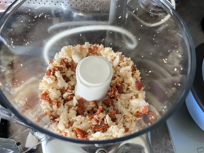
If you can’t get chicken mince, use a blender to mash up the required amount of chicken thighs1. Use the same blender to shred the chorizo (and make the breadcrumbs, unless you want to buy them).
Breadcrumbs and shredded chorizo in a Minimixer.
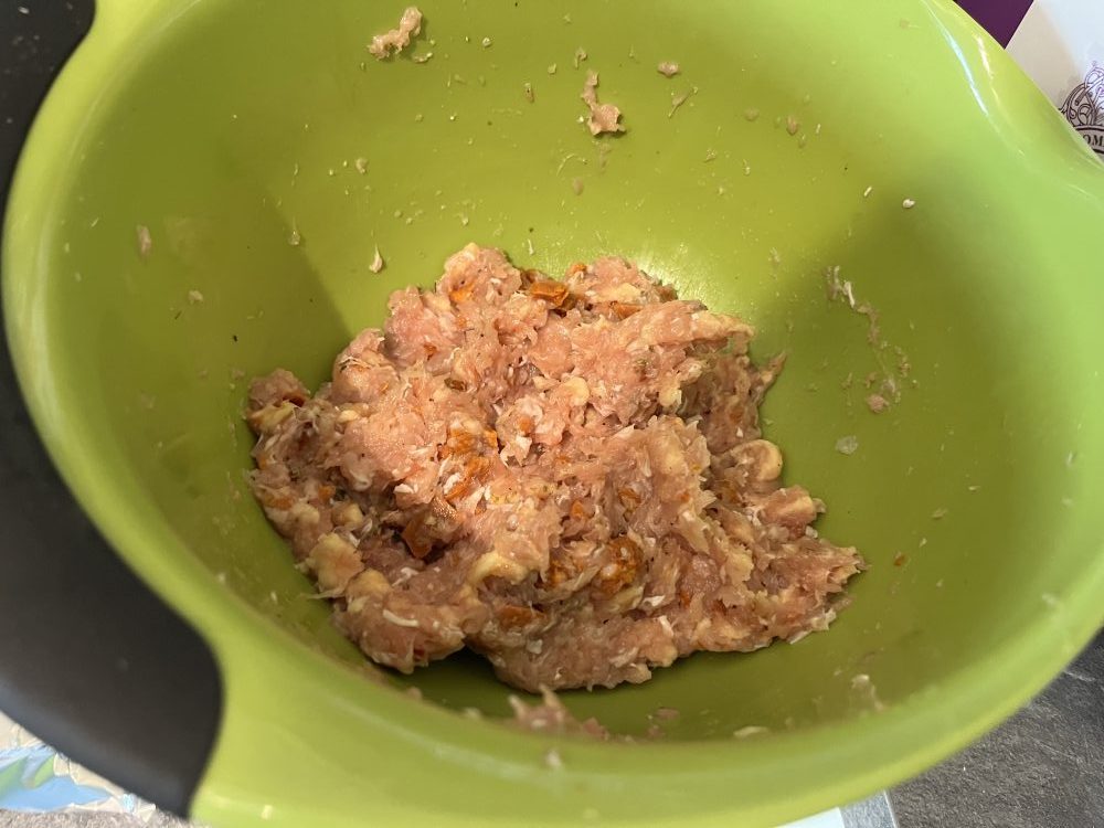
Combine the mince, chorizo, breadcrumbs, egg, salt, herbs and spices in a bowl and mix well. You can do away with the egg if you add more salt or leave the mix for longer – overnight is best2. Form into 12 or so meatballs. Smaller ones will cook quicker, you might make 20.
Meatball mix. The salt and egg help to bind the meatballs.
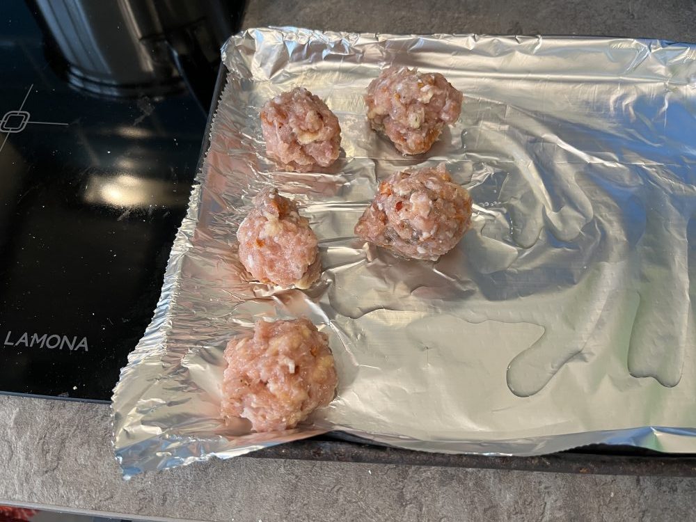
Distribute the raw meatballs onto a baking tray with an oiled baking sheet. Brush with a little oil and bake for 20 minutes until browned – check they are done with a meat thermometer if you have one.
Ready to cook, raw meatballs on an oiled, foiled baking tray. The oil helps brown the meatballs and lessen sticking to the foil.
While the meatballs are in the oven, make the tomato sauce. It would be an option to make this earlier – a couple of hours earlier – since the flavour improves with time. Depends on how busy you are.
Fry chopped onion at a low heat for at least 5 minutes until they are translucent. If you have time, fry at a very low heat for even longer until they caramelise. Add garlic, spices and dried herbs, fry for another minute.
Add the tin of tomatoes, rinse out with half a can of water and add this to the sauce. Add the stock cube/ stock pot and simmer.
Boil the pasta as directed on the packet. It’s a good idea to time it so that the pasta is done about five minutes after the meatballs are come out of the oven.
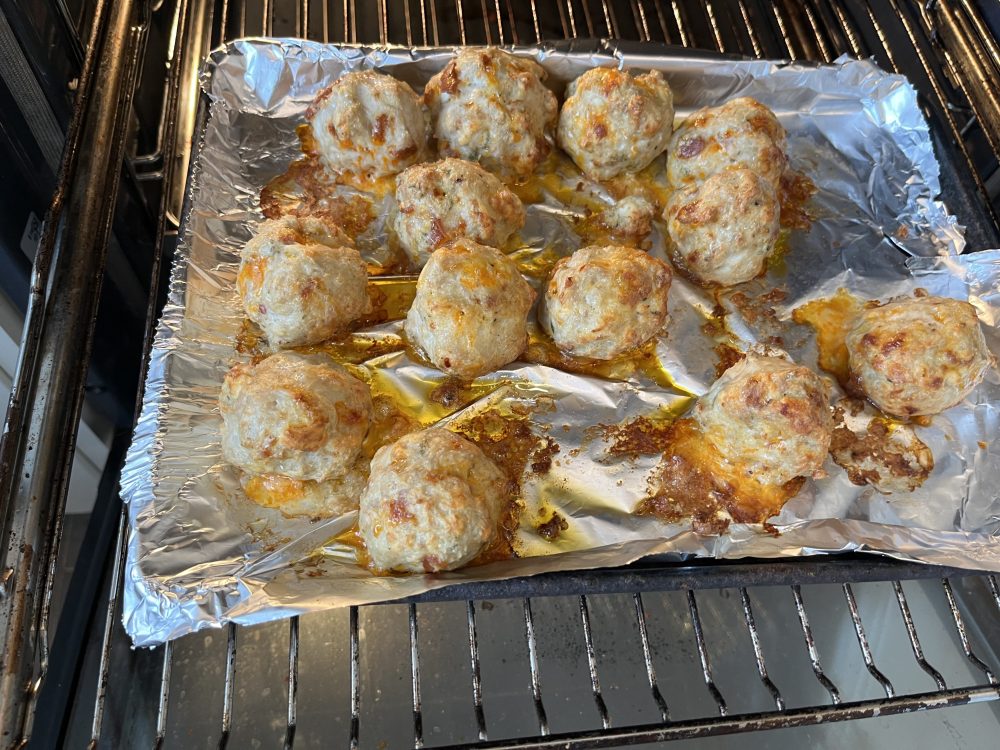
Meatballs after 20 minutes in the oven. A bit of browning adds flavour. An yes, OK, they did stick to the foil a bit.
Once the meatballs are cooked, transfer them into the pan with the sauce. This is why you need a big saucepan and I never made the mistake of using a small saucepan. Oh no, siree, matey Bob!
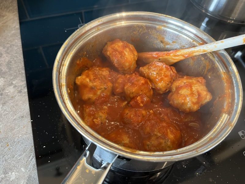
Meatballs in tomato sauce, ready to dish up.
Garlic bread goes well with this.
Chicken thigh are tastier than breast, but not as aesthetically pleasing. ↩︎
I think I got this tip from Gordon Ramsey. The salt breaks down some of the protein in the meat and helps the mixture bind by creating a natural glue. ↩︎
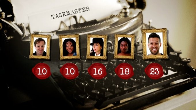
Taskmaster scoreboard from Season 13, Episode 1. Chris Ramsey – the person who enjoyed the experience the most of any contestant – set an early lead.
A recent publication by David Silver1 discusses the scoring in Taskmaster and how this impacts on the enjoyment of the series. It also looks at other metrics, such as the use of Large Language Model (LLM, a sort-of primitive AI) to analyse the script and detect sarcasm, among other things2.
The Abstract was enough for me to be sceptical about the study. Of all the metrics that were applied, the one that Little Alex Horne thinks is the most important was missed (from the abstract). It is the mix of people that’s the crucial element. I’ll come onto Silver’s treatment of that later.
What struck me was that if you wanted to know why we enjoy the show, a survey would do the trick. From what I’ve seen on the Taskmaster subreddit, most people see the scores as one of the many parts of the show. If anyone wants to win too much, it can be bad – John Robins strayed close to the ‘too needy’ zone. If they don’t care and do well (Jo Brand, Sarah Millican3, Sam Campbell4) that’s even better.
Sometimes you get the joy of a contestant such as Julian Clarey, who clearly didn’t care until towards the end. There was more sitting forward in his seat as scores were given out in the later episodes. He lost by a few points, sacrificing the win for a gloriously calm meltdown in the road-sweeper task.
The main attraction for winning is likely to be the chance to do it all again in Champion of Champions.
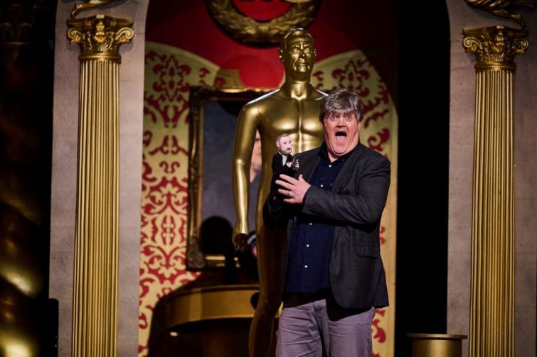
Dara O Briain, the winner of the third Champion of Champions with the Little Alex Horne puppet and his very convincing wig.
Whose win is it anyway?
Contestants are comedians (or comedy-adjacent) and they have different ideas about what winning is. Getting a laugh is the win and it’s this instant, honest feedback that many of them crave. That, and being paid on time.
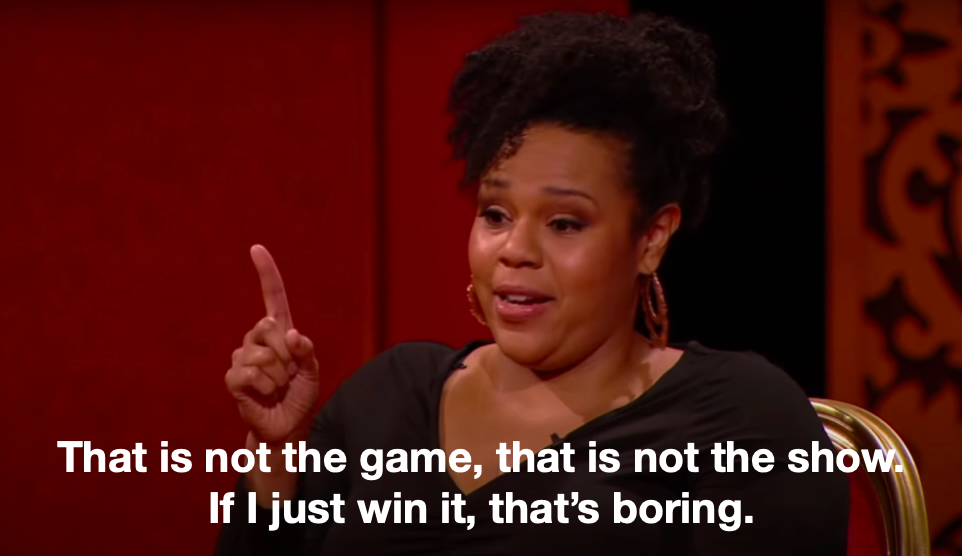
Desiree Burch epitomises this attitude. There was a balloon-popping task in Series 12. She knew that the ‘correct’ way to do the task was to get the scissors, cut the string and release the portcullis. But she also knew the funny thing was to throw pebbles, rubber ducks, a bucket-load of forks and eventually the bucket itself at the balloon until finally taking the scissors.
Desiree Burch cementing herself as a contestant who understood the brief.
Who? Who?
So we come back to what I think is the most important of the many factors in Taskmaster – the cast and the cast mix.
I’ve usually known a couple of the contestants, but then I’m a fan of comedy5. These tend to be well-established figures from stand-up (Dara Ó Briain, Mel Giedroyc, Sue Perkins) or related areas (Charlotte Ritchie, Steve Pemberton, Lisa Tarbuck). Add in some that I am not familiar with (Fern Brady6, Rose Matafeo), some I might have seen a couple of times on other things (Rosie Jones, John Kearns, Katie Wix) plus unknowns and we have a cast.
Eventually I get to know them all and their interaction is a major factor in the enjoyment. Seeing how the different minds complete the set-up that LAH has written is the principal draw, that is the meat of the sandwich.
In Silver’s paper he assigns five ‘types’ to the contestants based on how well they do points-wise, and then tries to fit each contestant in each season into these types. He tries to force his five types into every cast, like Cinderella’s sisters trying to force their feet into the glass slipper.
Assigning character types may be a better approach, but it gets very complex and I’m not a fan of assigning personality types7. There may be ten (or a different number) character traits that are needed in a cast, where each panellist has two or more components. Jack Dee is surly and competent. Julian Clary is sarcastic and insouciant. Kerry Godliman and Lisa Tarbuck were both straightforward ‘Bosh!’ merchants, but Godliman was competitive and Turbuck was laid back.
A moment of unalloyed joy for Kerry and Greg.
It’s a parody, innit?
The main reason for the points is that the show is a parody of competition. In his book ‘Be Funny or Die’, Joel Morris points out that a good parody has to look and feel like the thing it’s parodying. Spinal Tap only works because the music is professional quality and it looks like a documentary8. Airplane! works so well because there is a real aeroplane disaster plot thrumming away in the background and the cast play this straight. We follow the events of Galaxy Quest because the Thermians are facing extinction at the hands of the genocidal Sarris and their only hope is a bunch of shop-soiled actors.
There are points scored, so the show behaves like a panel show, the rhythms and beats are there to hang the chaos on. How the panellist behave is another matter and this is where the joy truly lies.
Artificial intelligence is really good at detecting sarcasm. ↩︎
Who would have walked away with the win in any other series (except maybe John Robins’), all the while not really caring. ↩︎
Sam won the most heart-warming series, with the two Sues forming an eternal friendship over a packet of NikNaks. ↩︎
That term suggests that there are people who don’t like comedy. I think the phrase in this case means people who go out of their way to find out about comedy and comedians, and go so far as to occasionally blog about comedy. ↩︎
Me Fern Brady! Me Fern Brady! I’m the rightful queen! ↩︎
Maybe there are people who are fans and I should be designing Myers-Briggs t-shirts for my shop. ↩︎
This is another paid-for course, again with Grant Abbitt as the tutor. This took me a while to complete, there was a lot to learn. But, again, Grant took us through everything and explained why things were being done. I got the course through Gamedev.tv, there are quite few other courses to look at, mainly for game design.
First we learned how to add shapes (mainly blocks) to a scene and add textures to the blocks. This is the sort of thing that familiarises the user with the setup of Blender and how to change things. It’s also useful if you’ve already done a course covering these things but forget quite easily.
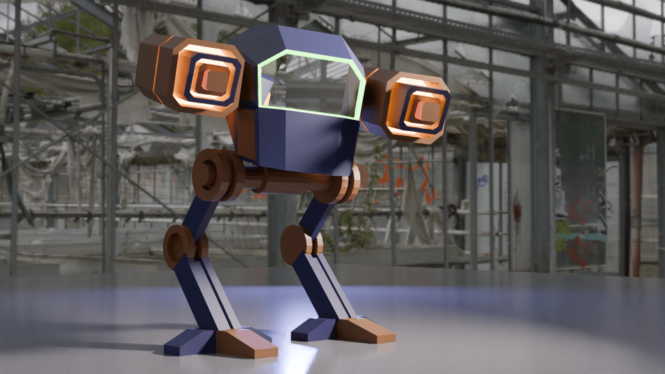
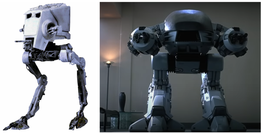
Secondly, we made a ‘mech’. This was a stylised all-terrain mobile gun and sort of a cross between ED 209 from Robocop and the two-legged transports in Star Wars.
A comparison of the two-legged all terrain walker from Star Wars (left) and ED 209, the enforcement droid from Robocop. The mech we designed is inspired by these machines.
The build was an exercise in hard-body modelling, one of the things I wanted to learn so that I could design things for 3D printing. Hard-body modelling is one of those things that you learn by doing. This became apparent as Grant guided us through the build and showed how to get from a cube to the cockpit by cutting and shaping in a particular order.
A chassis and legs came next, then the guns.
How the mech was assembled. The cockpit came first, then the chassis and legs, and finally the guns
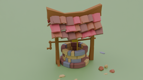
It’s a very angular look, this is done on purpose to achieve a ‘low poly’ aesthetic. The number of polygons (individual faces) affects how quickly a computer running a game can operate. You want the computer to be able to present good gameplay without a fiddly, highly detailed object slowing the computer down. The ‘low poly well’ I made earlier in this series is another example of this idea.
A low poly well made using as few ‘faces’ as possible to get a nice-looking but quick to render object.
The artistic side is the painting. We can add colours and textures to any ‘face’ in the model, so that the guns have a range of colours and glowing parts and there’s a green glow around the windscreen.
Completed mech with colouring and glowing guns. The green glow around the windscreen is a classy touch.
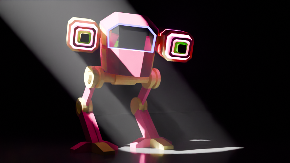
Setting the scene is another arty part and it’s best to get it right to show off the work. I changed the colours, because the sort-of camouflage was a bit dull, so I thought some vibrant colours would work well1.
An alternative to the original mech, this one is pink and yellow and standing in a spotlight.
Finally, I made a more fabulous version, with glitter (which took a while to learn how to do). I added a camera circle so that the true magnificence of the final design can be appreciated.
Fly-round of the glittery mech.
The next parts of the course leads up to sculpting, colouring and animating an orc. This took a few weeks to complete, I’ll post the progress in a couple of separate posts.
Grant Abbitt, the tutor for the course I’m doing, and the orc that we will spend the next few weeks sculpting.
Work well for image purposes. Maybe not so well on a battlefield. ↩︎
I’ve not ridden a bike for over 30 years (last one was stolen in 1993) so I’ve missed out on a lot of the developments in bicycle technology. I do enjoy watching the Tour de France, though, and one thing I was well aware of is the use of derailleur gears – they’ve been around since before I was born.
I was maybe 13 when I got my first multi-gear (10 speed, as I recall) bike after I’d outgrown the 3-speed one I got when I was 81. We’d moved to England by then, and where we lived wasn’t very hilly but also not so busy that I was in danger when out on the roads.
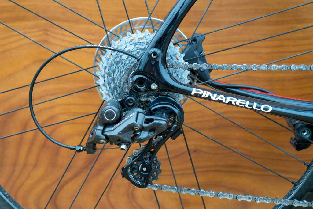
The rear wheel of a bike is probably not considered much by non-riders. It’s the wheel that turns when you turn the pedals. But the mechanism that controls the gears is the subject of much debate and engineering over the years.
Rear gear bit of a bike. The derailleur is the black Z-shaped thing which controls the chain as it hops between the spoke wheels on the axle and also maintains chain tension as the gear size changes.
Back in the old days (very old days) bikes didn’t have gears. The penny-farthing had a huge wheel and, if you found the hill was too steep, you hopped off and pushed.
Variable gearing initially involved having two gear spokes on either side of the back wheel and then getting off and turning your wheel around to go uphill (or downhill). I don’t know if there’s any footage of Tour de France competitors doing this, but your skills in fixing a bike were at least as important as your riding ability2.
The derailleur is a remarkably old invention, with the first rod-based systems being invented in the late 19th century. There is a book on this called ‘The Dancing Chain’ by Frank Berto, but it’s at least £75 and I’m not that into cycling.
Never an organisation to rush into making things easy for competitors, the Tour de France resisted such new-fangled innovations for many decades. Finally, in 1937, competitors in the Tour were allowed to use derailleur gearing. The effect this had on the average speed of the cyclists was minimal – an increase from 31.1 kph to 31.8 kph was about average for the speed year-on-year speed increase at the time (BikeRaceInfo.com).
Shimano gears
Founded in 1921 by Shozaburo Shimano, Shimano is one of the watch-words in the bike community. Their gears and groupsets (gears, gear changers, etc) are regarded as the best by many riders.
Pro teams currently using Shimano gears include fourteen of the eighteen UCI men’s World Tour (the top ranking pro teams) and four of the fifteen UCI Women’s World Tour teams.
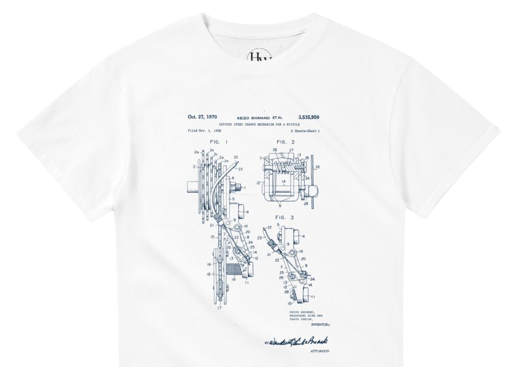
So in honour of this, I researched the early stages of derailleur gears and found the 1970 patent co-authored by Shozaburo’s son, Keizo Shimano. I think this was the basis of the Dura-Ace gear set that remained popular for a couple of decades.
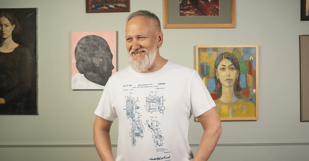
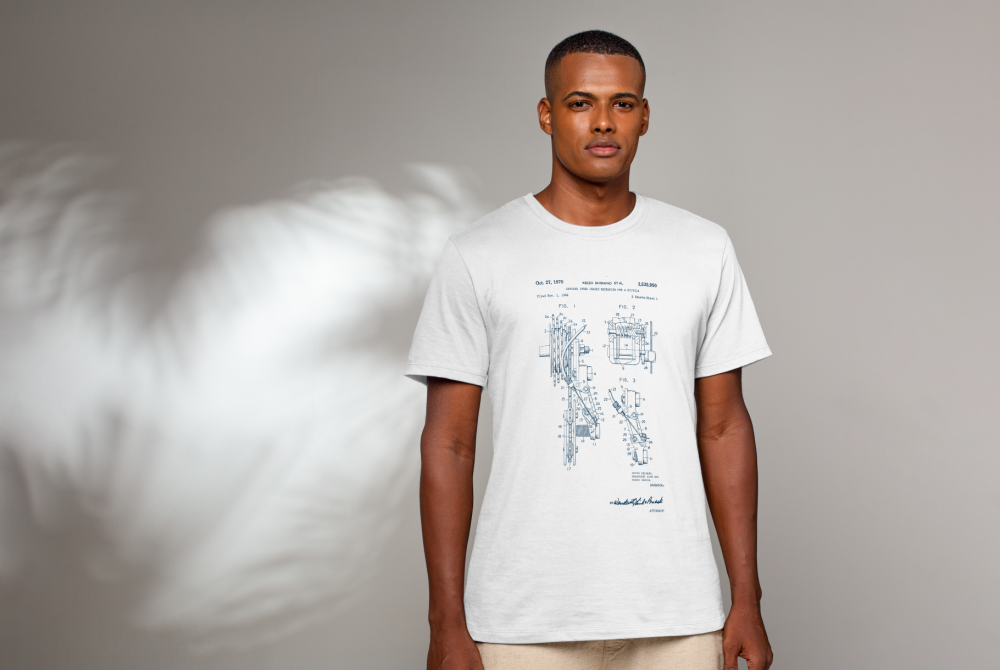
Shimano derailleur gearing patent, blue on a white t-shirt.
The patent design is now available as blue on white or (coming soon) white on blue or black in my Etsy shop.
As I said at the top derailleurs have been around since before I was born. Indeed, Cream’s 1967 album Disraeli Gears was so called when one of the group’s roadies dropped this malapropism when he heard that Eric Clapton was buying a racing bike.
Let’s listen to one of their songs from that album.
This had hub gears, which I never worked out the mechanism for, there’s just a chain that disappears into the axle. It’s probably magic. ↩︎
The spirit of the individual cyclist riding the Tour is typified by the story of Eugène Christophe from the 1913 Tour. He was leading by 18 minutes and descending the Tourmalet when his front forks broke. It took him two hours to reach the village at the foot of the mountain. He found a blacksmith who would let him use his forge – the rules stated he had to make repairs alone – and, after three more hours he set off with a mended bike. Race officials gave him a 10 minute penalty because a local boy pumped the bellows of the forge for him. He eventually finished seventh overall. ↩︎